James Adamé and Crew Work with Kareem Abdul Jabbar

Art Director James Adamé and some talented folks cooked up this cool video with Kareem Abdul Jabbar, who in 2009 anounced that he was suffering from a form of leukemia, Philadelphia chromosome-positive chronic myeloid leukemia, a cancer of the blood and bone marrow.  Abdul-Jabbar became a spokesman for Novartis, the company that produces his cancer medication, Gleevec.  In February 2011 Abdul-Jabbar said ‘My cancer right now is at an absolute minimum”.

Writers Megan Cohen & Scott Whittier, Art Director James Adamé, Producer Andy Rosenthal, Director Matt Bieler, Edited by Peel N Eat, Sound by Soundtrack, Color by Nice Shoes, VFX by Brickyard.

Posted in Altpick, Uncategorized | Tagged , , , , , , , , , | Leave a comment

Illustrator Janice Fried :: In Her Own Words

Illustrator and fine artist, Janice Fried never knew a time when she wasn’t drawing or doing some kind of artwork.  “My mother is also an artist so I grew up learning to find beauty in all kinds of things like an old piece of lacy rust or a smooth stone or a piece of birch bark.”, says Fried.  As a child, Janice loved to create her own children’s books and so being an illustrator, matching words with pictures was the most natural thing for her to do.  Janice picks three of her favorite images and tells us in her own words why.

AlbaniAlbani

Janice Fried: This piece is one of a series of mixed media pieces I did for myself based on the first volume (A-Ames) of an old Funk and Wagnalls Encyclopedia.  I would find a word or a name on the page and illustrate it.  To date, I have about 25 of these.  Maybe I’ll put together my own encyclopedia one day….Vol.1

aaalovethumb
Love

JF: The Love Image was originally done as a Valentine’s Day promo for myself.  I then used it for a very early page in Alternative Pick and it earned me a series of three card decks for Hay House publishers.  One deck used this image on the box cover. The Hay House cards were probably the best illustration job I’ve gotten to date.
This image has become a kind of logo for me and people seem to always like it.

debbie's tree imagekind
The Caring Tree

JF: Trees have always been a favorite subject matter for me.  A dear friend of mine commissioned me to do a piece for her office and this was what I came up with.  She is a lawyer who defends children and I thought what better subject matter than a cozy, protected tree.

To see more of Janice Fried’s work go to her website and Altpick page.

Posted in Altpick, Illustrations | Tagged , , , , , | 2 Comments

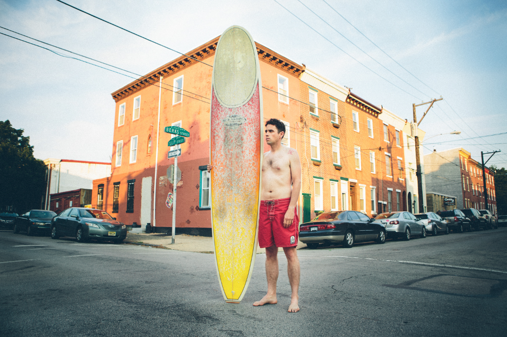
“Urban Surfers” by Chris Sembrot

Screen Shot 2013-05-31 at 10.43.23 AM

There’s nothing quite like the motivation of a beautiful woman to get you to try a sport that you’ve always wished you could do but never thought you could pick it up past your 10th birthday. This is the motivation that I felt three years ago when I met the woman of my dreams that would become my best friend and wife.

I always knew some of my friends surfed but I never REALLY knew what that meant. Being from Philly (minus my college years) I knew people surfed at the Jersey Shore, that’s pretty obvious if you hit the beach each summer.  But not knowing the culture and the passion that drives each individual to wake up at 4-5am and drive 1+ hours each way just to get a couple hours in during a swell (which the best surfing in the Northeast is from Fall – Spring), I was basically clueless what surfing really meant to them.

This project is directly inspired by three friends of mine: Adrian Castillo, Chris “Cakes” Savaiano, and Jim “Hammer” Hammell who took me under their wings, suffered with the humiliation (that I still bring when I go out with them) of helping a newbe. Their dedication to teaching and insisting I go out with them whenever they go, helped me confidently say to that beautiful girl I met for coffee three years ago that “…yeah, I surf”.

Screen Shot 2013-05-31 at 10.43.34 AM

Screen Shot 2013-05-31 at 10.43.03 AM Screen Shot 2013-05-31 at 10.43.12 AM Screen Shot 2013-05-31 at 10.42.57 AM

Stay tuned for more info regarding this project as I have big plans for next Spring/early Summer.

To see more of Chris Sembrot’s photography go to his website and his Altpick page.

Posted in Altpick, Photography | Tagged , , , , | 1 Comment

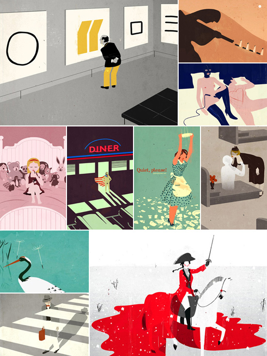
Friday Illustration Picks :: Conceptual

definition :: conceptual art :: noun ::symbolic in nature often using metaphors or allegory to create an emotional or intellectual response.

Posted in Altpick, Illustrations | Tagged , , , , , , , , , , , , , , , , , , , , , , , , , , , , , , , , , , , , , , , , , , , , | Leave a comment

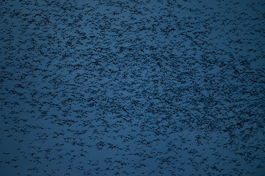
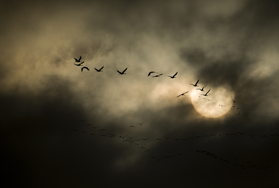
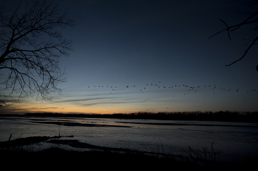
Migration Home by Photographer Bill Frakes

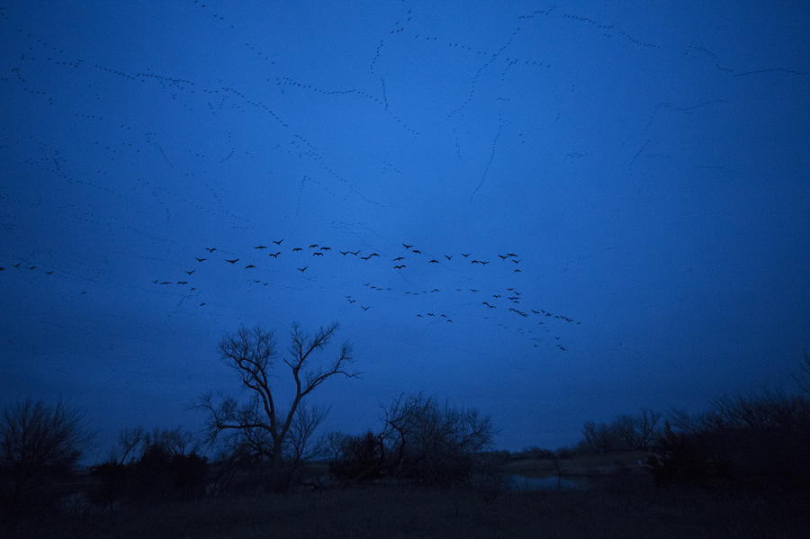
Platte River  Sandhill CranesI grew up in Nebraska loving the land, the people, the wildlife. It wasn’t until I went away to college that I realized most Americans think my home state is, well, homely.

When our family finally got a television set I was confused because the helpful commercials would announce 9 Eastern, 8 Central, and 6 Pacific. Why no Mountain Time zone? And then I painfully figured out that I lived in a fly over state.

I’ve spent a lot of time flying over a lot of places.

What I had never done was put myself in a position where tens of thousands of birds would fly just above my head as they make an ancient journey along routes that far predate men’s presence on the Earth.

Platte River  Sandhill Cranes

When I was three our family was enjoying a picnic on the banks of the Platte in the shadow of Scotts Bluff when I toddled off and decided to chase a duck into the river. The river isn’t mighty, or swift, or deep. But it was more powerful than my young legs. I don’t remember much about it, but my mom told a terrifying story of watching the current pull me under. Somehow they got me out, not too much the worse for wear.

So just a few, okay, maybe five decades later, when I was wading out to a sandbar in that same river carrying a heavy Gitzo tripod, and a Nikkor 600mm f4 lens it was rather unsettling when I found my foot sinking into deep, soft mud. I couldn’t drop the tripod, or the lens so I had to pull my foot out of the hip wider and continue across the unpleasantly cold river.

We had a pop-up blind tacked down on the small piece of land right in the middle of the Platte. We knew there was a whooping crane in the area, and we knew the sandhill cranes and snow geese were maybe 30 minutes from starting to glide down to their overnight resting places. I was soaked. But no time to head back to get dry clothes. It was going to be a very long, cold night.

But what a night. I have been in many places — all 50 Americans states, 138 countries at last count, and every continent except Antarctica so I’m pretty confident in saying I am well-traveled. I’m comfortable saying that being on this piece of sand, in the middle of the first river I knew, on a bitter March night, drenched to the bone was one of the most magnificent experiences I’ve enjoyed in nature.

Platte River Sandhill Cranes

We were facing due west. The sunset was full, bright orange. The sky crystal clear. As it went from a glorious yellow intensity to a full deep royal blue, a sliver of a moon gracing the pre star filled night, the birds appeared. A handful tentatively dropped to their roosts, then the noise increased, the sky was full of soaring, gliding black, honking birds. Impossible to count but likely 50,000 of these gangly, magnificent prehistoric creatures swirled overhead and settled in to join us overnight on the flat, wide river the water coursing a foot from our blind.

 Platte River  Sandhill Cranes

There were no people close, and it was a dark, dark night but it was far from quiet. The sound was almost deafening, yet soothing.

Around 4 a.m. we had visitors. A small herd of deer splashed out across the channel to stand inches from the tent. Nothing scary but a little strange to look out through the tent windows at the dark, questioning eyes of those gentle creatures.

As the sun slowly crept up in the eastern sky, Laura made incredible video images of the graceful creatures in flight. I sat spellbound trying to do the same.

Full circle. And I can’t wait to get back next year. It’s my migration. Home.


To see more of Bill Frakes’ work go to his website and Altpick page.

Posted in Altpick, Photography | Tagged , , , , , , , , , , , , , | 1 Comment

Illustrator Michael Lewy :: In His Own Words

Michael Lewy is a big fan of the science fiction genre.  The 1960’s and 1970’s sci-films from his childhood left him with fond memories that carry over into his work today.

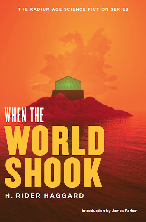
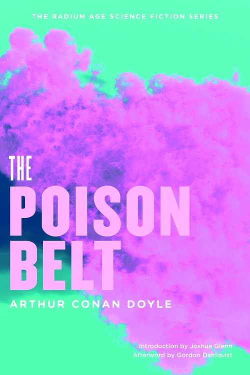
When Michael illustrated these book covers, he worked closely with Josh Glenn of HiLoBooks and Tony Leone of Leone Design.

In his own words, Michael tells us of two of his favorite covers:

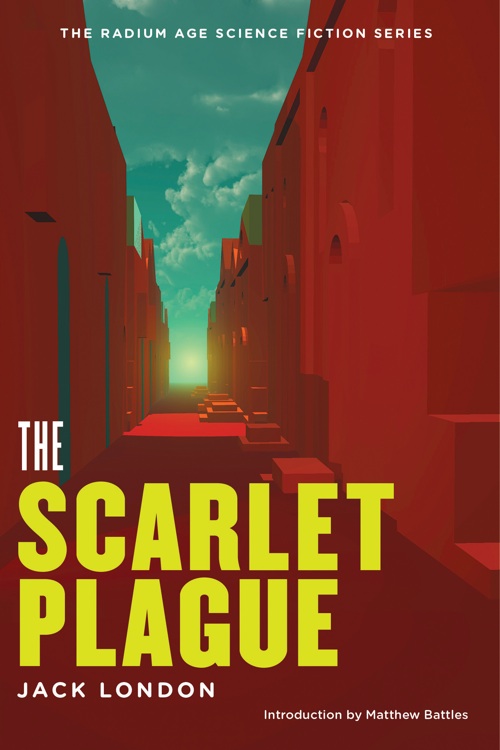
scarlet-final-500

Michael Lewy: One of my favorite covers is The Scarlet Plague’s cover. I love the how it came about – the simple images are really my favorites.  That weird street and the strange light I think really has a sense of mystery.

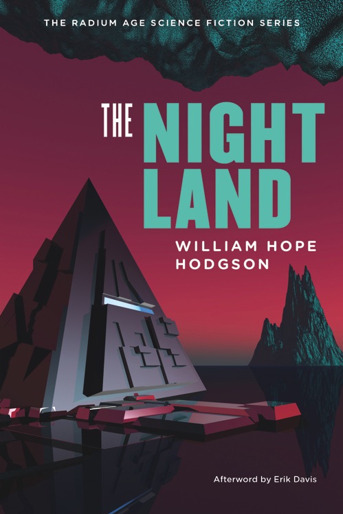
tumblr_m3pukc3Y1h1qh4qhko1_500

ML: “The Night Land” cover is a kind of throw back to those old sci-fi paperbacks of the 70s’, but it still remains modern.

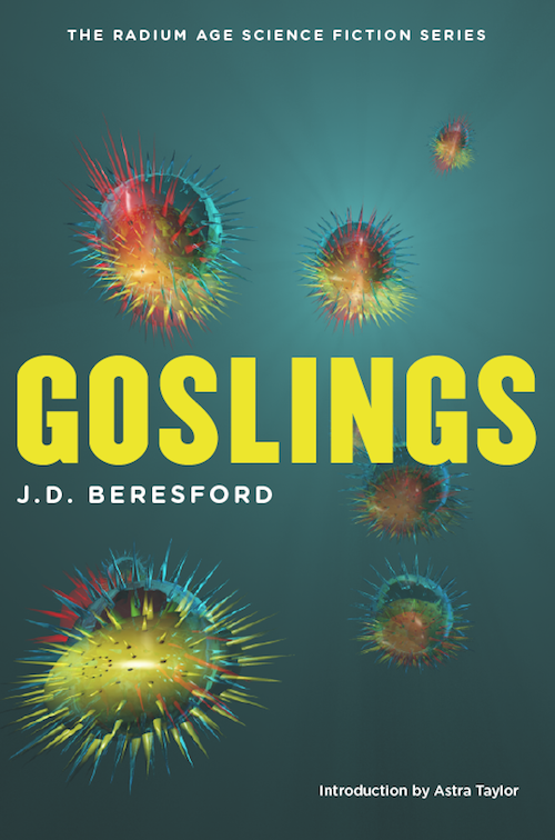
Here are a few more of my favorite covers: 

tumblr_memgcg8xtT1qh4qhko1_1280world-shook PoisonBelt-final-e1338576146117

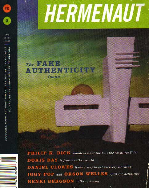
In the early 90’s, Michael collaborated with Josh and Tony on Hermenaut magazine. The crumpled cover gave it a second-hand look. http://jahsonic.tumblr.com/post/18573198904/hermenaut-magazine-15-1999-the-fake

tumblr_m08baen1V01qz4yqio1_500

To see more of Michael Lewy’s work go to his website and Altpick page.

Posted in Illustrations | Tagged , , , , , , , , , , , , | Leave a comment

Illustrator Rob Wilson :: In His Own Words

Blurring the lines between design, illustration and typography, Rob Wilson’s work offers bold, creative concepts with understated thoughtfulness and wit. His experience as a creative director, designer and illustrator has given him a depth of understanding, and the ability to create artwork that resonates with intelligence. Often you find a sense of humor, inviting an emotional connection to his work.

Inspired by his surroundings, Rob documents his travels and daily walks with his iPhone. He uses the photographs  he takes to ground his two-dimensional images in a three-dimensional reality.  In his own words, Rob gives us a little insight on the images he calls his favorites.

D_Home_RobWilson

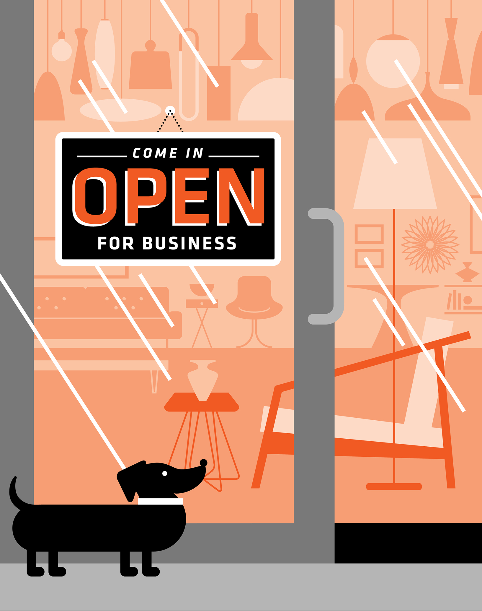
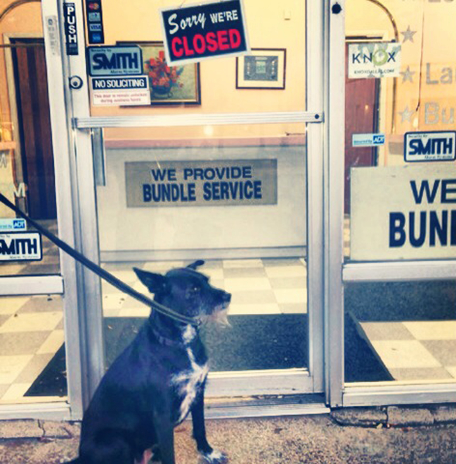
photoRob Wilson: Image: An illustration for an article about the opening of designer furniture showrooms to the public in the Dallas Design District. It had to incorporate a classic “open” sign in the artwork.

Inspiration: A walk with my dog, Maisie. Even though the cleaners were closed when we arrived, a photo of the sign on the door–with Maisie patiently posing–led to the creative spark of the illustration and to its final composition.

NYC_NEST

Greenpoint

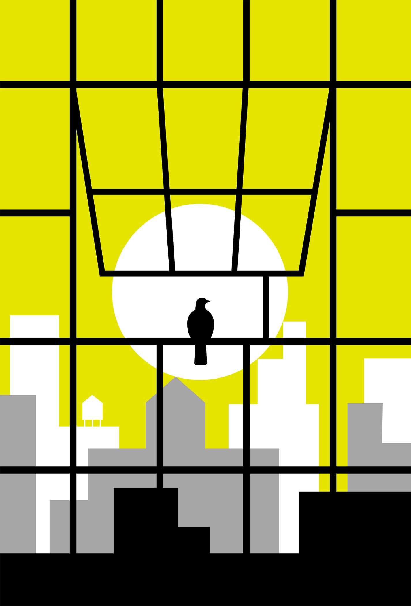
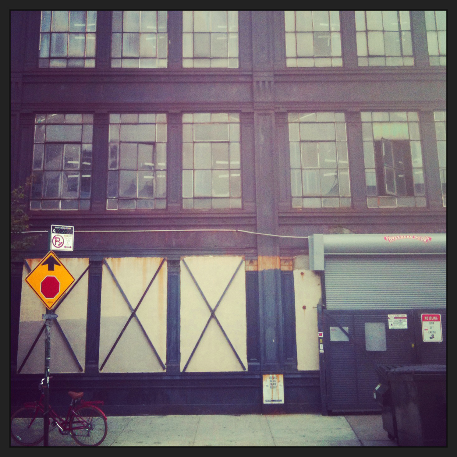
RW: Image: A personal drawing from a room with a spectacular view.

Inspiration: A stay in Greenpoint. I’ve spent a lot of time in Brooklyn over the past couple of years, and have shot countless photos of the industrial warehouses and buildings. I love how their mechanical windows open and offer you their own framed, singular views of the city.

ruth-dress

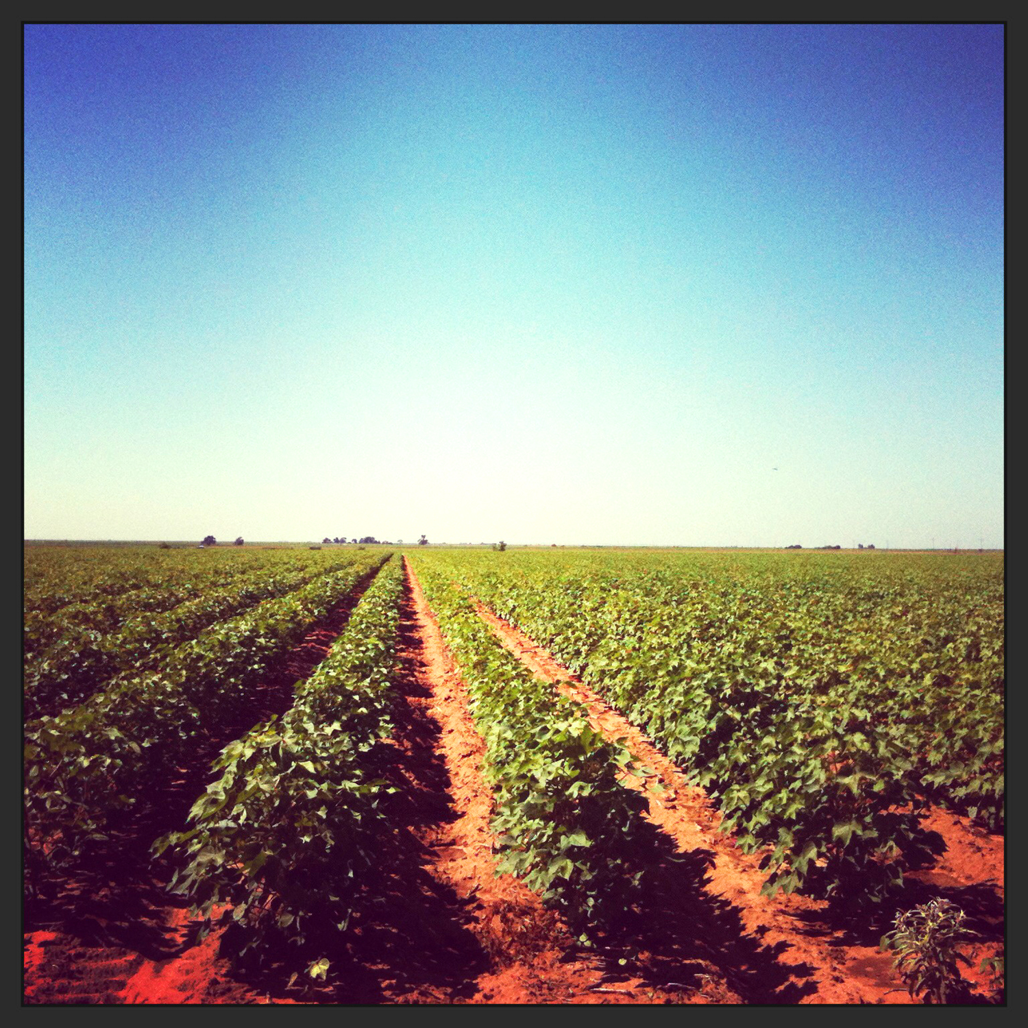
CottonField

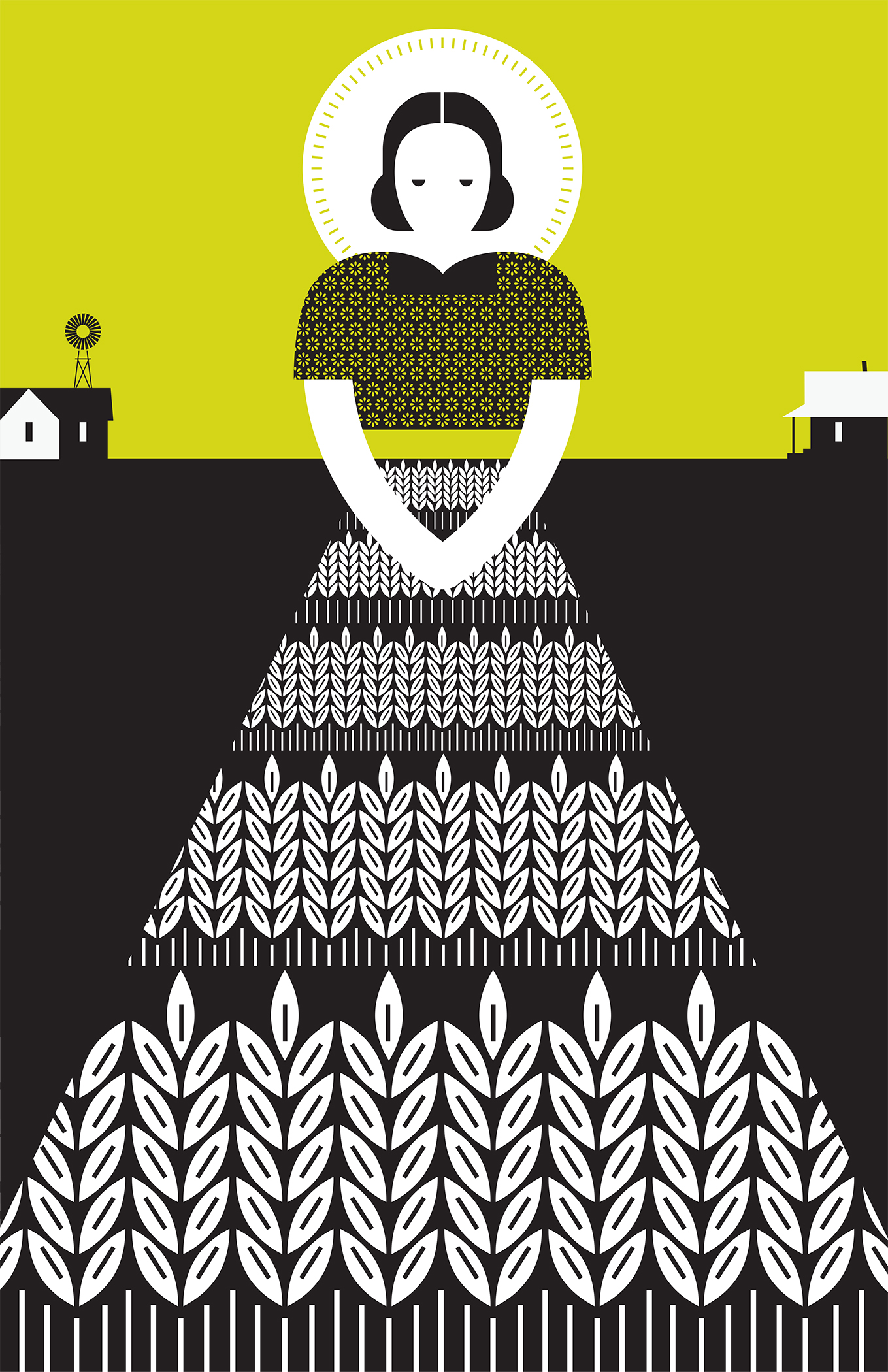
RW: Image: An illustration for the play “Ruth,” an adaptation of the Biblical story set in Depression-era Oklahoma.

Inspiration: A field of cotton. I grew up near my grandparents’ farm in rural West Texas, surrounded by a vast sky and endless acres of farmland. I took a photo of the farm and realized the perspective could give shape to a simple dress. This led me to think about the starkness of the horizon, the long distances between houses, and how this landscape worked conceptually with the production of the play.

Watertower_Poster

WaterTower

RW: Image: One of a series of Texas icons.

Inspiration: A road trip. There are many Texas stereotypes, but for a series of Texas icons I was compelled to look past them and seek ideas I thought were an inextricable part of the state. I found the first concept for the icons during a visit to Marfa, when I saw the local water tower. I then took photos of other water towers–including the one from my hometown–and combined them to create a single image that is often overlooked, but appears mile after mile on the horizon as you drive across the state.

To see more of Rob Wilson’s work, go to his website and Altpick page.

Prints of the entire series are available at http://www.reneerhynershop.com

Posted in Altpick, Art, Design, Illustrations | Tagged , | Leave a comment

EmilianoPonzi_72

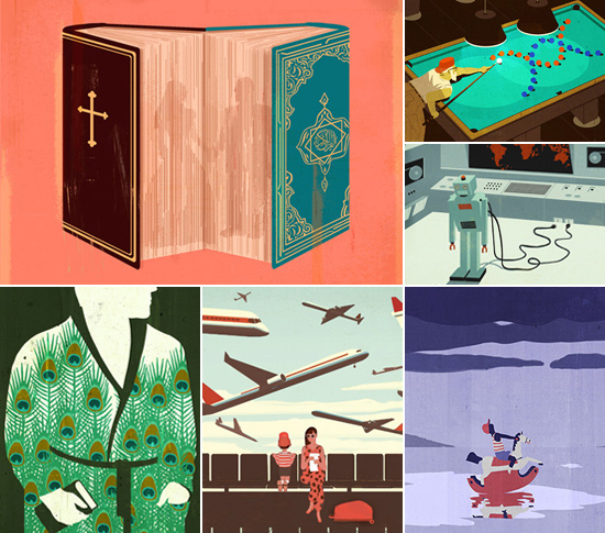
Emiliano Ponzi’s artful conceptual illustrations cross language barriers and cultural divides in their concise yet playful simplicity. The past year has been a momentous one for him, in addition to winning top honors from some of the industry’s most respected associations and exhibiting his work in a number of cities around the world, he has received international press, including a documentary about his work for Swiss television.

NEWSPAPER

EP_Newspaper

CLOCKWISE (from upper left): The Washington Post; La Repubblica;
La Repubblica; Le Monde; The Los Angeles Times; Le Monde

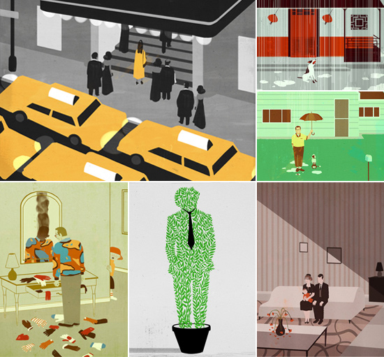
Emiliano’s illustrations can regularly be seen in the pages of The New York Times and other newspapers. His recent piece for the Sunday Book Review’s feature on Emily Rapp’s book, The Still Point of the Turning World, provides a somber yet beautiful treatment for the autobiographical story of a mother and her terminally ill child. Another unique piece (check it out – it’s animated) for the Opinion Page ‘goes green’ in response to a recent article about the economic benefits of a federal climate policy. Last year, The New York Times’ Manhattan office presented a solo exhibition of some of Emiliano’s most successful pieces for the newspaper. Curator and Art Director, Nicholas Blechman, said “These illustrations answer perfectly to the Munari principle, for whom the designer must be able to answer with humility and talent, the questions made by the society in which he lives.”

THE NEW YORK TIMES
EP_NYT

ABOVE: All illustrations from The New York Times

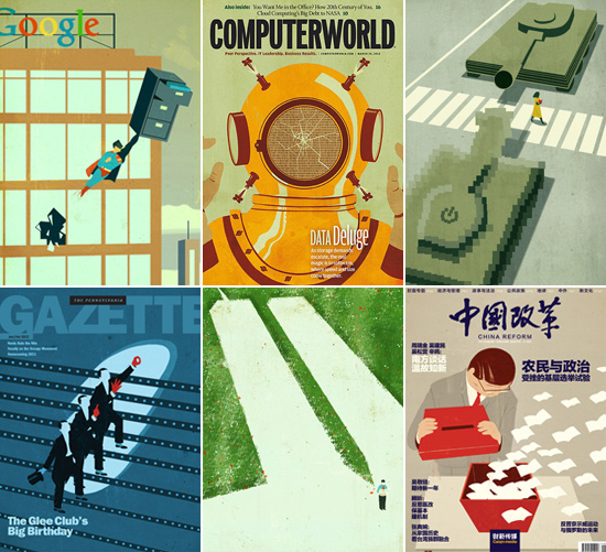
His editorial work includes recent covers for Computerworld and the Pennsylvania Gazette, as well as assignments from The New Yorker, Runner’s World, More, and PCWorld. His illustration of two tanks takes a clever approach to the The New Yorker’s article about the battle between Amazon and traditional book publishers, while another piece for PCWorld’s report on ‘rescuing’ your data from Google features a superhero character, offering a solution that is both charming and witty. The illustration was also animated for the iPad edition of the magazine (see it here).

MAGAZINE

TOP (from left): PCWorld; Computerworld; The New Yorker BOTTOM (from left): The Pennsylvania Gazette; Entertainment Weekly; China Reform

TOP (from left): PCWorld; Computerworld; The New Yorker
BOTTOM (from left): The Pennsylvania Gazette; Entertainment Weekly; China Reform

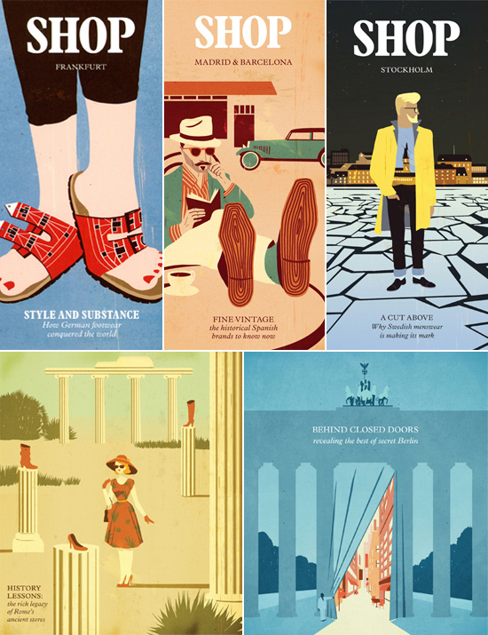
Another project for UK-based shopping tourism company, Global Blue, had Emiliano illustrate a series of covers for their European shopping guides. The eye-catching Stockholm guide features a bold, graphic illustration that celebrates the cutting-edge menswear that Sweden is becoming known for. The series also includes guides to Madrid and Barcelona, Frankfurt and special luxury editions for Berlin and Rome.

TRAVEL

EP_Travel

ABOVE: Shopping guides for Global Blue

One of Emiliano’s biggest recent assignments came from Italian publisher, Feltrinelli, who tasked him with creating covers for the Italian language editions of German-born American writer Charles Bukowski’s novels, poetry and short stories. Bukowski, famed for his gritty, explicit style of writing, depicted “a certain taboo male fantasy: the uninhibited bachelor, slobby, anti-social, and utterly free” said Michael Greenberg of The Boston Review. The illustrations Emiliano created needed to communicate both the titles and Bukowski himself and they succeeded in doing so. The series, which includes nine titles so far, has already earned Emiliano a coveted Gold Cube from The Art Directors Club 92, a Gold Medal from the Society of Illustrators of New York 59, inclusion in the American Illustration 32 annual and a front page feature in Italy’s largest newspaper, La Repubblica. Clickhere to see an animated video teaser for the series.

CHILDREN’S BOOKS

ABOVE: All illustrations from Il più grande fiore del mondo by Jose Saramago (Feltrinelli Kids)

ABOVE: All illustrations from Il più grande fiore del mondo by Jose Saramago (Feltrinelli Kids)

Feltrinelli Kids, chose Emiliano to create the illustrations for Nobel Laureate Jose Saramago’s first and only children’s book, Il più grande fiore del mondo (or The Biggest Flower in the World). When describing his work for the book, Emiliano says “I […] mostly worked with wide/empty spaces so children could imagine what they don’t see in my illustrations. There is a lot of ‘air’ in the book and some details represent fragments from my personal childhood memories, such as my grandma’s house floor or the t-shirts I used to wear when I was a little boy.”

PUBLISHING
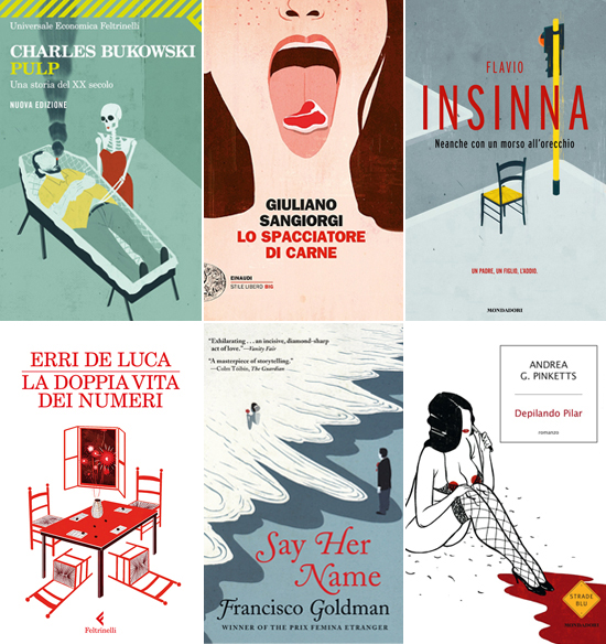
TOP (from left): Feltrinelli; Einaudi; Mondadori BOTTOM (from left): Feltrinelli; Grove Atlantic; Mondadori

TOP (from left): Feltrinelli; Einaudi; Mondadori
BOTTOM (from left): Feltrinelli; Grove Atlantic; Mondadori

Another publishing project sprung from a New York Times editorial assignment. Originally appearing with the newspaper’s review of Francisco Goldman’s book Say Her Name, the hauntingly beautiful illustration was later licensed for the Grove Atlantic US paperback and UK editions, the French edition (Editions Bourgois) and Dutch edition (Lebowski Publishers). The touching memoir of a man whose bride dies tragically while surfing went on to win the French literary prize, the Prix Femina Étranger, while the illustration made the AltPick Editor’s Choice list.

PRODUCT + PACKAGING

EP_ProductPackaging

FROM LEFT: Beer label for Portsmouth Brewery; Greeting card for Marian Heath; Calendar for Arcobaleno

A similar situation spawned a packaging project. Emiliano’s somber illustration of the infamous Russian empress, Catherine the Great was noticed by a brewery with an interesting project. Portsmouth Brewery’s annual ‘Kate the Great Day’ marks the only day of the year that the Great Russian Imperial Stout is available, attracting crowds from all over New England with many waiting in line overnight for a chance to sample what Beer Advocate magazine calls the “best beer in America.” The tongue-in-cheek illustration appeared on the beer’s label, as well as souvenir pint glasses and t-shirts.

EXHIBITION
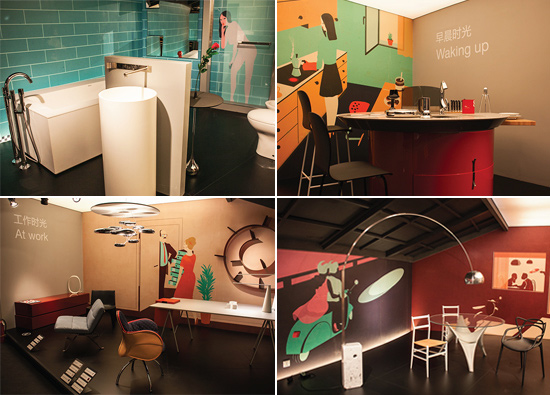
ABOVE: Artwork created for Design Time, the main exhibition at the 2012 Beijing Design Fair

ABOVE: Artwork created for Design Time, the main exhibition at the 2012 Beijing Design Fair

Emiliano had the opportunity to present his work internationally as part of Design Time, the main exhibition at the 2012 Beijing Design Fair. His illustrations provided the backdrop for the show which was conceptualized by Italian design studio, Migliore + Servetto, and showcased how Italian industrial design has embraced all aspects of everyday life. Emiliano’s work again took center stage in the Suspension of Disbelief exhibition at Rome’s Wunderkammern Gallery. His piece, Sunrise Hotel, was the result of a collaboration with Italian artist, Giacomo Benelli. Viewers were invited to peer inside nine of the hotel’s twenty-eight windows and witness the guests of Sunrise Hotel, from celebratory newlyweds to a woman scorned. In his coverage of Sunset Hotel, Rob Alderson of art and design blog, It’s Nice That, said “Emiliano has produced an extraordinary set of scenes glorifying in the seediest parts of society’s underbelly. With sex, death and neglect all present and correct this is an interesting project about the perseverance of private vices in an increasingly public society.” Other exhibitions included TOWNIES: An Exhibition of Illustration from the New York Times Opinion Blog and a display at the MoCCA Arts Festival in New York.

GALLERY
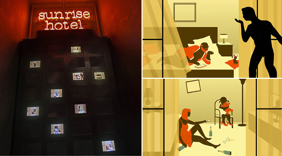
ABOVE: Artwork created for Sunrise Hotel, part of the Suspension of Disbelief exhibition Wunderkammern Gallery

ABOVE: Artwork created for Sunrise Hotel, part of the Suspension of Disbelief exhibition Wunderkammern Gallery

Emiliano and his work were the subject matter of Sense and Sensibility, a short documentary from director Fabio De Luca for RSI, a Swiss television network that specializes in Italian programming. In the 7-minute documentary Emiliano discussed the unique texture of his digital illustrations, his thoughts on creativity and the universal appeal of his work. A selection of his most-popular illustrations were also animated for the film with Emiliano actually stepping inside and interacting with his work. He says “They were very interested in building a story around my job and the way I feel it. Not just a usual documentary but something more, a view that could show both the inner and the outer side.” Visit Emiliano’s website to to watch the video with English subtitles and to see some behind-the-scenes photos. Other press includes a recent appearance on Italian music television channel, DeeJay TV, and an interview on Italian radio show, RaiTunes. During the interview, RaiTunes live streamed a drawing demo by Emiliano online. See the video here.

PRESS
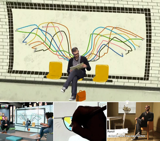
TOP: Still from Sense & Sensibility, a documentary from director Fabio De Luca BOTTOM (from left): Appearance on DeeJay TV; Live drawing for RaiTunes; Still from Sense & Sensibility

TOP: Still from Sense & Sensibility, a documentary from director Fabio De Luca
BOTTOM (from left): Appearance on DeeJay TV; Live drawing for RaiTunes; Still from Sense & Sensibility

Click here to read Magnet Rep’s previous spotlight on Emiliano.
Click here for downloadable items – desktop wallpapers and a high-res printable letter sized promo.

 AWARDS
TOP: Society of Illustrators 55 MIDDLE: Society of Illustrators 55; Society of Illustrators 55 / ADC 92 / American Illustration 32; Society of Illustrators 55 BOTTOM: PRINT In Motion; HOW International Design Competition; PRINT Hand Drawn Competition

TOP: Society of Illustrators 55
MIDDLE: Society of Illustrators 55; Society of Illustrators 55 / ADC 92 / American Illustration 32; Society of Illustrators 55
BOTTOM: PRINT In Motion; HOW International Design Competition; PRINT Hand Drawn Competition

Q&A with EMILIANO PONZI

Use three words to describe your style.
Universal, synthetical, easy to read.

In an ideal world, you would have an infinite amount of… ?
Money.

What are some of your interests and hobbies outside of illustration?
Nothing too odd: hanging out, reading, watching a movie, running.

What is your ideal assignment?
1. A narrative topic without many bonds
2. Great art direction that leads me in the right direction without being too imperative
3. A very good fee

What’s the best way to get over a creative block?
Smoking a cigarette on the balcony or distracting the mind and hanging out with someone.

What is your favorite part of living and working in Milan?
Milan is the only city in Italy where you can breath an international atmosphere. There are many people here I have things in common with. On the job side mostly the editorial and advertising industry is located in Milan so it makes it easier to interact with them. On the living side you could have some benefits of staying in Italy but with a look to the outside. It’s  a sort of bridge city.

Do you have a favorite movie?
I have more than one, Women on the Verge of a Nervous Breakdown by Pedro Almodovar, Annie Hall by Woody Allen…

How has the illustration industry changed since you became a professional illustrator? How do you see it changing in the future?
I guess that the references changed. I started around 2001 when the visual trend was more realistic. Illustrations on average were more detailed and naturalistic. Now vector based and flat images are mainstream and the border between graphic and illustration are thinner than in the past and illustration direction is more minimal. I don’t know what other subtraction will be possible in the future so I think that rather than being more synthetic it will simply change in other direction connected to the switch between a static illustration and a moving image.

What is your biggest challenge as an illustrator?
Last a lot, being able to interpret the audience feeling along the decades.

Your ideal vacation spot?
A place where I can unplug my mind, hopefully somewhere I’m not able to speak the language or access to the web.

Who are three artists you admire and why?
Fortunato Depero was a Futurist painter. He designed many of the greatest posters during the first decades of the 1900′s. His style and technique gave a new shape to the advertising industry helping to build modern imagery of applied arts. Edward Hopper was able to enter into the intimate emotions of normal people, daily gesture loaded with extraordinary meaning. I love his environments and scenes. David Hockney learnt all the lesson from the past and added the ‘pop’ culture and colors to his visions.

Best way to end a long day of work?
Three possible great ways:
1. Going out doing something interesting and exciting
2. A long walk in the neighborhood
3. Laying on the couch with a book or watching the TV zombie style

For more information and images, go to Magnet Rep’ website and Emiliano’s Altpick page.

Posted in Art, Illustrations | Tagged , , , , , , , | Leave a comment

Friday’s Picks :: Portrait Photographers

To see more of the photographers’ pages on Altpick.com, go to their individual pages:

Tom Atwood, Keith Barraclough, Gina Binkley, Jon Blacker, Art Brewer, Blair Bunting, Geneviene Caron, Eric Cassee, Studio Caswell, Chris Clor, Scott Council, Steve Craft, Chris Crisman, Brian Cummings, Rick Dahms, Kristofer Dan-Bergman, Stephanie Diani, Van Ditthavong, Elk Studios, Lisa Fasten, John Fedele, Mark Finkenstaedt, Mark Guthrie, Stephen Hill, Jordan Hollender, Robert Houser, Bruce Hulse, Leslie Jean-Bart, Matt Kalinowski, Ryan Ketterman, Shane Kislack, Brian Kuhlmann, Landry Major, Tim Mantoani, Christopher T Martin, Alex Martinez, Doug McGoldrick, Jonnie Miles, Tadd Myers, Henrik Olund, Beth Perkins, Brook Pifer, Lisa Predko, Simon Puschmann, Bruce Racine, Daniel Rey, Ken Richardson, Lara Rossignol, Tom SandersChris Sembrot, Stephen Sherman, Ken Sax, Brian Smale, Jenna Stamm, Zave Smith, Kevin Steele, Jay Watson, Ken Weingart.

Posted in Altpick, Art, Photography, Uncategorized | Tagged , | 1 Comment

Illustrator James Benn :: In His Own Words

James Benn lives and works in the UK.  As an illustrator, James loves to come up with new ideas for both his clients and his own personal projects.  With graphic influences and illustrative undertones, sometimes he prefers flat bold shapes within the imagery to tell the story.  James first sketches out his drawings by hand before scanning them into the computer. He creates a flow that tends to have a narrative base.  His strong concepts within his work captures the idea and delivers the message.  You can feel the joy he is portraying.  In his own words, James tells us about some of his favorite images.

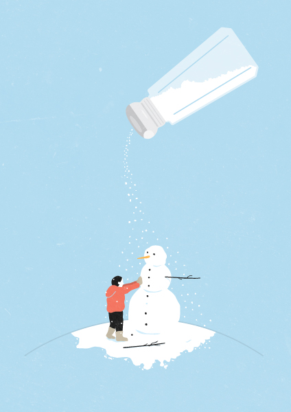
SnowJB: Snowman – I created this past winter, no surprise from the fact that it was snowing and I was searching for inspiration.

Apple
JB: Apple – is a fun play on the brand, as it is so symbolic nowadays I thought it would be humorous to play on that.

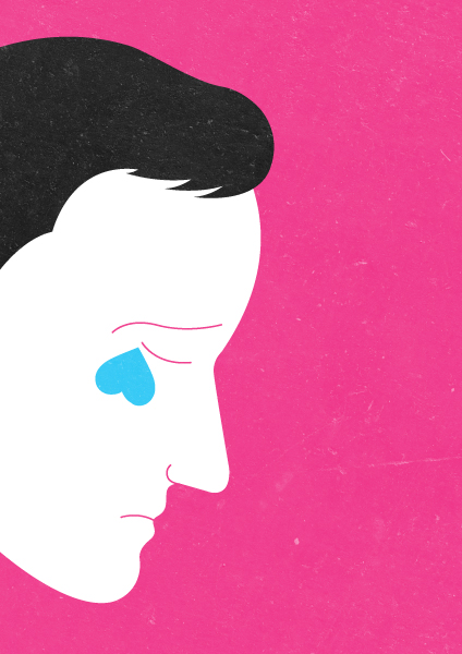
heartbreak
JB:  Heartbreak – a slightly more graphic image but one I’m sure that resonates with everyone.

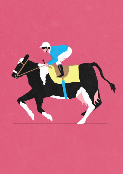
Cow-jockey
JB: Jockey – In the UK there was big news when Horse meat had gotten into beef products. So it was merely a bit of a joke that if were eating horse were riding cows.

To see more of James Benn’s work go to his website and Altpick page.

Posted in Altpick, Illustrations | Tagged , , , , , , | Leave a comment