
by Zave Smith
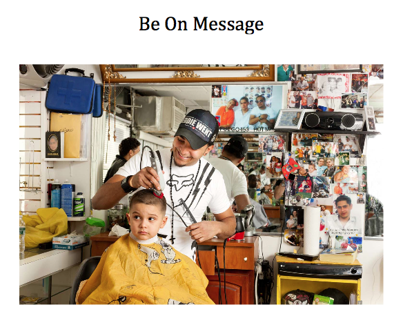
In today’s crowded multi-channel media market, it has become more important than ever for companies to create communications that are on brand. We live in the era of very short attention spans. We live in an era where branded visual communication has become the power tool for reaching our client base.
How does a company build a strong branded library of visual assets?
In this article we are going to talk about stock photography, custom photography and your brand.

I am going to assume that all of you know more about branding and your company’s brand than I do. But let us take a few moments to review branding anyway. A brand is simply your company’s story. It should be an expression of what your company stands for, what you offer your customers, and what your company’s values are. Or as Seth Siegel once said, “Branding de-commoditizes a commodity.”
Strong brands are built by showing and they are built by doing.
What do I mean by that? I once worked for a company that made “collectibles”. They basically sold junk. While their advertising, their promotional material and even their internal propaganda called their merchandise “collectibles”, “art”, “heirlooms” and “investments”. I believed that it was this disconnection between what they said and what they did that led to their demise. I am sure that many of you have similar experiences with other brands. Maybe you enjoyed that wonderful phone support your cell phone provider bragged about. Or the amazing amount of free stuff your airline points have given you. Just think about how you felt while listening to our politics on Fox Sunday Morning.
With good companies, what they say and what they do are one and the same. No one ever wrote home about the wonderful food and comfortable seats of Spirit Airlines, but then again, nobody expects luxury on Spirit. Customers choose Spirit for one reason and one reason only: it is cheap. Cheap fairs are what Spirit does and it is what they promote. Fast food does not stand for healthy and organic cuisine. But you know when going into a burger joint exactly what you are going to get and they deliver that almost perfectly.
In the markets that we mainly work in, the markets that sell intangibles like insurance, banking and healthcare services, we, as branders have a harder task than the Spirits and burger joints of the world. What we do is much harder to condense into a single slogan. It is also much harder to differentiate ourselves from our competition.
So, before we can start talking about pictures, we need to talk about what we are talking about.
What is your company’s brand? How do you picture and how do you illustrate that? Once you have an idea of how to illustrate your company’s brand, where do you acquire the right images?
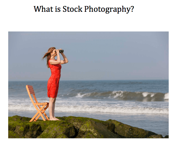 Stock photography is nothing more than pre-shot images that you can rent. Some of the biggest players in this field are Getty Images, Corbis, I-Stock, Dreamstock, Image Source and Shutterstock. You can even buy stock directly from photographers’ either by contacting them directly or via platforms like PhotoShelter.
Stock is sold via four major licensing models: Rights Managed, Royalty Free, Micro and Subscription.

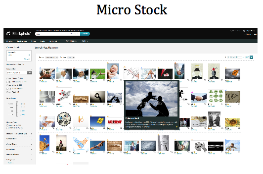
I-Stock was one of the first players in the Micro Stock industry. Their business model allowed anyone to upload their images and then to download and use these images for a very slight fee. Micro Stock was basically set up to help bloggers and small website owners find content. This business model really took off around 2002 when it became very easy to upload and download images on the web. There was also a new proliferation of blogs and websites that needed content. What website owner could resist buying a picture of a cute puppy for a buck? Since then Micro Stock has evolved. Now the content is often edited and the fees are slightly higher. I-Stock images can now be found in places like the cover of Time Magazine and in countless corporate advertisements and promotions. In fact last week, I was in a donut shop in rural Pennsylvania and there was a brochure for a massage parlor. The image on the brochure promotion was the same one that I saw earlier that day promoting tourism for the New Jersey Shore. Both the State of New Jersey and the massage parlor were promoting ‘relaxation’.
As you see, you get what you pay for. This screen shot contains I-Stock’s best offering for illustrating the concept of trust. Micro stock images tend to be very simple and clean. They also tend to be fee common.
By the way, I-Stock was bought by Getty Images way back in 2006.
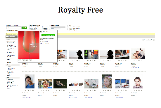
The next step up the ladder of image nirvana is Royalty Free. Now, Royalty Free is a misnomer. Believe me, you pay a royalty. But in this model, the royalty is based on image size. If you want a 500K image for a website, you pay a little. If you want a 600mb image for a magazine ad, you pay more. Buying Royalty Free Stock is sort of like buying potatoes.
Like most bad things to happen to the creators of intellectual content , this business model started with the proliferation of personal computers, the invention of optical drives and the need for images to fill out all those power point presentations that everybody started giving in the mid 1990s. A company called Photo Disk started selling CDs with 100 themed images on them for one low fee. The attractive feature of Royalty Free was both its simplicity and its low price. If you bought a stock image for a trades how booth and then later decided that you wanted to use the same image for a direct mail piece you did not have to go back to your stock agency and re-negotiate a price. Buy once, use often. Like voting in Chicago.
The picture here is a screen shot of PhotoDisk best offerings again for the keyword of ‘trust”. The images are slightly more sophisticated than the Micro Stock offerings. Guess who now owns PhotoDisk? (Getty Images)
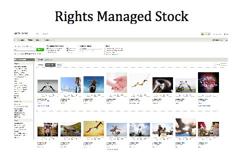 RIGHTS MANAGED STOCK
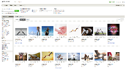
Rights Managed can be the most complicated way to buy images. The pricing is dependent on usage. Usage is defined by geography, media buy, media type, length of usage and if you need image exclusivity. While this might seem complicated, our stock photography providers have made it much simpler than it once was by using online pull down menus and simplified pricing structures. There are a couple of real advantages to using Rights Managed Stock and one disadvantage. The disadvantage is that Right Managed tends to be pricier than the other licensing models but the advantages are:
1. More sophisticated images
2. Protection
A couple of years ago I received a panicky, tear-filled call from a client. It seems that he designed a brochure for his client, The Big Bank. They spent a lot of money designing and printing this gorgeous brochure. It seems that they spent so much money on design, paper and printing that they were over budget and decided to use some Royalty Free images to help keep the costs down…now I can tell by your smirks that you know where this story is going. Just as they were about to send out this beautiful baby brochure, the Next Big Bank used the same image in their promotions. This designer wanted to know what he could do. My answer, “That is what happens when you sleep around without wearing protection”. Images, like good-looking viruses, somehow get spread all over the town.
Besides protection, Rights Managed images tend to be the most appealing unique, sophisticated and interesting images available.
There is one more business model that I will mention. That is Subscription. Subscription is basically where you pay a monthly fee that allows you to download and use x number of images. These contracts are varied in both the type of images available and the terms of the image usages.
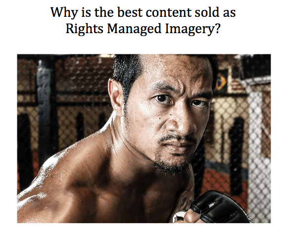
I bet you were wondering why the best images are in Rights Manage collections? The answer, you guessed right, is money. Independent photographers like myself produce most of the images you see in stock. We pay out of our pockets the cost of creating images and we only collect money if and when the image is sold. The range of commission paid to the poor souls like myself range from 10% in most Micro Collections, Royalty Free often pays us a 20% commission and Rights Managed pay us around 38%. Also, since Rights Managed is usually sold at a higher price point, we collect a lot more money. Hence we cannot afford to put images that cost us a lot of money to produce in the less expensive and less well-paying collections. If we have the talent to produce an image that is good enough for a Rights Manage Collection, that is where we usually want that image to go.


Now that your head is full with the four ways to buy stock, what should you buy? How are you going to find that perfect set of images?
We started this discussion by talking about branding and how to illustrate your brand. Let’s take for example the images in the Sports illustrated Winter Edition. While I might enjoy looking at those images, I am not sure what they have to do with insurance, trust, money, health or my future. In other words, the images from Sports illustrated might not fit my brand.
This topic: How to Illustrate Concepts is at the heart and the hardest part of what we are talking about today.
So lets take a few minutes and talk about the various ways to search for those perfect images via stock.

While researching this article, I spoke with the head of search at Corbis. This is the guy who is the expert on image search. I asked him, if I were the Vice President of Marketing at Security Forever Insurance Company, how would I best find images that fit my brand? His answer, “boy, that is a tough one”.
Yes, next time you are online trying to find that perfect image for your next email promotion and you think to yourself that I must be really dumb because I cannot find what I want , IT IS NOT YOU. Image search is like asking Siri to find the address of your old flame. Image search is a very imperfect technology.
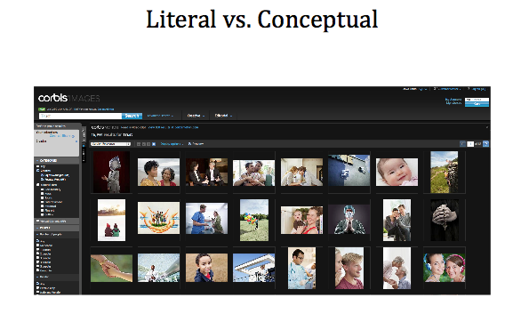
There are basically two ways to search for images. The first and the most popular one is ‘Literal’ search. This is where you search by description; “I want a 62-year-old grandmother holding hands with her 20-year-old boyfriend”. This type of search is fairly straightforward and should give you a collection of images that fit your request.
The second way to search is ‘Conceptual’. This is where you search for concept like love, trust, or fear.
According to my Corbis expert, the best searches use a combination of both literal and conceptual approaches.

Now one fact that I learned while talking to my search expert, a fact that surprised me, was that at Corbis, no human looks at most of their images to make sure that they are key worded correctly.
It used to be that photographers would submit images to the editors at our stock agencies and the editors would take the best and most sellable images from our submissions. Once these images were retouched and uploaded onto the agency website, the images would be key worded by a trained image key worder.
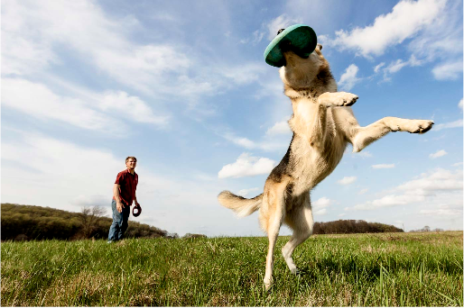
Now the stock agencies ask us photographers for suggested keywords. At Getty and Image Source, those suggestions are just the starting point for their key worder who then goes through our submissions, image-by-image, and adds the necessary keywords. At Corbis and many of the Micro Stock sites, what we photographers put in as keywords is what you get. Since few of us, the image creators, were trained in key wording or have spent hours searching for images based on need, we really don’t know how to keyword. Just because I know how to create a wonderful image of a dog catching a Frisbee does not mean I know how to correctly keyword that image, so you can find it next time you need to illustrate friendship. This fact is likely adding to your frustration in finding the right images.

Today, we are talking about insurance and pictures. When we think about insurance, words like trust, money and help come to mind.
I am sure that each of these terms, as we say them aloud, is provoking a visual image in our heads. For some of us when hearing the word trust, we are thinking of a baby, others might think of a grandfather. While other people might picture a guy in a superman suit. The pictures in our heads are dependent on our cultural references. This is our inner visual language.
When coming up with images to communicate our brand, we not only need to know what our brand is, but to whom we are speaking. It would most likely not be effective to illustrate ‘faith’ by using a picture of a girl in a bikini jumping off a high diving board if your targets are retired ministers in Minnesota. So in essence, when building a library of visual assets we need to know both our brand and to whom we are speaking.
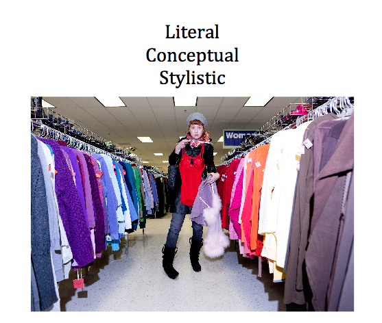
We talked about search and how you can search via literal and conceptual keywords. I would like to add a third element here, one that I think is equally important.
Style.
What separates the good from the good ads from the let’s-fast-forward-through-this-commercial, is not what they say but How They Said It. It is the ad’s style.
Progressive’s Flo, Geico’s Gecko and All State’s fictional President, not only tell you what their company stands for, they say it in a unique voice and in a unique style that reflects and reinforces both their brand and the concerns of their target market.
This uniqueness is as important as the message. For only the unique, the stylized ad or communication will break through the commercial clutter that is today’s media landscape.
Let’s repeat this: Just as our companies are unique, our corporate communications has to be unique in order to reflect and reinforce this uniqueness.
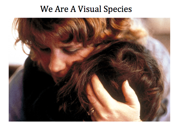
While most of us think in words, we observe our world, mainly, through our eyes. We are a visual species. We judge our food, we judge the comfort of our homes, and we make judgments about how safe we are mainly on what our eyes are telling us. Our first writings were picture graphs. Our first ‘crushes’ were started by visual stimulation. If you want to communicate to your customer effectively, you need visual images that sing your song.
The reason that we brand our companies, the reason we promote, advertise, and communicate about our businesses is that we want to convince people to buy our product or service, or at least try them. Because without customers, we all would be hunter-gatherers walking around wearing fig leaves, searching under the brush for our next meal.
There is a funny fact about humans. We don’t trust facts. We don’t trust data. We don’t trust logic and we don’t trust words that much. We trust our gut. We trust our emotions. If you want to convince somebody to buy or try your product you could try to bury them in facts but it is far more effective and much easier to seduce them with feelings. Advertising without emotional appeal is just a term paper that no one will read again. What is the fastest way to appeal to someone’s emotion, especially in today’s mass media market? Good and unique pictures.
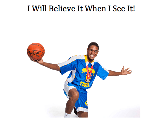
Several years ago my wife and I were buying a very expensive tree for our front yard. I remember asking the Tree Guy, how big a hole do I need to dig for this precious sapling?
He said, “Don’t plant a $200.00 tree in a fifty cent hole”.
We have spent the last 20 minutes of so talking about the importance of brand, in communicating your company’s unique story. We have talked about the importance of emotion as a way of convincing people to try our products. And we talked about how efficient and effective visual imagery can be.
Now ladies, if I walked up to you, got down on my knees and told you how beautiful you are and how I want to spend my life with you and have kids with you and then pulled out a cigar wrapper for a ring, how many of you would say yes?
Corporate communication is very expensive. It can take lifetimes to build brand awareness. So why would anybody bring a 50 cent image to this marriage proposal? We, in the insurance game are selling a lot of the same stuff, that the guy on his knees is trying to sell so we better dress up our proposal in something more attractive and compelling than a cigar wrapper.
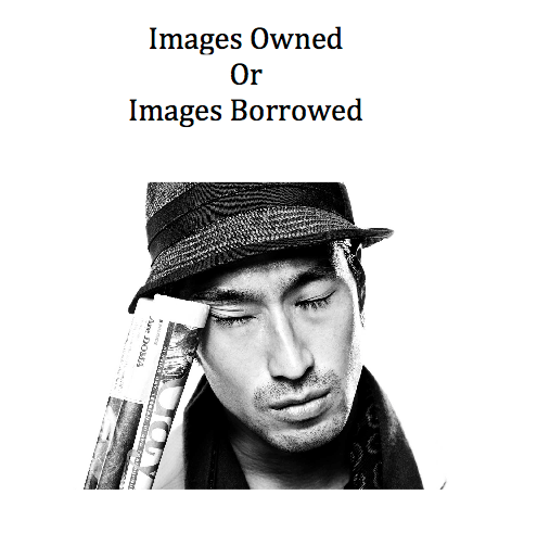
There are a lot of great images available via Stock. I should know. Some of them are mine. But borrowing somebody else’s images can often feel like you are trying to find the right Tupperware lid for that container for tonight’s leftovers. Often time the image does not quite fit your brand so you end up with a mess on the floor. Other times using stock feels common or cliché or worst yet, it feels like everybody else’s. And who wants to marry the guy who has been with everybody else?
This leaves us with a question. How do I build an unique image library for my company?
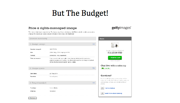
Before we start talking about building your own branded stock library, let’s talk about the elephant in any room, money. There is no way that a custom stock library is going to compete, dollar per image, with a Subscription, Royalty Free or Micro Stock image.
While researching article, I looked at the pricing of the last 4 image libraries that I have shot. The price per image ranged from $900.00-$5,100.00 per image. I know that this is a wide range of costs and we will cover the reasons for this disparity in a moment.
Now let’s compare that to a rights managed image from Getty. Pictured here is a screen shot from Getty’s website, This image was for three years, non-exclusive North America or what I would call basic advertising usage. Getty wanted $7,200.00 per image. Now I am sure that if you called Getty and said, hey, I want to buy 100 rights managed images, you will get a bit of a discount. But, this is important; you still do not have image exclusivity. Exclusivity in stock costs.
Stock images, by their very nature, have to fit elastic. When people like myself shoot stock, we try to create images that can cover all sorts of concepts or keywords. That is how we make multiple sales and that is how we send our kids to college. In other words, using stock will buy you a range of concepts but the art of branding is creating a specific identity not a generic one. So why use generic images? How often do you buy that corn cereal in the bag on the bottom shelf of the grocery store?

So why is there a wide range of image pricing on a custom library? There are two major components to a custom library budget: image usage and production fees. Let’s say your image need consists of 20 portraits of people shot on a white background in a studio. You are also a small company operating only in a corner of one state. This type of shoot is going to cost a lot less per image than a national company who wants images with multiple people in multiple locations throughout the U.S.
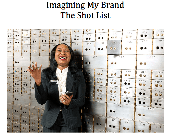
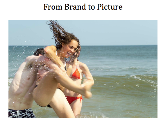
Remember back when we talked about Brand to Picture? This is where we now put those ideas into action. Before a person like myself can put together a budget we have to know how many pounds of beef you desire. We also need to know if you are interested in hamburger or Kobe beef. We need a shot list.
A shot list should, if possible, be literal, conceptual and stylistic. This is a tall order. And for those of you whose expertise is in branding and marketing, this is where you might want to bring in a Creative Director who is good at visual conceptualizing.
A shot list is just a list of the images you want. This list can be as simple as, ‘scenes of family life’ or as complex as, ‘portraits of our customers in all fifty states, all looking fit, all dressed in civil war clothing and all shot in the style of Matthew Brady’.
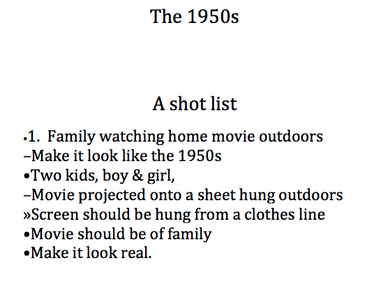
As you can see, with every line, every new detail added, we, your creative team, have a better idea of what you are looking for. Believe me, I get many shot lists that do not include all this data. But the more detail information I get, the more accurate my budget will be. And the better chance that the image I create will look like the image in your head.

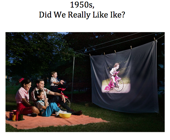
To create an image to this brief, we first had to cast a family. We needed a mom, a dad and two squirts. We needed kids young enough to be cute but old enough to be awake past dusk and to follow directions. We needed a home that had a backyard that felt a bit private. We need to buy and install a 1950s style clothes’ line and we needed period clothing. We also needed to project a home movie that looked like it was shot in the 1950s. We debated whether to project a movie or add the movie in post. We chose create and project a real movie mainly to help keep the kids focused on the screen.
All these things are real, all of these things do not come out of nowhere but need to be found, approved and brought together. All of these things cost money.
While setting up a shot like this with its casting, propping, location scouting and wardrobe can be expensive, not all image libraries need this sort of complex treatment.
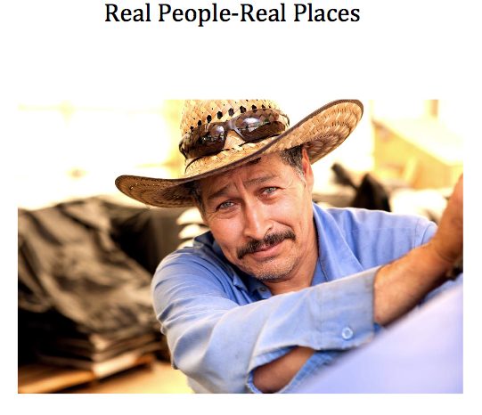
Often working with real people in real places is the right way to go. This image, shot for Capital One was part of a business-to-business library of images created to help promote small business banking. All we needed here was a list of places to go. All we took was an art director, a camera, my assistant and a small lighting kit.
Working with real people not only brings a sense of authenticity to a project, it also saves a boatload of cash.

You have your shot list. Now all you need is a magician to spin this list into image gold. You could start in the Yellow Pages under magician but I am guessing that is not going to work. If you are working with a design firm or ad agency, well you can delegate this. But if you are your own ringmaster, you might need some help here. The easiest thing would be to hire the niece of the Vice President of Marketing. Heck, they just bought a new iPhone. But while inexpensive, I am not sure this is going to get you that library of unique and on brand images.
Several places I would suggest starting with are portfolio websites, such as Altpick.com. ASMP, APA and many more.
When you are looking for is style. Is the way this photographer sees compatible with what you are looking for? If the photographer’s portfolio is filled with wonderful images of poverty in the third world, then he or she might not be comfortable or even know how to create a scene that does not exist. Someone once said that there are two types of photographers; those that take images and those that create images. What you need, what you are going to be looking for, is not just someone with a wonderful eye but also someone who knows how to create and manage a shoot.
You are also going to be looking for is someone who you can get along with, someone who can understand the politics of your job, who will strive to make you look good and to fulfill your vision, not just theirs. Commercial photography, and especially image library work, is a team sport.
I would add one more thing. For image library work, I would look for somebody who shoots both advertising and stock photography. The assignment people are very good at following layouts and image briefs; they are trained to create that perfect image. Stock shooters on the other hand tend to be very good at maximizing visual opportunities. They not only know how to create a scene but how to shoot that scene 10 different ways to create a bundle of image joy. Advertising people tend to be image perfectionist. Stock people tend to be good at improvisation and finding the most opportunities in any given scene. Image library work tends to fall somewhere in the middle of these two methods of working. Hiring somebody who is comfortable working both ways can be very helpful.

You found the right magician who you feel you can work with and help turn your shot list into pictures. Now you need to negotiate a proper fee. People like myself price a photo shoot on two factors: the usage required and the costs of production.
Obviously a shoot that takes us to twenty cities in five days with 50 models is going to cost more to produce than a day of studio portraits. The other factor is usage. Your legal department will push you to secure either an image ‘buyout’ or they will ask for ‘unlimited usage in unlimited media for an unlimited amount of time’.
While both a buyout and unlimited usage sound great, it might not be the way to go. If you are a small company that services only one state then why pay for worldwide rights? Try to narrow down your usage to what you actually need. Any more than that is a waste of cash.
You will end up negotiating with either the photographer directly or often times with their agent or rep. Often times your company will require you to triple bid this project. Let me tell you a secret. We photographers tend to be pushovers. We love what we do and would do it even if nobody was paying us. So, if the person whom you really want to work with puts in an estimate that is high, pick up the phone, be honest with them and see if together you can create a budget that you can both be happy with.
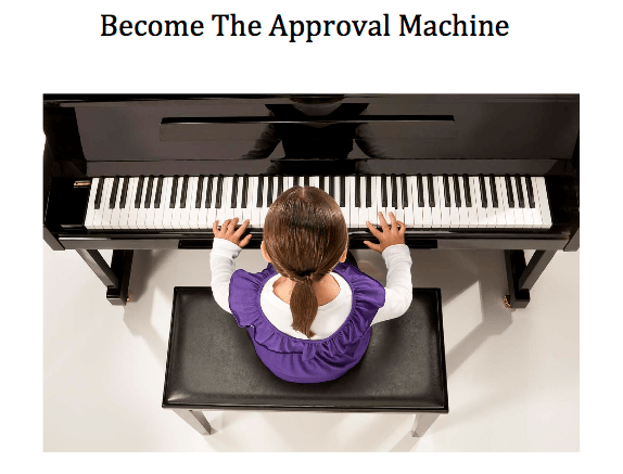
Once you have your shot list, once you have hired your talent and convinced your finance department that spending 50K with a guy who looks like me will save your company money and increase sales by 30% therefore providing a 100% return on this investment in just under three months, you are well on your way to building that image library. But your role is not just to sign a P.O. and eat at the craft services tent. You now become the approval machine.
What needs approvals? What should you be monitoring? You will need to approve the cast, the locations, the props, the clothing and the final shot list.
I have discovered, after years of playing in this ballpark, that often it is the approval process that can bog a production down. I have seen many companies spend weeks deciding on which photographer to hire leaving that hired photographer with a very short window to produce and shoot in order to meet a deadline. I have seen companies sit on the cast selection for a week making it almost impossible to buy clothing and outfit that cast in the remaining time. Or worse, waiting so long to approve a cast that the requested talent is not longer available on the given shoot dates.
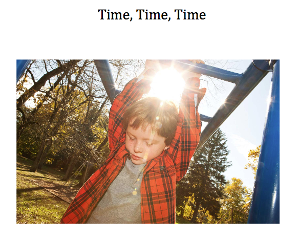
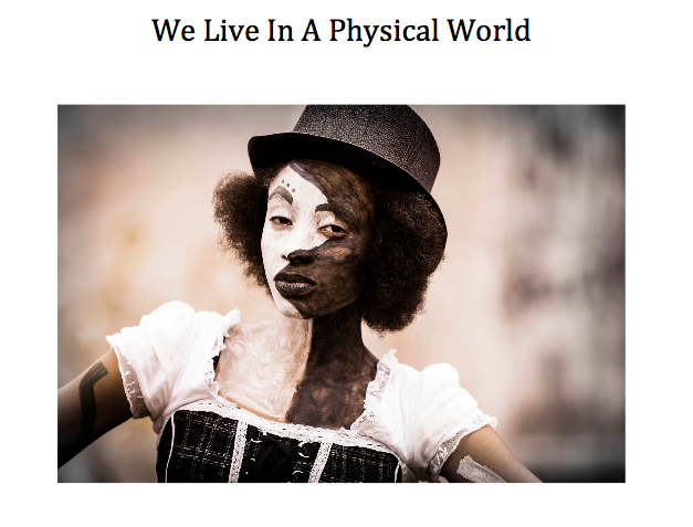
I would suggest, that you, along with your photographer and their producer, set up a realistic production calendar. There is no point in having a committee of five, who need to be part of the approval process, if one person on that committee is always out on customer or budget meetings. This can hold up the process and cause difficulties down the road. Photo shoots are about logistics. Or as one art buyer once said to me, “Clients’ forget that we live in a physical world”.

You arrive on set and you see 5-15 people running around, spending your money and you have to ask yourself, who are these people and what are they doing here?
1. The most important person on your set is the photographer. Your photographer sets the tone of the set and their talent is what you are buying.
2. The Producer. Any shoot with more than one location and/or one or two models will need a producer. The job of a producer is to organize. He or she will be in charge of the logistics from the small things like coffee to the large things like location permits. The producer’s job is to take care of all these details so your photographer can think about images and not worry if lunch is late.
3. Photographer’s Assistants/Digital Tech: These people are there to help the photographer. Their responsibility runs from lugging gear, to setting up lights, to making sure that the images are being captured and downloaded correctly to the computer. They have both brains and the muscle.
4. Hair and Make Up Stylists: They are there to prevent you from having to spend a fortune on retouching. Even the beautiful don’t always look their best or look the part.

5. Clothing Stylist: We don’t want your insurance company’s images to be full of naked people or people who look like they were shopping at 2am. Your clothing stylist buys the right clothes and preps them so these clothes are pressed and fit. The best stylists bring not one pair of jeans but ten pairs of jeans and twenty tops so you can pick out, coordinate and see in real life what works the best for your shot or project.
6. Set Stylist: Grandmother is baking, what is she baking with? What is she baking on? Why is there a clock with a beer company logo coming out of the talent’s head? You rented a home for the family scenes but you also need a doctor’s waiting room. A good set stylist can convert that basement or second bedroom into that desired office space.
All these people report to the photographer. The photographer reports to the art director or creative director who is on set and they report to you, the client. Or as we like to say, ‘the person who writes the check has the final word’.

Why do I need all these people? Insurance. You want to make sure that all the elements in your image library reinforce your brand. You just don’t want casual clothing but you want casual clothing that fits the market you are talking to. You want clothing that works with your company colors and if there is going to be a group of people in a shot you need clothing that works well in a group shot. You need the right props not just stuff you found at that rented or borrowed office. You need hair and make up that look good but not so good that the model could be walking down the red carpet at the Oscars. You need people to make sure that the overhead scrim, which is there to soften the light, does not blow in the wind. You need people there so when suddenly you think that this shot would be perfect with the grandson standing on a step stool, you have somebody who can run over to the Home Deport.
There is a difference between creating great images and creating great images on brand, on time and on budget. A good crew insures that your company’s new image collection does just that.

A photo shoot is a very physical endeavor. A photo shoot is also expensive. Clients love to stuff as many shots into a day as possible. I have seen clients try and shoot in 4-6 different locations in a day forgetting about traffic, parking and the possibility people getting lost on route. I have seen clients forget that crews need to eat lunch. I have seen Marketing Directors show up to factory or beach shoot in high heels. I have seen clients try to add several shots, last minute, to a day that is already close to impossible. Or the infamous instruction ‘lets work through the shot list and then do something really creative!’
If I would add one element, one method of working that often allows for a great shoot instead of an OK one is the element of time. Your crew, your photographer should not feel like they are on a marathon. They need time think, to problem solve and to create. The same is true with your cast, especially if you have kids involved. IF you want great work, leave time in your schedule for greatness.
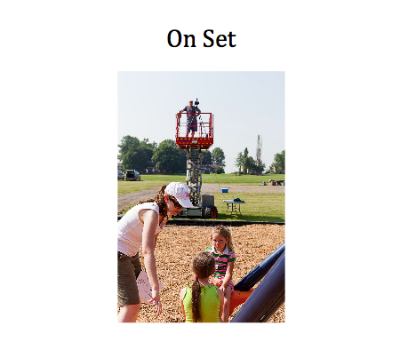
What is your role on set?
Your biggest role is to make sure you are getting what you need. Working with creative people is always a challenge. They know that their way is best, just ask them and they will tell you so. But, here is the secret. We photographers want to make great pictures. That is why we gave up our lucrative career in medicine and went to art school. But great images are not what you need. You need images that are great for you.
We photographers live with these images only a short while. You, our client will have to live and work with them for possibly years. We photographers are looking through a camera viewfinder trying to use the image real estate in an effective way. You, our clients might never use these images in the same proportion as the camera’s viewfinder. We see the image in a visual oasis that is the camera. You will live and work with them on websites, billboards, brochures, and in media that none of us have heard of yet. So, the best thing you can do on shot day is put down your cell phone and your iPad and look at what the photographer is doing.
Most of the time, during this modern era, photographers shoot directly to a laptop and often that laptop is hooked up to a large monitor. That is where your focus should be. Grab your coffee, pull up a chair, if one is available, and watch the image parade.
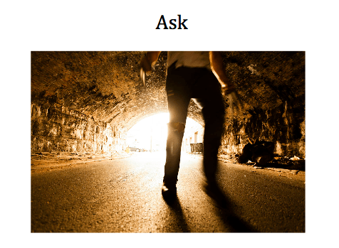
While watching you should be asking yourself:
Are the images proportioned correctly? Are the colors, textures and attitude right? Are the models expressions what you are looking for? Is the background and set working for you? Are they enhancing your brand? Does the clothing fit? Did some tag suddenly appear?
You are asking yourself: How would I know if an image is working for me? I work in branding with a degree in English; I did not go to art school. My answer is stop thinking and trust your gut. Is the image provoking the emotion that you are looking for?
If you are lucky, you have an art director or a creative director on set with you watching these things. If not, you become the watchdog.
Now, what happens if you don’t see what you want?
If it is a small styling issue, it is worth mentioning to the photographer or his/her assistant. They are human and cannot see everything. If the model’s expression seems strained or strange, hold back a bit, the photographer might be trying to coax the talent into a more natural or believable look. Sometimes that can take a while and often too much stopping and talking gets in the way of image flow and energy. Be prudent, be patient but please speak your mind.
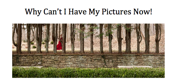
In the olden days, after a day or a week of shooting, we photographers would drop the film off at the lab and the next day, we could deliver shiny contact sheets to you our beloved client. Today, photographers face about a half-day of image downloading, editing, color correction and exposure correction for each day of shooting. We also have to convert those raw files into jpegs and then create online galleries for you to view and edit.
That is just the beginning. Once you have shared our galleries of your shoot, once you have sat through twenty meetings with 30 people to decide which images are worthy of being included in your new collection of visual assets, we photographers need to prep your final images.
Image prep can at times be simple. We take that raw file make any final exposure and color correcting that might be needed. We may open up the shadows a bit, crop out a stray hand along the edge or maybe sharpen the eyes and soften the skin. Other times, it can be a lot more complicated. Logos might have to be removed. Wrinkles in the clothing might have to be ‘ironed out’ in Photoshop. Maybe we need to replace a background or convert the image to a duo tone. All these things happen in post. All these things take time as well all know, time means money. In your initial estimates there should be a line item to cover final file prep and an additional line item to cover retouching. Not all photographers bid these things the same way. For us, the basic things like exposure and color correction, burning and dodging and removing unsightly zits are included in image prep and only things like special effects will be billed as ‘retouching’.
Some photographers handle this themselves, some will farm it out to professional retouching service and some will dump it on the ad agency or design firm who oversaw the project. Me, I like to do most of this myself.

Building a branded image library at first can seem like a monumental task. With the right talent it can be a joy. A custom photo shoot is not that much more time-consuming that searching endlessly for that perfect stock image. Plus, it can be competitive with buying and using stock. But most importantly, creating your own image library, can provide you with images that reinforce and help build your company’s brand instead of just filling some space between your copy.
To see more of Zave Smith’s work go to his website and Altpick page.
This article is excerpted from a seminar given to the insurance Marketing and Communication Association.



































 The Pick