Tadd Myers Adds ‘The Grammys’ To The American Craftsman Series

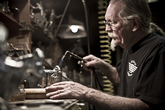
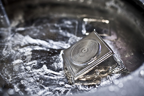
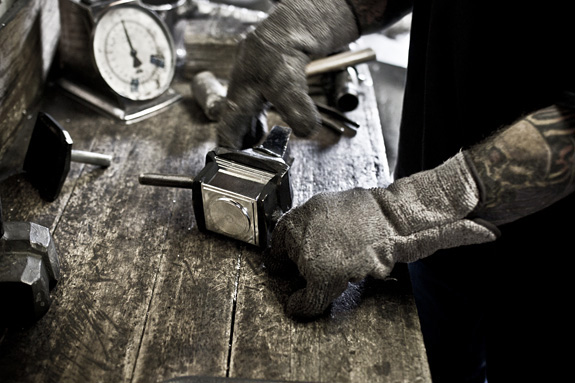
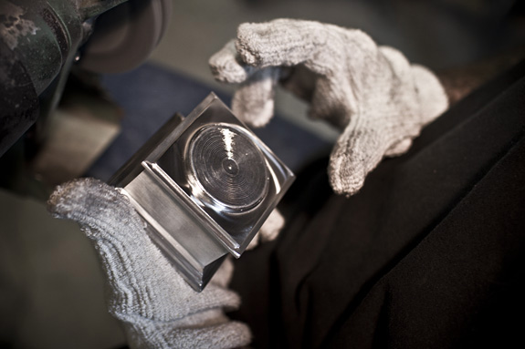
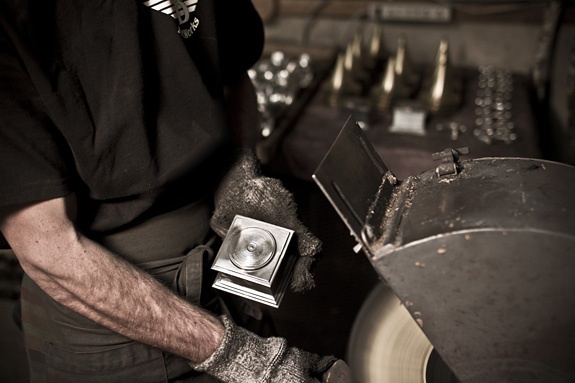
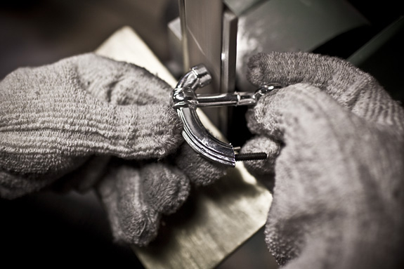
Photographer, Tadd Myers was inspired by his father, Landis Wilson Myers, to document and tell the story of the American Craftsman.  His father worked as a wood worker, home builder, metal worker, guitar player, printing pressman, baseball player and self-made business man.  “My father loved working with his hands and would have felt a very deep connection to this project.”  To continue, Tadd adds his 20th installment to the American Craftsman  series.  This time it’s John Billings of Billings Artworks in Ridgway, Colorado.  Mainly known for creating the beautiful sculpture for the music awards, The Grammy.

John Billings, ‘The Grammy Man” says, “Perfection is what we strive for, knowing full well it can’t be achieved.  Each Grammy we make has it’s own character, it’s own soul.  To see the joy in a Grammy Winner’s face is very humbling experience and you forget all of the burns, cuts and bruises.”

See more of Tadd’s American Craftman’s projects here and more of his photography on his Altpick page.

Also, check out Billings Artworks here.

Posted in Altpick, Art, Photography | Tagged , , , , | Leave a comment

On Silk Stockings, Cigars and Turning 20

by Clare Ultimo

My favorite 20 year old is celebrating an amazing history of creativity and commitment this year. And while I do know a lot of 20-year-olds, I’m talking about The Alternative Pick, the place to find edgy photographers, illustrators, multimedia and design since 1992. AltPick.com went live in 1995.

It’s bit of graphic design history in the making, you might say. AltPick has been attracting the freshest talent in the business from the start of its youthful life. Founder Maria Ragusa wanted this to be the cornerstone of their existence and it was. Back in the day, if an illustrator, photographer, or designer for example, wanted to let an art director or editor know they were around, outside of going door to door with a portfolio, there weren’t many options to choose from. The big and beautiful “Black Book”(where Maria cut her teeth in the business for 13 years) was a coveted and expensive venue for any new kid on the block but it was one of the more effective ways to “be seen” at the time. I remember finding it in the offices of Art Directors and Creative Directors, on their desk or hanging out on their bookshelf; it was a necessary tool of the trade. After all, this was a time when books and stuff on paper were our main source of staying connected!

The first edition of the Alternative Pick book was square, (8″ x 8″) full color, gorgeous and glossy. And my brand new design studio could actually afford a full page spread in it! That was another thing Maria wanted to offer fledgling groups like mine – an affordable option to advertise our work. Warner Music saw my spread that year and kept my studio busy for quite a while! The book’s reputation quickly became one that looked ahead to where our profession was going and I think in the 20 years they’ve been around, AltPick never looked back!

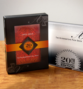
AltPick is a large interactive online community now, with friends and members around the world. The AltPick Card Deck is a unique way Maria likes to connect artists and art buyers beyond cyberspace every year. And I love cards. They are always playful. They don’t take up too much space on your desk and these of course, give us an enticing peek into our constantly changing creative world. So you can imagine I was pretty thrilled when Maria asked me to design the packaging this year.

“Think magic”, she said. A big concept that is purposely mysterious and generally unexplainable. Like sex, I thought! The 2012 package began to take shape in my head in a place where black silk stockings and an exotic cigar are having a drink. Dramatic color, historic references (the backs of old fashioned playing cards with gold gilt edges) and a whimsical “A P” – all aiming to look like they were having fun and belonged together. And of course, all of it in the service of providing a suitable home for the wonderful artwork inside the box! Please see the website below and get yourself a deck!

Maria is always looking for the connections that we have yet to find as artists (and as people too), encouraging the AltPick community to do the same, and I guess that was the biggest inspiration of all for me when I designed the deck. The attraction that the AltPick audience has had over these 20 years to what is not yet labeled or categorized is encouraging to me as a creative. Still figuring it out, still bringing the unexpected together, still surprising us after all this time…Happy Birthday baby!

This slideshow requires JavaScript.

Website: www.altpick.com
Click here to check out Ultimo AltPick ads through the years

Posted in Altpick, Branding, Design, Illustrations, Photography, The Alternative Pick Deck | Tagged , , , , , , , , , , , , , , , , , | 2 Comments

Brian Cummings’ Fairy Fatales : : Unhappily Ever After

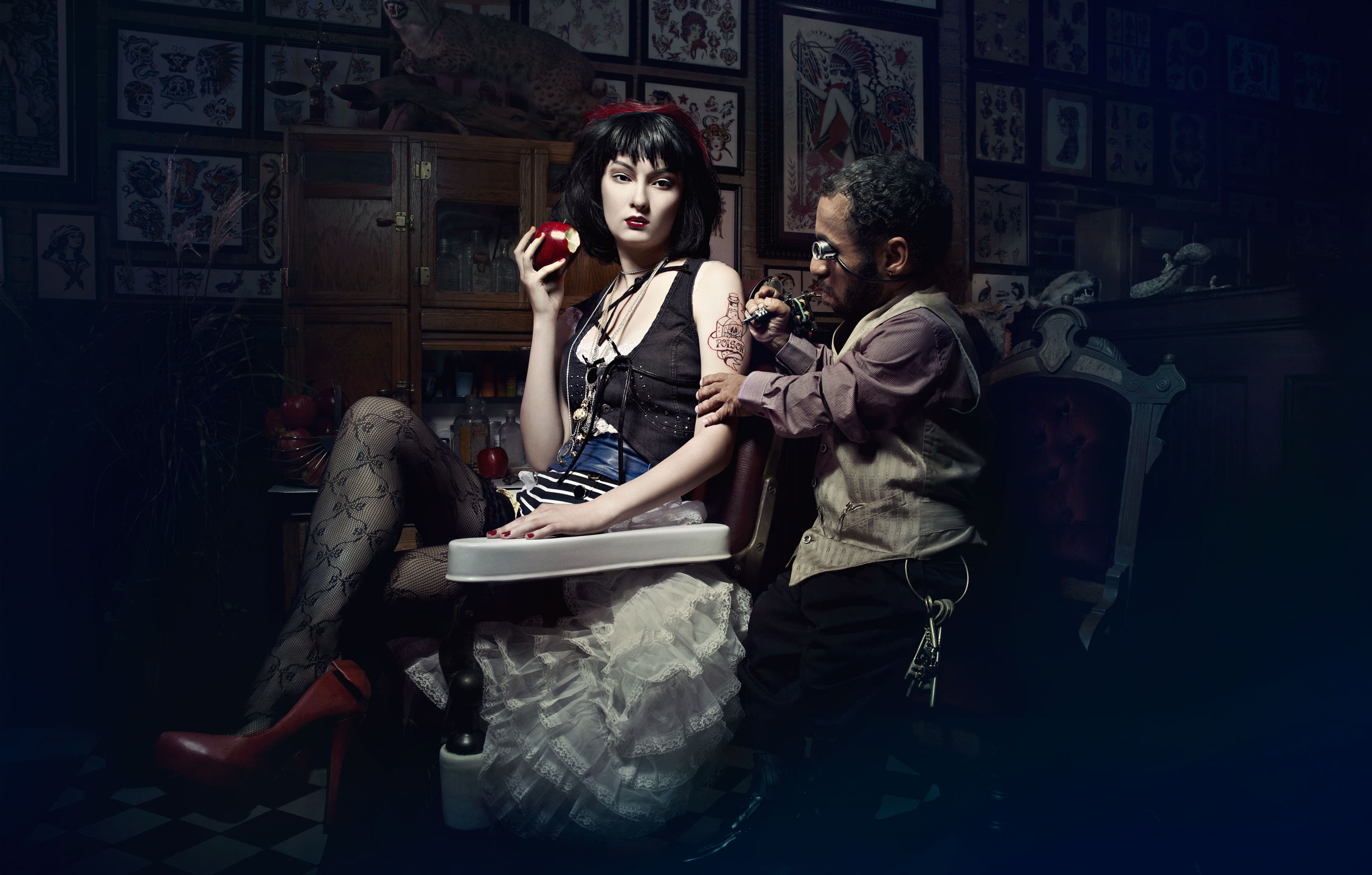
Imagine that the sweet, beautiful, angelic protagonist of your favorite childhood fairy tale were actually a dangerous seductress, capable of heinous, deceitful acts and unforgivable cruelty towards fictional talking animals in pants and crowns. Need some help? Leave it to Brian Cummings, sick and demented individual that he is, to spark your imagination.

In a photo series that has come to be known as “Fairy Fatales,” Brian has created visual narratives telling the other side of the story, and unforgivingly implying twisted alternate endings to our favorite traditional tales. Maybe the slimy green frog’s destiny is NOT to receive a kiss from the princess, living happily ever after as a handsome prince. Maybe he’d be better suited quartered and simmering in a golden broth as the first course?

Rapunzel just wasn’t ready for a long-term relationship.

Also, wouldn’t Papa Bear make a FABULOUS rug for Goldilocks’s new cabin? This is a series that is sure to delight (and perhaps disturb) children and adults of all ages!

To see more of Brian Cummings photography go to his website and his Altpick page.


The End.

Sleep tight. Don’t let the bed bugs bite. Because they will.

Posted in Altpick, Art, Photography | Tagged , , , | Leave a comment

Jeff Hester : : Of Wine, Spirits, Food and Music

This slideshow requires JavaScript.

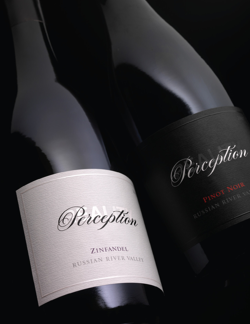
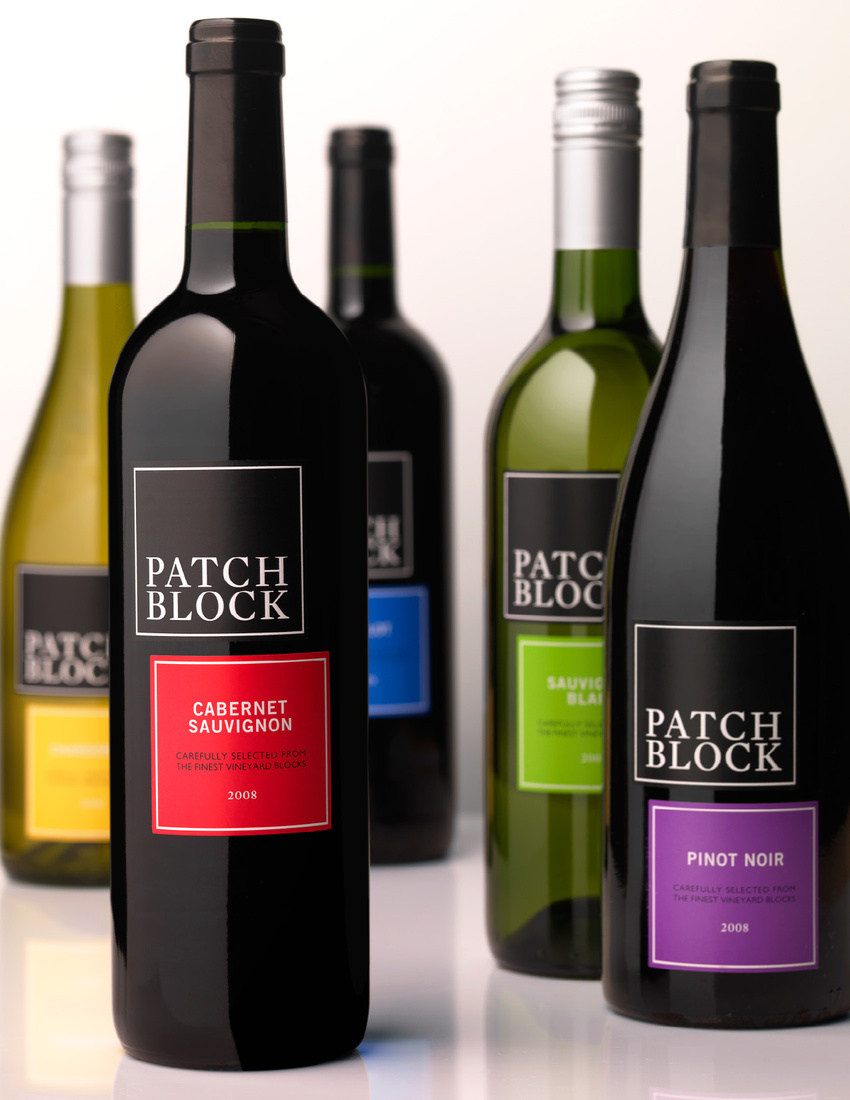
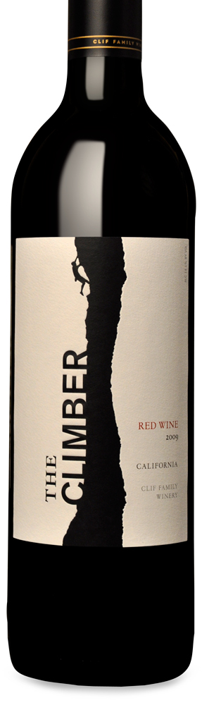
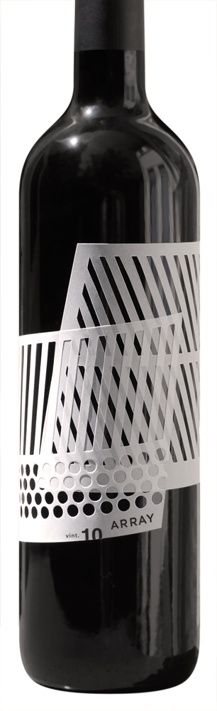
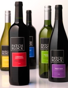
Multi-talented designer, Jeff Hester, specializes in packaging for the wine, spirits, luxury food, and music industries.  In addition, he is also an illustrator and works magic with typography.  Altpick Connects had the pleasure of talking with Jeff about one of his many disciplines: designing wine labels.
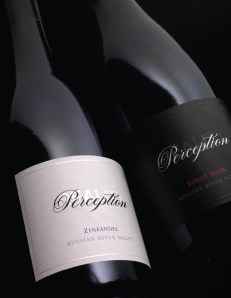
You have many remarkable wine label designs, all-different, yet each captures each of the wines’ distinctive tastes.  

Often I am asked if the label reflects the taste or flavor profile of the wine, but I have yet to work on a single project where there is any direct flavor queue in the branding. Wine labels usually function to support the brand messaging and tell the story of the winemaker or where the grapes are from. Most wine brands have multiple varietals, or kinds of wine, and since a Chardonnay tastes completely different from a Cabernet Sauvignon, it would be impossible to convey both flavor profiles in a single logo. To make it easier for consumers to find the varietal they want on shelf most brands color code the capsules, but the color does not reflect the taste of the wine. For example, blue is the most common color for Merlot, but what flavor does blue represent?
Copyright Jeff Hester

Was designing wine label something that you pursued or did it come to you organically?

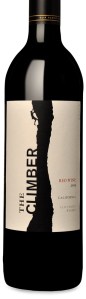
I had never considered being a wine label designer, it happened organically. I began my career in Los Angeles working for Capitol Records, though file sharing eventually killed the industry and made it harder to find work. I began designing marketing materials for TV and film, but they too were reeling from the loss of ad revenue caused by new DVR technology, which allowed viewers to fast forward through commercials. I had always admired the work of CF Napa, a studio in Northern California who designed modern wine labels and good logos. On a whim I sent my resume and the next thing I knew I was driving a U-haul up Interstate 5 to the Bay Area. I worked for CF Napa for almost four years–I learned a lot there, and made some good friends at the studio.
Do you appreciate wine and are you familiar with the different types of wine and what to expect?

I love wine and I have tried just about everything. Based on the varietal and where it is grown, I have a pretty good idea what to expect. If you are an inexperienced wine consumer, don’t be afraid to ask the wine clerk questions. They have tried the wines and know what is good. Don’t be intimidated–tell them what you want to spend, and what you’re going to eat or not eat with the wine, and take notes. People have a misconception that wine has to be expensive to be good. The large wine groups are producing high quality wine at a reasonable cost, and there are mom and pop producers making wines of good value too.

Do you work directly with the winery on the designs or with an advertising agency?

I usually work directly with the winery, but I have worked with some other design studios as well.
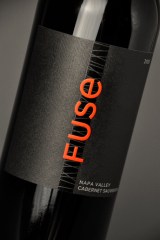
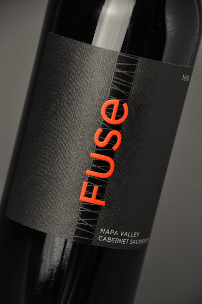
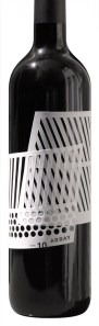
Tell us little about the ‘Fuse’ bottle design.  Love the  type and the simple design.  Was this label heavily art directed by the client or was it your concept?

I designed Fuse while at CF Napa. Fuse was easy to design; the client wanted something very modern with a lot of shelf impact. The wine is a blend of a couple varietals, so the client wanted the label to be graphically fused together. Initially my Creative Director did not like the design, I had to fight to have it included in the presentation. The client was thrilled with the presentation, and picked the label right away.
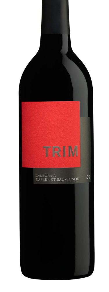
I finessed the type, and worked on getting the textures just right, and soon it was on press. The client came back shortly thereafter and picked another one of my designs from the same presentation to turn into Trim. The Trim design was my Creative Director’s favorite design from the presentation.

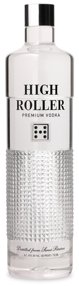
Are you involved in just the label or can you have input on the actual bottle design as in ‘High Roller’ Vodka bottle?
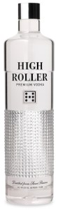
For wine projects it is almost always a stock bottle, but for High Roller I designed the structure as well. Most people use stock bottles because it is very expensive to produce custom glass, especially if it is going to be manufactured by a company that will do it right.

Were you trained in type design or are you self-taught?

I took one type class in college, but I did not learn much. The majority came from reading a lot of typography books and a lot of practice. Type is strange; some days I know exactly what to do, and other days I can’t set type to save my life. I love to draw custom type when I have time, but it’s a luxury when I am on a tight deadline.

What would you say was your favorite label and which project was your best?

My favorite wine label is designer Michael Vanderbyl‘s Scarecrow.  It is so modern, yet so classic, and has a calm confidence. My best project is probably High Roller Vodka; it’s a custom bottle and custom type. It’s not often you have so much input.
Thank you Jeff for sharing your story and giving us a little insight on the world of the wine and design!

Thank you for including me on your blog. I hope to have lots more beautiful work to share with you in the future.

We look forward to it!

See more of Jeff Hester work on his website and Altpick.com page.

Posted in Altpick, Branding, Design, Illustrations, Typography | Tagged , , , , , | Leave a comment

Artist Hugh Syme : : 36-Year Collaboration : : What A Rush

Our artist Hugh Syme recently completed a fantastic collaboration with Canadian rock band, Rush. Hugh is responsible for the cover art on their newest (and nineteenth!) album, Clockwork Angels (2012), as well as the images inside the album’s accompanying novel, and the cover art for Rush’s subsequent tour book.

In fact, Hugh is responsible for most of the band’s artwork over the last 36 years, since he’s the band’s art director, designer, illustrator, and principal image maker. This partnership between the visual arts and music has proven the importance of interdisciplinary collaboration.

Hugh’s work with Rush began in 1975 with the cover for Caress of Steel (1975). But his most iconic contribution may be the band’s logo–the “Starman” emblem–which Rush fans adopted after its original appearance on the 2112 album (1976). Hugh has also created cover art for Aerosmith, Megadeth, Styx, Def Leppard, Dream Theater, Celine Dion, Bon Jovie, Iron Maiden, and Queensrÿche, but he is forever associated with Rush’s epic sagas.

Hugh’s work on Clockwork Angels began nearly two years ago, after Rush recorded their first two songs for the album. The band immediately began the Time Machine tour in 2010, during which they leaked these two songs, “BU2B – Brought Up to Believe” and “Caravan.” But the remainder of the album remained unwritten, unrehearsed, and unrecorded for nearly a year. When the Time Machine tour entered its second phase in 2011, Hugh began to delve deeply into the concepts for the album’s packaging.

Originally, Hugh and Rush drummer Neil Peart wanted Clockwork Angels‘ cover to be urban and edgy, so they drew inspiration from the British tag/graffiti artist Banksy. But as time passed, the tone and imagery for the album developed and took on a life of its own. Still liking the original art, Hugh and Neil decided to use it for the cover of the tour book, which accompanies what one might call the third part of the Time Machine tour: their much anticipated upcoming Clockwork Angels tour in September, 2012.

Now, Hugh’s redesigned, reimagined work can be seen on Clockwork Angels album cover and on/in its accompanying book. The album debuted at #1 in Canada and at #2 on the Billboard 200 chart. Neil Peart recently released an essay describing the band’s process and illuminating the partnership with Hugh in particular:

So once again, collaboration proves joyful, and elevates the art. This project has been sparked by many sources of flint and steel, and one quality shared by everyone involved might be called ‘a fevered imagination.’ That temperament, burning slightly hotter than what passes for ‘normal,’ also describes art director Hugh Syme—who is serving a life sentence as my graphic arts collaborator. Hugh brings his own febrile dreams to the Vision Quest, and whatever I can visualize, he can realize. The two-year (literally elephantine) gestation period of this album allowed Hugh time to generate a series of beautifully evocative paintings to accompany the story—the words and music.”

We are so proud to have supported Hugh throughout his lifelong collaboration with Rush. We anticipate many more wonderful things from Hugh and Rush, and we can’t wait to see, hear, and experience them all!

–As published on Mendola Artists’ Blog.

CLICK HERE for more of Hugh’s work and check out his Altpick page.
Posted in Altpick, Art, Branding, Design, Illustrations | Tagged , , , , , , , , , , , , , , , , , | Leave a comment

Zave Smith’s “Kelica”

Voices In My Head                                                                                                                             by Zave Smith

We photographers have a funny life.  Few of us have assignments everyday. What I am starting to understand is how we spend our non-assignment hours defines us as photographers almost as much as the pictures we make.

So how do we spend our “off” hours?  Do we endlessly fiddle with our images in Photoshop?  Do we spend our off time on the phone, sending emails and engaging in heavy-duty marketing?  Are we constantly shooting, testing or trying new things between our paid gigs? Or have we perfected the means of self-justified time waste like cruising the social media or watching a 40-part mini-series about art on Netflix?

I believe that the more successful among us divide the majority of our off time between marketing and creating new images.  My feeling is, why not shoot? I did not become a photographer because I want to play video games.

This series, “Kelica”, was not really planned.  Kelica is a woman who I have photographed before.  After our last shoot I had dropped her off at her apartment.  I noticed that she had a lot of artwork on her walls where she is the subject.  I knew then that I wanted to shoot a portrait of her, just being there, in the midst of images of herself.

This slideshow requires JavaScript.

The rest of the images just flowed over the next two hours of visual play.  This is my practice.  I start with one or two ideas and then see what happens.  For testing, I often work alone with no assistants or stylists to distract me.

My goal is to get deep inside my visual head and see what happens.  This is a lot harder than it sounds.  We live in world of many distractions and constant worry.  It is very hard to let go, to be present, to let your artist side play without your critical telling yourself that you should be doing something different- right now!

But, if I were the type of person who listened closely to the voices in my head, I would be in a different line of work.

–Zave Smith

To see more of Zave Smith’s work go to his website and Altpick page.

Posted in Photography | Tagged , , , | 2 Comments

Kevin Steele :: Sheds Some Light

2012 Kevin Steele

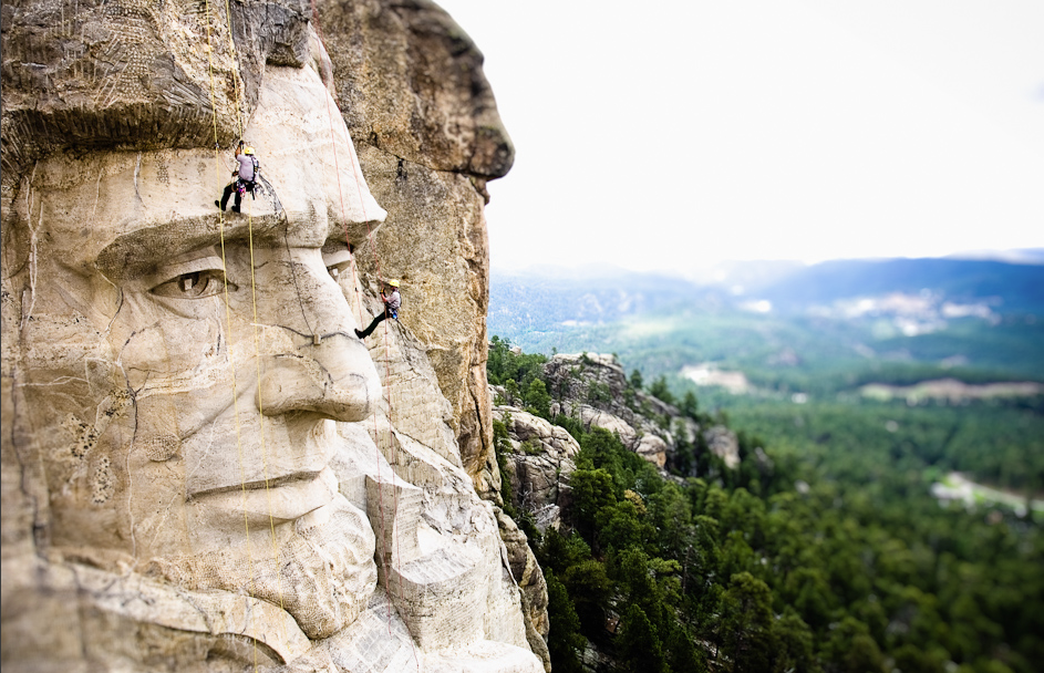
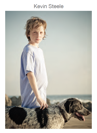
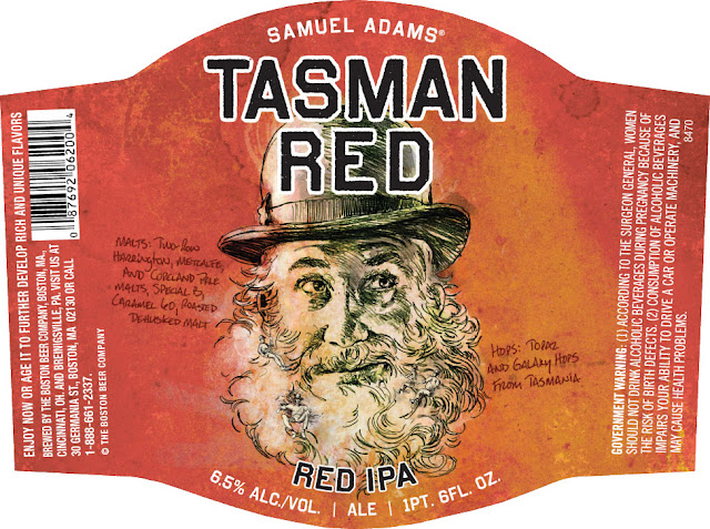
Early on photography was Kevin Steele’s tool for documenting the world of rock and ice climbing.   He was passionate about sharing those adventures and shedding light on the experiences that words alone could not do justice.

For Kevin it’s about telling a visual story, whether it’s a still photograph or motion.

2012 Kevin Steele

What inspires a man who can hang on a rock with a $10,000 camera and hold it steady?  To begin with, it starts with black coffee…Running mountain trails… Beautiful light…Good people with good attitudes…Creative challenges…Constraints…Telling someone’s story …Lines, shapes and forms…Seeing something new…Seeing something different…People with passion…

This slideshow requires JavaScript.

Don’t we all want to be like Kevin Steele?

Check out Kevin’s work on his website and Altpick page.
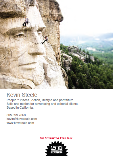
Kevin was also part of The 20th Alternative Pick Anniversary Edition :: Deck

2012 Kevin Steele

2012 Kevin Steele

Posted in Altpick, Photography, The Alternative Pick Deck | Tagged , , | Leave a comment

Dahl Taylor :: Samuel Adams Redesigned Packaging

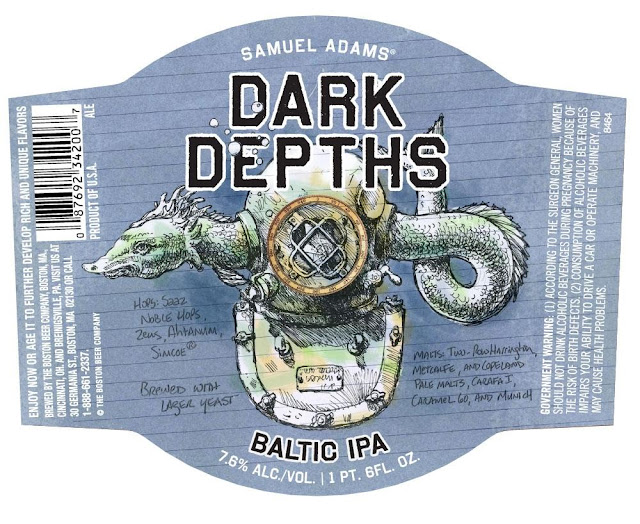
We would like to highlight a fantastic collaboration between Boston Beer and Dahl Taylor (represented by Mendola Artists). 

2012 Boston Beer

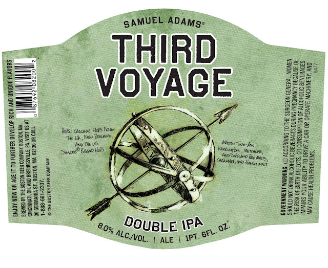
Boston Beer has produced a limited edition Samuel Adams IPA Hop-logy variety pack containing an assortment of beers adorned with labels illustrated by Dahl Taylor. For Dahl, this mix pack is the culmination of an ongoing project and it was exciting to see how well the labels coordinate.  Dahl combines his eclectic style, a dash of humor and exceptional drawing skills, giving each bottle the appearance of a relic.  Coincidentally, the case for the pack was hand-drawn in chalk by Bernard Maisner, an artist from their affiliate, Gerald & Cullen Rapp.

2012 Boston Beer

2012 Boston Beer

2012 Boston Beer

2012 Boston Beer

To see more of Dahl Taylor’s work go to his website and Altpick page.  Also, check out Mendola Artists Representation’s blog here.
Posted in Altpick, Branding | Tagged , , , , , | Leave a comment

Zave Smith : : Of Life, Love and the Stuff In Between

This slideshow requires JavaScript.

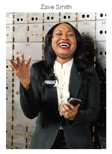
Midwest born and trained, exuberant photographer Zave Smith has told some short and tall tales behind the lens. This is but a short snapshot of his many passionate stories. Once upon a time …

The summer heat has melted the cat.  She no longer cares when the mouse runs over her tail.

The summer light fades and the bars fill up with guys in fancy tshirts.  The ladies stroll the sidewalk, arm in arm with their friends, filling the evening air with laughter and secrets. The sap is running hot.

Two people who have hated and chased and have followed each other for so long that they have long ago forgotten why, have once again crossed paths under the old dirty streets of the city industrial past.

Summertime.  The heat grows while the client world becomes a bit quiet. Summer is the time let go. It is the time to try something new. Summertime. Time to go out and play.  Summertime. Let’s create a story or two.

In Zave’s style, this story has no ending. Keep turning the page at http://www.zavesmith.com

Zave Smith is part of the 20th Anniversary Alternative Pick :: Deck Edition and is also a member on Altpick.com.

Posted in Altpick, The Alternative Pick Deck | Tagged , , , , | 1 Comment

Secret to Success :: Words of Wisdom

by Ralph Mennemeyer

In my opinion the secret to success for photographers and/or artists, boils down to a couple of key things – not the least of which is timing – aka “dumb luck”. It is a promo card that comes across a desk at just the moment that the creative is looking for something like that. It is the sum total of being “out there” in as many places as you can be – consistently – with amazing work.

AMAZING WORK. Not good work. Not pretty good work. Not work that anyone could do (which sadly is what we are all competing for most of the time) but AMAZING, INSPIRING, BREATHTAKING WORK THAT IS IMPOSSIBLE TO FORGET. And how do you get there? Shoot all the time. It won’t all be great – but if you shoot enough you allow yourself the opportunity for greatness to happen! Famous authors don’t sit down and write a book…they write ten drafts of the same page. Enough pages and well….you get the point. Same with musicians…same with all creatives. Create enough good work – let it be seen in enough venues enough times…and your chances have improved.

But now the secret – which nobody wants to talk about but it is the truth – make genuine friends with every client you work with. Not only “never burn a bridge” (a motto that you have to live by) – but never let a client walk out the door and not stay in touch again. The one consistent quality I have seen over the years between those photographers who year in and year out make it big – is that the big ones know more people personally. And if you think about it – it makes sense.

Here is the art director (CD, client..whatever) and they are giving you their vision – their BABY- which they have thought up themselves, fought tooth and nail to get pushed through countless committees, labored over, compromised, pitched fits to make it happen and now they bring it to YOU to bring to life. What a privilege! But 8 out of 10 photographers treat it like “this is my gig today” and never give them a thought once they have walked out the door. Many don’t even remember the AD’s name a month later. Shame on them! The good ones remember the name – their kids names – their wife or husband or BFF or dog or cats name. They take the time – in the trenches or at lunch or at a lunch right after – to get to know them as people. And then….they stay in touch. Not just when they want a job – but when they see an article that is something the creative is interested in….fly fishing, manolo blahnik shoes, Maroon 5…whatever.

As much as this is a visual business – ALL BUSINESS IS PERSONAL BUSINESS.  And if you don’t know the “person” it’s hard to get ahead. Whether you get a copy of Dale Carnegie’s “How to Win Friends and Influence People” or any of a dozen other authors who preach the same thing the truth always boils down to the person they know and trust is the person they will go to. Earn both titles. Do great work for them…AND…get to know them. In the future your life will be richer on both fronts – financial and personal.

 Ralph Mennemeyer – Owner, M Represents, Inc.  More on Altpick.com.
Posted in Altpick, Art, Branding, Photography, Tip | Tagged , , , | 4 Comments