
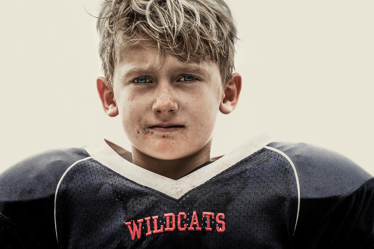
©Andy Mahr
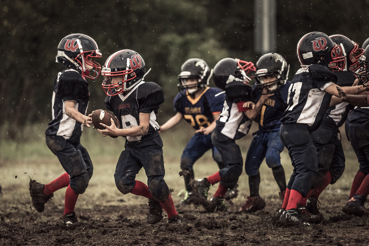
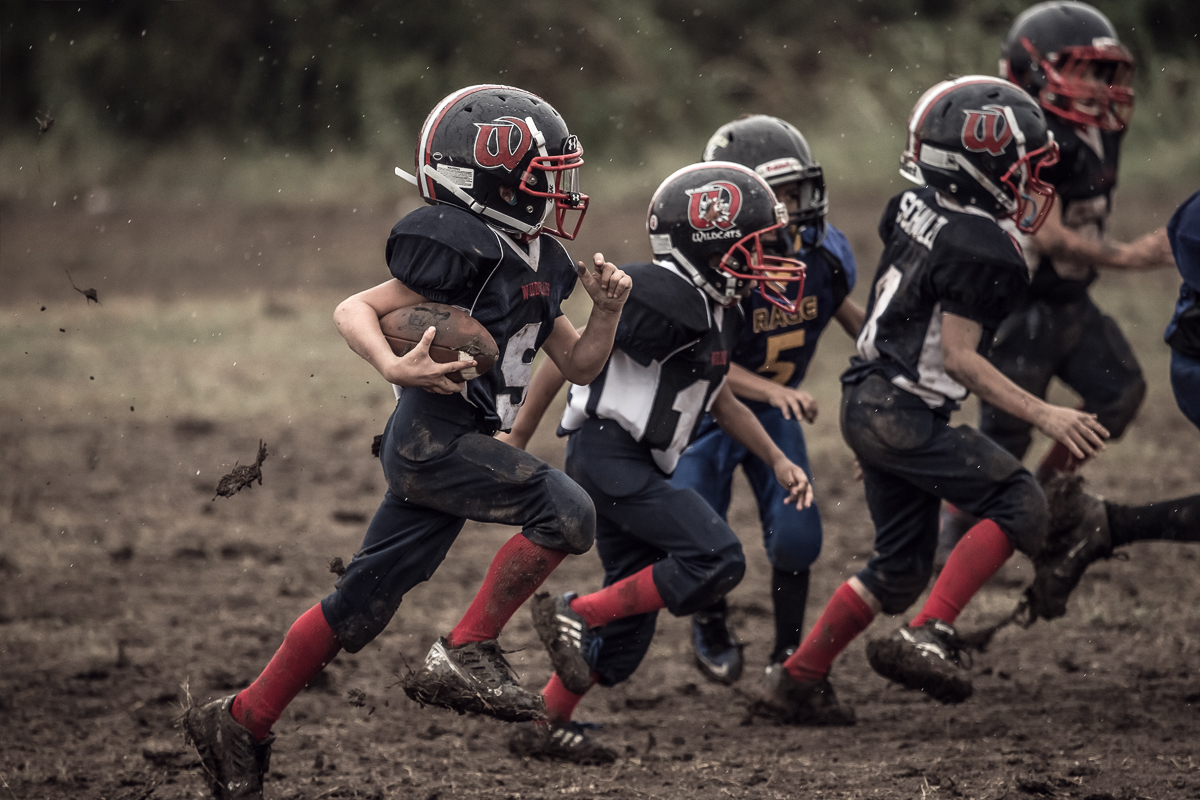
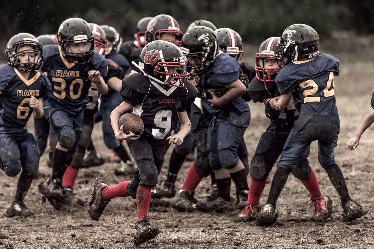
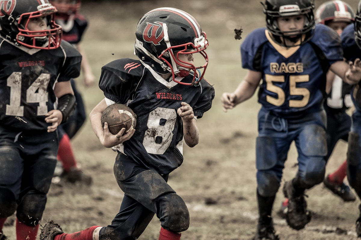
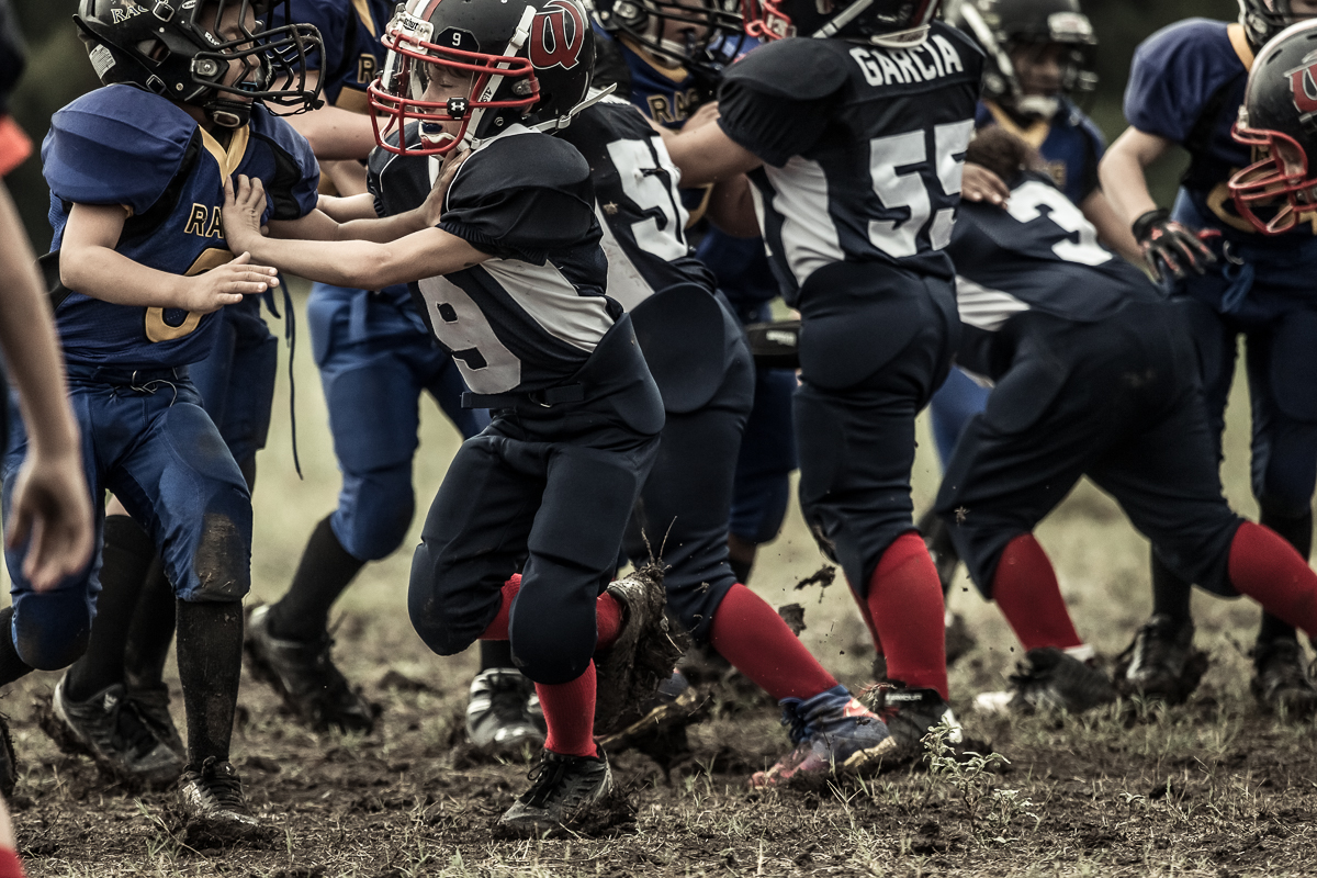
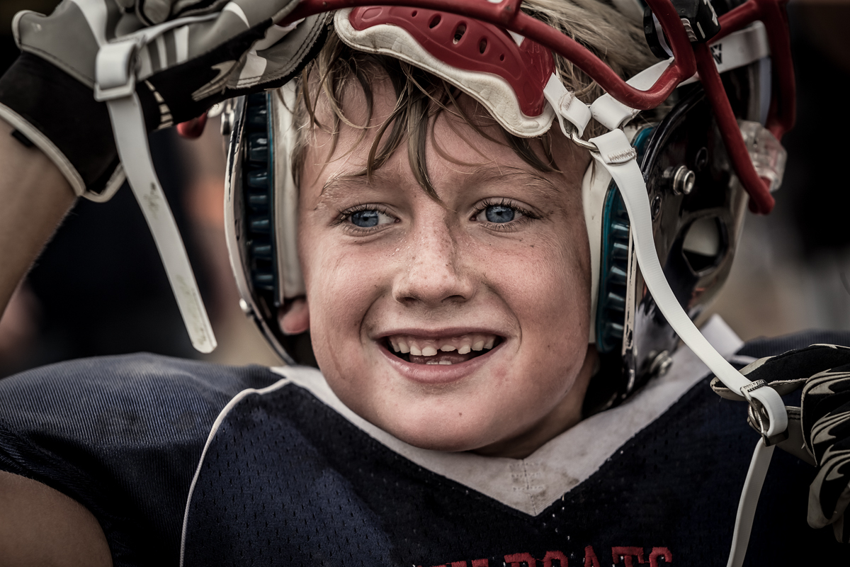
Andy Mahr photographs his son’s football team the “Wildcats” as a personal project. This is the same league as “Friday Night Tykes”, the TV series that is currently running on Esquire Magazine TV network.
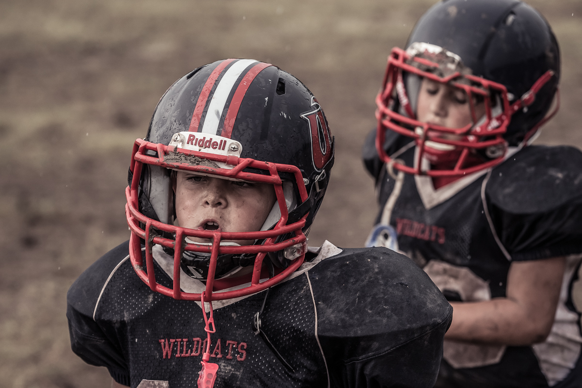
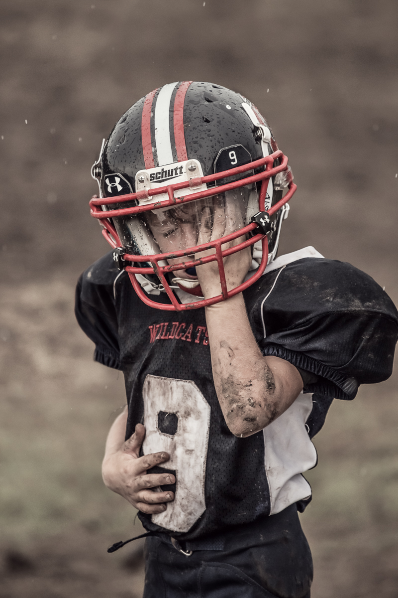

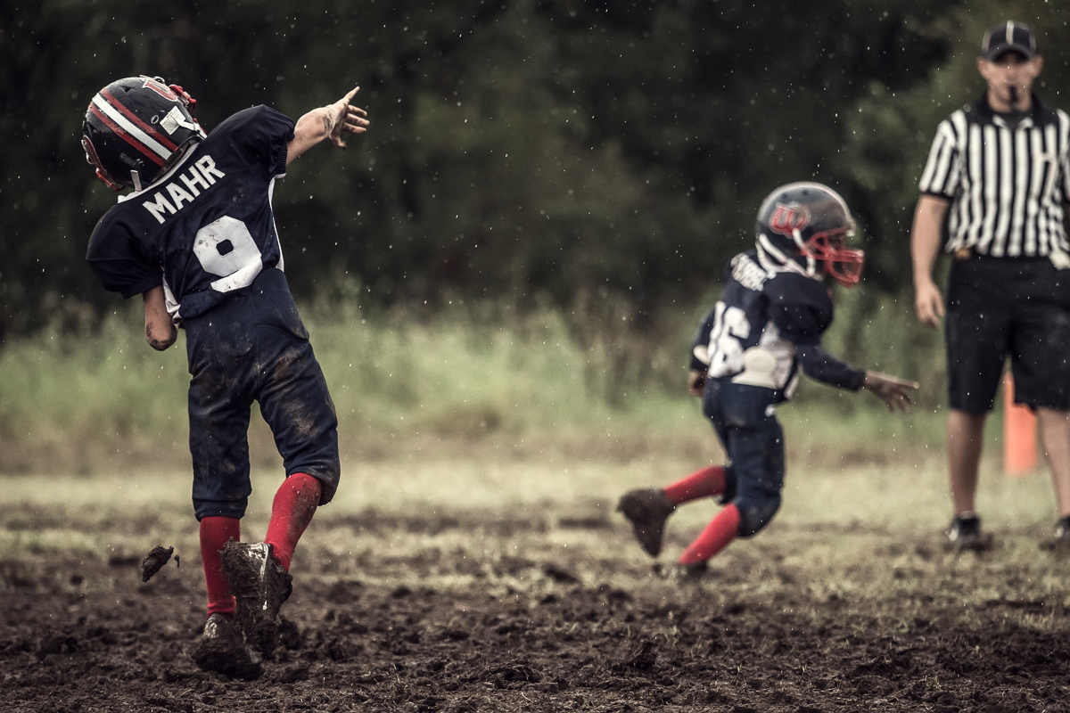








©Andy Mahr
Andy Mahr photographs his son’s football team the “Wildcats” as a personal project. This is the same league as “Friday Night Tykes”, the TV series that is currently running on Esquire Magazine TV network.

Eddie. Photo by Jim Fiscus
Orginally posted on Stockland Martel’s blog.
Jim Fiscus is a pro at photographing characters who have sprung from other people’s imagination. He’s shot key art for series like Downton Abbey, Dexter, The Borgias, Shameless, Episodes, and Penny Dreadful, masterfully photographing the actors in costume and often on set to capture the story, emotion, and tone of each show.
But for his latest personal project, shot on location in his hometown of Athens, Georgia, Jim supplied the characters himself. For “Athens,” Jim first searched for evocative locations, studied the quality of light and the stories he could tell there, and then did a mix of street casting and enlisting friends to find people who he thought would suit the locations.
Some of the portraits, like “Kimberly” and “Gwinny,” are classic black & white character studies, but others have Southern Gothic streaks—something of an outsider quality, or maybe it’s that it feels like the rest of us are not part of this club.
Below are more portraits from Jim’s “Athens” series.

Gwinny. Photo by Jim Fiscus

Wilfong. Photo by Jim Fiscus.

Kimberly. Photo by Jim Fiscus.

Twins. Photo by Jim Fiscus.

Photo by Jim Fiscus.

Photo by Jim Fiscus.

Photo by Jim Fiscus.
To see more of Jim Fiscus’ photography, please go to his website and Altpick page.
 by Clare Ultimo Sept 25, 2014
The Urban Outfitter Kent State shirt design. It’s almost embarrassing to talk about it. On the one hand, what power could a shirt design have? Shirt designs come and go in seasons, like everything fashionable. New ones pour out of department stores daily. What could have caused one shirt design to get so much flak?
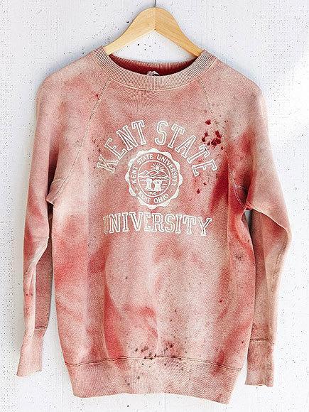
Last week, Urban Outfitters released a shirt that became almost immediately controversial, and not in a good way. The shirt has the Kent State University logo on it, under what seems to be a lot of blood staining. Responding rapidly to criticism of the design, Urban Outfitters went on record saying what looked like blood stains were really just a “vintage” look but then proceeded to take the shirt down from their website, not wanting to further offend.
No one so far has taken the “credit” for designing this shirt, but of course, no matter how this happened, the final responsibility fell on the company for offering it in the first place, and once it became clear to them it was “unfortunate”, they handled it well. They don’t seem to be uncomfortable with controversy.
The Unfortunate Reality of Kent State
Four unarmed kids were shot by the National Guard at Kent State University in Ohio in 1970, during a protest related to the Vietnam war. I was a freshman in high school then, but at 15, my friends and I were aware four kids around our own age were killed for disagreeing with the government. It was reported that the National Guard fired 67 rounds over 13 seconds. Some time after this, I participated with other kids from my high school in our own demonstration, complete with homemade posters calling for the safety of free speech. We were pretty young, but we knew it wasn’t okay to shoot someone for speaking their mind and certainly not a kid in school. At the time, I didn’t completely understand the imbalance that government was heading towards, towards the extreme imbalance we are experiencing today where our freedom of press and freedom of speech are entirely compromised. And at the time, I didn’t imagine the role that powerful, meaningful graphics in popular culture could play in influencing a population – except that my participation that day in school was prompted by well-designed and well-written articles, graphics, and even a song that spread like wildfire across the US. Ultimately, graphic design and the young, fashionable, hip media of the day, made what happened at Kent State relevant to kids like me.
Social relevance for sale
No matter what was behind the making of the Kent State shirt, there had to be a few hoped-for responses from the potential consumer: Do you wear the shirt with pride because people died that day and you want to remember them? Seems unlikely given an audience of buyers who may have no clue about what really happened at the Kent State killings. Do you wear it because it looks like something dangerous happened there and you want to appear “dangerous” too? Possibly. Or maybe “social relevance” is just the latest sales tool* Gasp. So terribly un-PC: “This is such a cool shirt, and didn’t something bad happen at Kent State once?…that would be a great selling point etc etc“… Perhaps they thought it would be part of a “Protest Wear” line; cashing in on the ever growing discontent of people around the country complaining about censorship and control. Except that innocent people died at Kent State at the hands of the National Guard, they might have imagined it would represent a sweet memory in our collective consciousness: a time when youth stood up for something they believed in.
It’s not that a corporate entity got “caught” while it slept through history, or created something that embarrassed them and had to take it off the market that matters to me. That kind of thing happens more regularly than anyone would want to admit. The reality that it could happen at all – even looking at all possible, plausible, excusable reasons squarely in the eye – is a sure sign we have become pretty irresponsible with our message-making.
Meaningful graphic design is still a dangerous idea…
In 1989, too long ago for many young designers to remember, an AIGA conference took place called “Dangerous Ideas” where Tibor Kalman and Stuart Ewen** asked if graphic design had simply become a tool of corporatism. Tibor annoyed a lot of wealthy, celebrity designers in the audience as he accused them of having no conscience while doing highly visible, professionally celebrated and well paid work for ultimately abusive companies, and his presentation was unforgettable. It caused quite a buzz around the coffee breaks and prompted a public debate later that day between Kalman and Joe Duffy, becoming quite the spectacle in an impromptu battle of wits. I appreciated the exchange, but it all seemed hypocritical to me. If design was portrayed as a ladder to fame, fortune or status, the designer needed to play by the rules, even if he/she was able to bend them a little, like Kalman did. By 1989, we all knew that design was compromised as a tool for social reform, and there was little anyone could do to change that, if designers wanted to keep the cash coming. It’s a bargain designers make with the devil: use your talents and mind for the corporate ideal and keep your opinions and ideas to yourself.
And yet, I remain hopeful…
Urban Outfitters has safely, and smartly ended the discourse over this shirt. On to the next concept. But the shirt did not go entirely unnoticed by the public, which is a really good sign. Many believed it trivialized police brutality, not to mention death, protest and free speech. Some folks know what happens from experience, when peaceful protest is met by the “authorities” and we still don’t want to be killed, imprisoned or blacklisted for disagreeing with our government. Perhaps this is even more meaningful today than ever, in the wake of a militarized police force and the ever-growing power of the NSA.
If we believe that graphic design has nothing to do with how we view or remember experience, this is our wake up call. Graphic design remains a powerful tool of our corporate culture, often used against us, rarely used for real education or enlightenment. If we as designers have relinquished our potential influence in order to climb the corporate ladder or feel good about being “artists”, it’s completely understandable, but does this also give us permission to be irresponsible with the messages we share?
We can’t disregard the kind of power and persuasion that intelligent, informed visual communication can make in the world, even one as badly done as the Kent State shirt. Graphic design may not be able to “change the world” but it certainly can teach us what the world is about. If design is meant to transcend the trivial, we must be willing to tell the truthful stories, as unfashionable as this might be. And when you have taken the time to learn those stories yourself, you will make all the difference in the world. •
* An entire discussion for another blog!
** If you don’t know who these guys are, just look ‘em up.
Pertinent links: Click here to read more on Clare Ultimo’s Blog. Read more about Urban Outfitters’ Bloody Kent State Shirt on The Daily Beast.

©Ali Smith
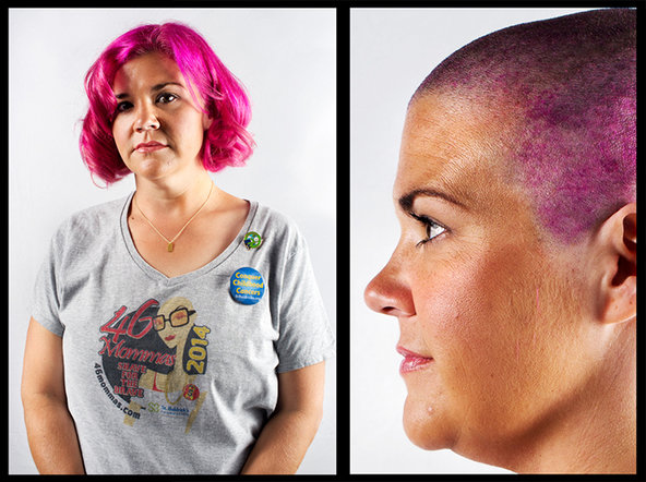
Alyson Weissman, shaving for Jared. ©Ali Smith
Allison Smith, shaving for Jackson. © Ali Smith
by Ali Smith
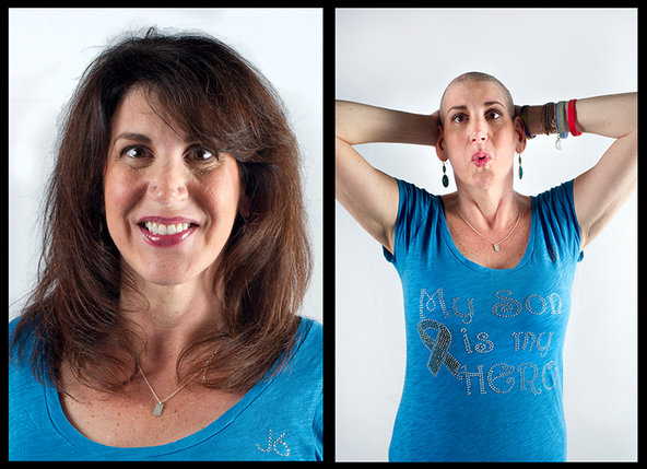
A mother stands in front of my camera. “I don’t know what I’m supposed to do,” she says anxiously, so she smiles stiffly, as you might in a school picture. “Just be yourself,” I encourage. When she leaves my makeshift studio, set up at the Prudential Center in Boston for the occasion, I feel I’ve failed. The images reveal nothing about how she was feeling. Instead, I’ve taken a smiling portrait of a woman with no indication that she was about to undergo a serious, emotional transformation.
Kris Doyle, shaving for William. © Ali Smith
Lisa Giguere, shaving for Hailey. © Ali Smith
Audra Wilford, shaving for Max. ©Ali Smith
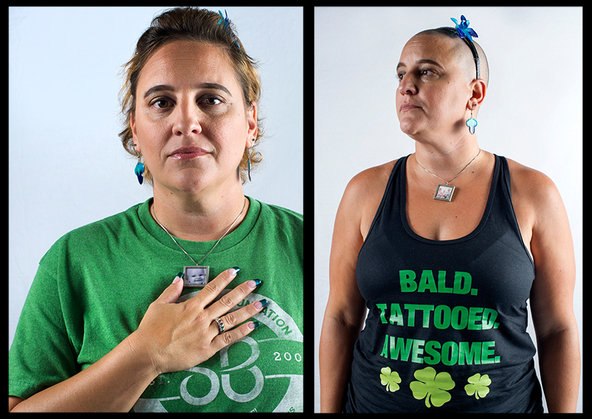
Lisa Sanders, shaving for Rayley. @ Ali Smith
On Monday this mother will return home, where she will stand out in her office, at her local restaurant, at her kid’s playground, as “the bald mom.” Wherever she comes from, that will take some nerve. And it will, by design, inspire questions.
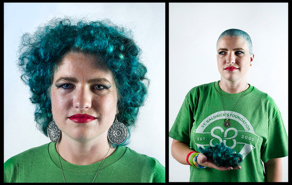
April Hawks, shaving for Spencer. ©Ali Smith
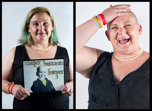
Sarah Betz Bucciero, shaving for Carter. © Ali Smith
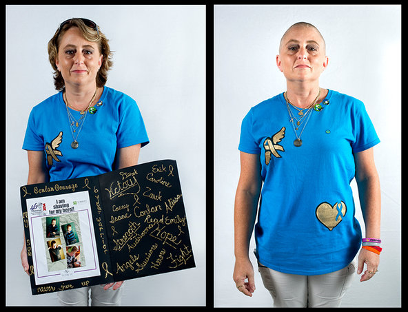
Carina Shaw, shaving for Conlan. © Ali Smith
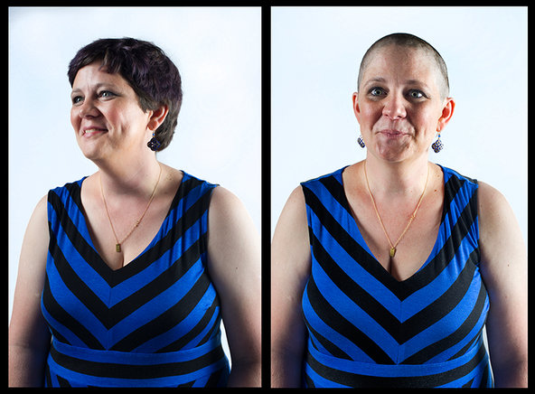
Nicole McPherson, shaving for Eleanor. © Ali Smith
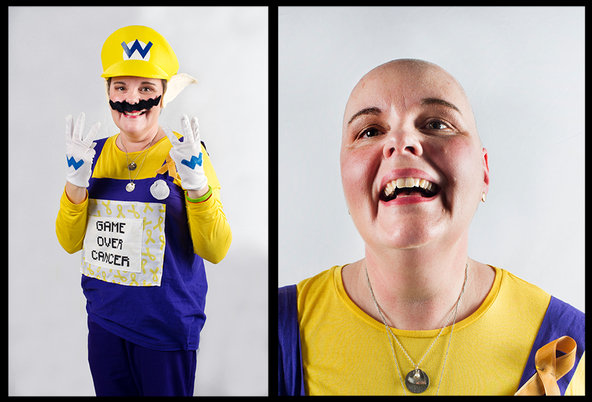
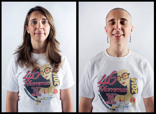
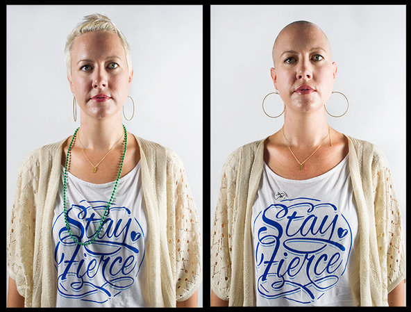
Each weekday, an average of 46 American families receive the unenviable news that their child has some form of cancer. At this event, part of the fifth annual Shave for the Brave Campaign organized by the St. Baldrick’s Foundation, mothers of children affected by cancer shaved their heads in solidarity with their children to help raise awareness and funds for pediatric cancer research as part of the 46Mommas team.

Allison Smith, shaving for Jackson. ©Ali Smith
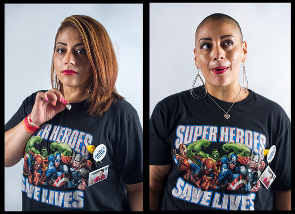
YvetteVelez Rivera, shaving for Nayelis.© Ali Smith
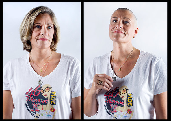
Leslie Woodstock Jermainne, shaving for Brian. ©Ali Smith

Linda Berthelet, shaving for Alyssa. ©Ali Smith
I took their pictures, before and after, a record of what was lost, and what was gained.

Nicole Blakely, shaving for Layla. © Ali Smith
Originally published in the New York Times’ Motherlode column.
To find out about Ali’s Award-Winning book Momma Love, visit MommaLovetheBook.com @mommaloveAli on Twitter and Instagram Momma Love The Book on FB. See more of Ali’s work at alismith.com and altpick.com/alismith
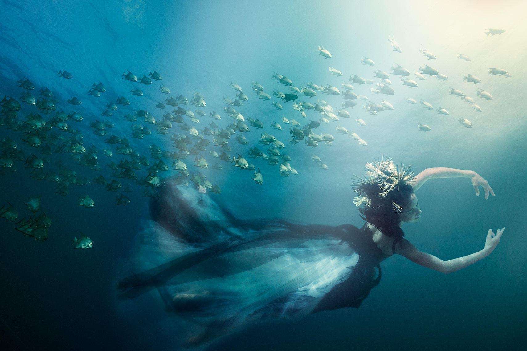
©George Kamper
by George Kamper
I’m often awed by personal projects my advertising photographer peers shoot. I’ve seen fashion shooters display documentary images shot in Nicaragua, still life guys shoot action and sports at the Olympics…And often, I’m more enamored by their personal work.
Being an advertising photographer has been a wonderful journey for me throughout the years. I’ve been fortunate to travel around the world and meet some interesting people along the way.
I’ve been producing personal work since the beginning of my career. It’s especially rewarding to have the opportunity to produce images with my vision and the support of a great benefactor or client.
I’ve been a scuba diver, lifeguard, lover of swimming pools and the water ever since I can remember. I also love a good challenge and often, I’m the guy the agency calls when there’s a challenge that needs a creative approach and solution due to a difficult environment, logistics or tight budget.
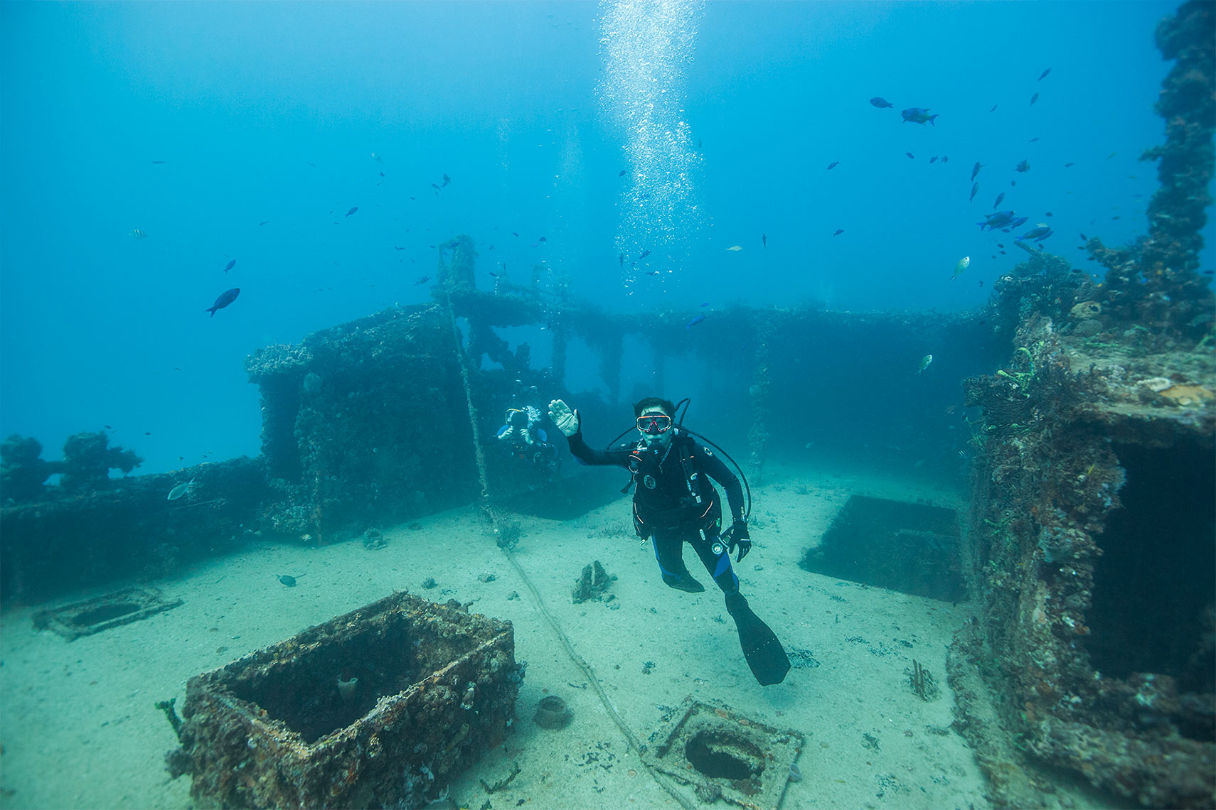
©George Kamper
A year or so ago, I came up with the idea to shoot some underwater imagery. Not of fish and coral, but of people, playing sports, fashion, or dancing. I hadn’t yet decided what the final scenarios might be, first I had to do my homework.
Shooting stills underwater sounds easy. Grab your Go Pro, jump in the ocean or pool, and there ya go! Well, that may be true for some, I wanted to shoot a story with higher quality, more thought out, with an awe factor that would leave people asking how were these done? And, at the end of the day, I wanted to end up with a stunning and unique series of images!

©George Kamper
I faced several challenges, most importantly; I had to come up with an idea that hadn’t been overdone. Though I love long flowy fashion, and how it looks when shot underwater, it’s been done. I wanted my shots to be more than that. I wanted the images to have an organic quality and not feel cliché’.
I came up with the idea to shoot underwater wrecks coupled with dancers, athletes, or to create a lifestyle situation on the wrecks with models. Once I came up with the general direction, I handled this shoot just like I do my advertising shoots. I began by doing extensive research, homework, and practice.

©George Kamper
First I had to learn to shoot underwater, with and without tanks and diving gear, in a pool and in the ocean. I needed to practice in the environment with camera housings that were new to me and of course, I needed a muse that would be willing to put up with me. As I do on most of my shoots in one capacity or another, I tapped my wife to pose for me and a neighbor to allow us to shoot in their pool. Here’s a couple of my “practice shots” utilizing my wife Sherryl, my always willing muse.
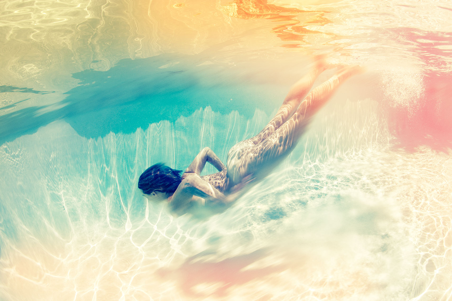
©George Kamper
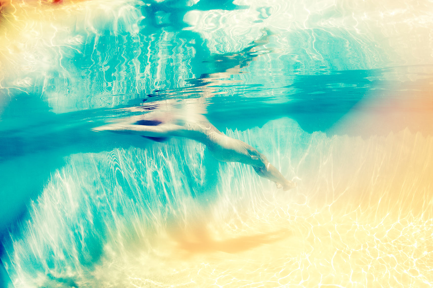
©George Kamper
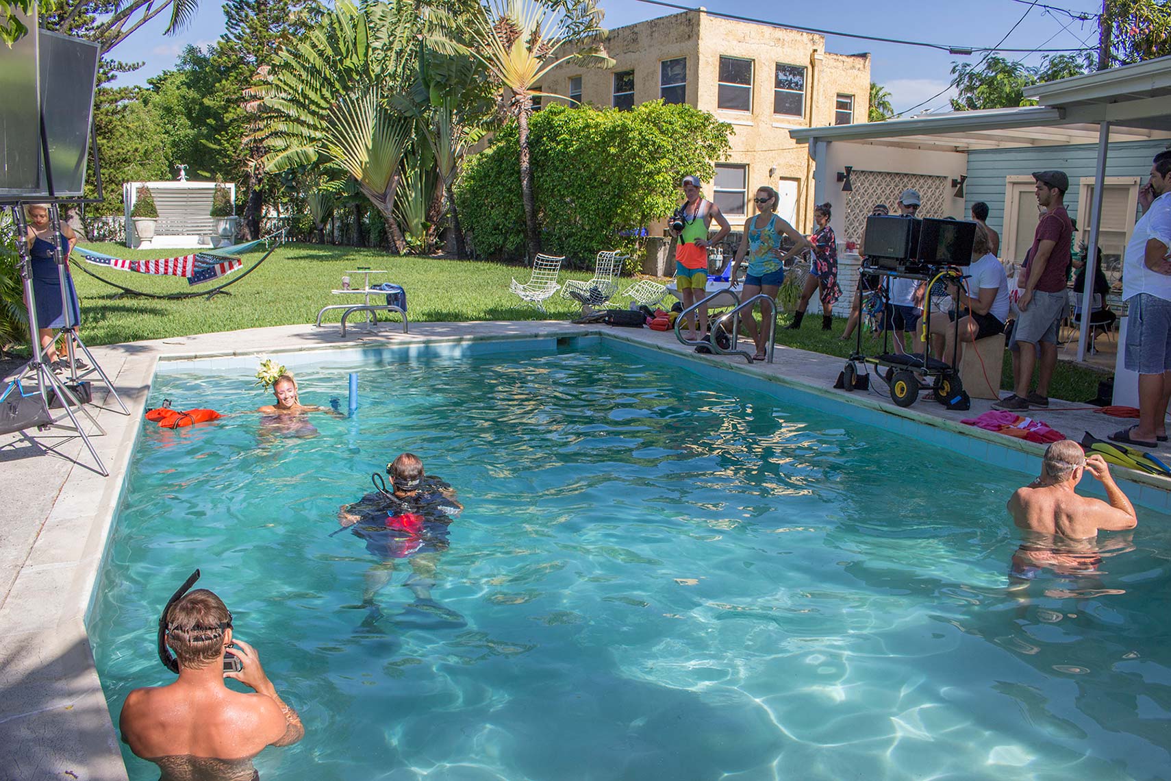
©George Kamper
Secondly, I had to come up with a way to gain access to underwater wrecks and procure the gear needed to shoot them. I also realized the wrecks were in water over 100’ deep in some instances. To prolong my dive time safely, I needed to get Nitrox certified along the way.
I wanted a great fashion stylist with access to interesting wardrobe and props. Both props and wardrobe would be subjected to saltwater or chlorine, which could potentially ruin them.
We needed great make up and hair and knew this would be a major factor to contend with, both for aesthetic and technical reasons.
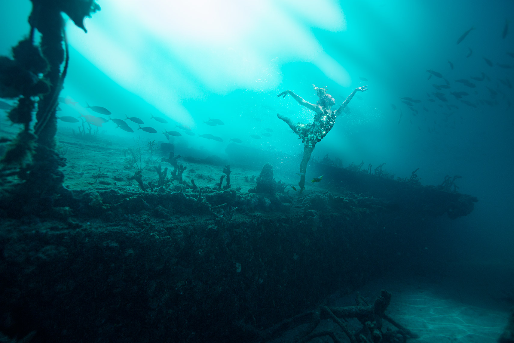
©George Kamper
Additionally, I needed talent that would be good with holding their breath, opening their eyes underwater and acting naturally while contending with being in the water for prolonged periods of time.
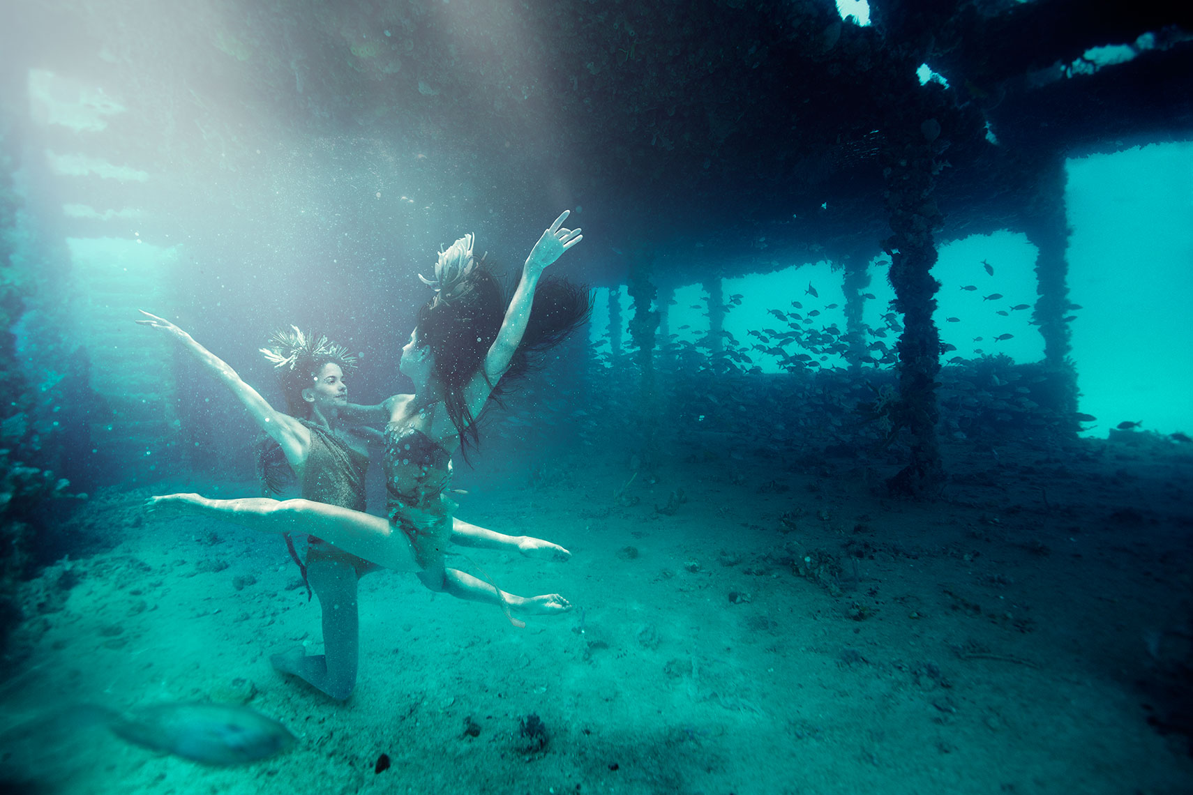
©George Kamper
After a year of homework, gathering the right gear, testing in pools and the ocean, I had the opportunity I’d been looking for.
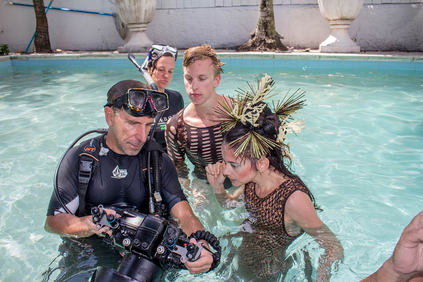
I was asked by an editorial client if I’d be interested in photographing members of the Miami City Ballet for an editorial UNDERWATER. We had talked about doing an underwater fashion story in the past, but I wanted it to be more than girls swishing around in gowns. I presented the publisher and editor with my idea and a couple of practice shots of my wife, combined with the wrecks. They loved the direction, and we were on!
©George Kamper
I knew that the dancers could give me the right form I was looking for and that they are very disciplined with control of their bodies, but I had no idea if they could work in the water.
I followed up with them sending over a “How to Guide” to holding your breath for longer periods of time, and asked them to read up and practice.
The day of the shoot finally arrived, I had decided to shoot the wrecks prior to the dancers, keeping in mind how I would like to position the dancers in post. I decided that shooting the dancers in a pool in Miami, and editing them into the wrecks, would be the safest way of producing this. Additionally, we had a very small editorial budget to work with. Hiring all the support services I would need to get my dancers 100’ down and onto a wreck in the ocean, while safely posing, wasn’t the right approach in this instance. Even so, shooting around and under the water is not very forgiving. Every aspect has to be thought out as little mistakes can exponentially grow and become major issues.
Our shoot came of seamlessly. We used the sun as our main source throughout the day with strategically placed reflectors to maintain an organic consistent look to match what we were getting in the ocean on the wrecks.
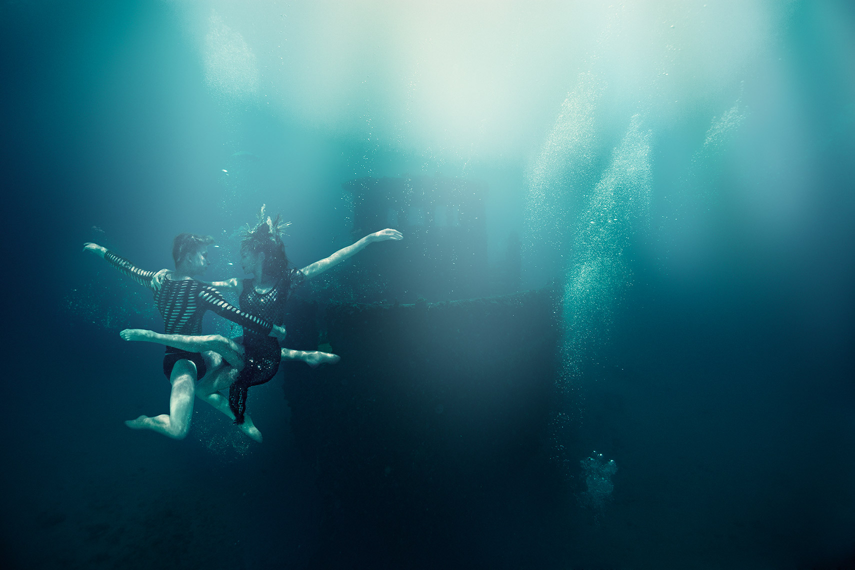
©George Kamper
I take my hat off to my retoucher Christine Craig, who is much more a partner in vision, than a retoucher. We’ve been working together for over five years, mostly over the shared networked internet tunnel we have created so we can each see what the other is working on in real-time. She’s lived in various locations around the northeast since she started as my intern in Miami and has since settled in SC. Christine had been excited by the idea of shooting underwater from day one. We did research and tests to come up with the best approach to match our vision. She’s the kind of girl who doesn’t give up easily and every time I challenged her, she exceeded my expectations. I’m lucky to have her and so are my clients.

©George Kamper

©George Kamper
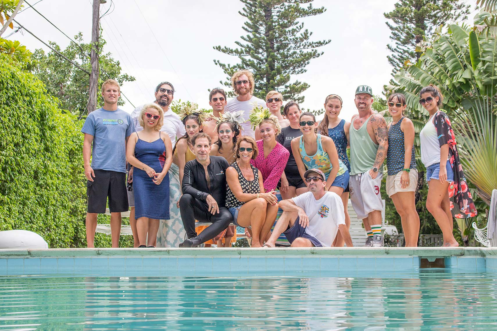
I started this as a personal project and I was fortunate to have it evolve into an editorial that came with support from the magazine and amazing talent. The editor on set was wonderful and took care of the crew, talent, and politics. The dancers were enthusiastic and very willing to jump through hoops to make this happen. My support staff worked for free or a small stipend, they believed in the idea and wanted to be part of creating some cool and unique images. I take my Hat off for all involved, Thank you!
©George Kamper
To see more of George Kamper’s work go to his website and Altpick page.
©John Lacko
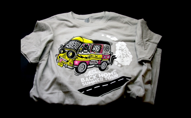
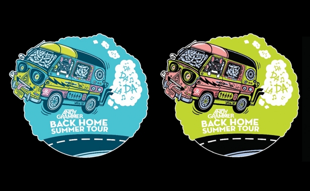
When platinum-selling recording artist Andy Grammer set out on his Back Home Summer Tour, he reached out to Miami artist John Lacko to create the graphics for promotional tees, hats and totes that are such an important part of funding any musical road trip. His management team admired the work Lacko recently completed for Diplo’s Major Lazer project and wanted to capture some of that same energy for Grammer’s promotional gear.
©John Lacko
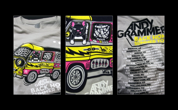
The design elements had to feel like home and homecoming, part of the theme of Grammer’s first single, “Back Home” [ http://tinyurl.com/nsbjo6r ] with sentimental lyrics about friendship, minivans, and the enduring nature of returning to where he started. The first video for the song includes sunny shots of friends and bandmates traveling together, playing cards and singing songs on the way to the next gig. Once Grammer reaches the stage, the audience sings and dances under clouds of colorful smoke. As the song hits its final chorus, Grammer stage dives out into the crowd.
©John Lacko
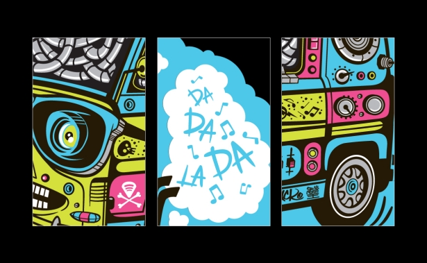
Lacko set the project in motion with a goofy band bus that’s kitted out with giant speakers, filled with miles of tangled wires and Grammer’s dog at the wheel. The van has cheap sunglasses across the headlights and a wide grin spreads along the grill. To give the sloppy jalopy added appeal, clouds of smoke belch from the twin tailpipes that billow into happy clouds of music. The van bounces across the highway making a joyful noise wherever it goes.
©John Lacko
See more of Lacko’s work at http://altpick.com/lacko

©Gina Binkley
Gina Binkley adds NEW Photographic WORK to her portfolio, “Lera”.
©Guy Stauber
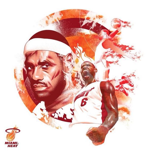
Following his recent move to Cleveland, Guy Stauber illustrates a tribute to Lebron and his time with Miami for Richard Solomon Artist Reps.
©Heather Scholl
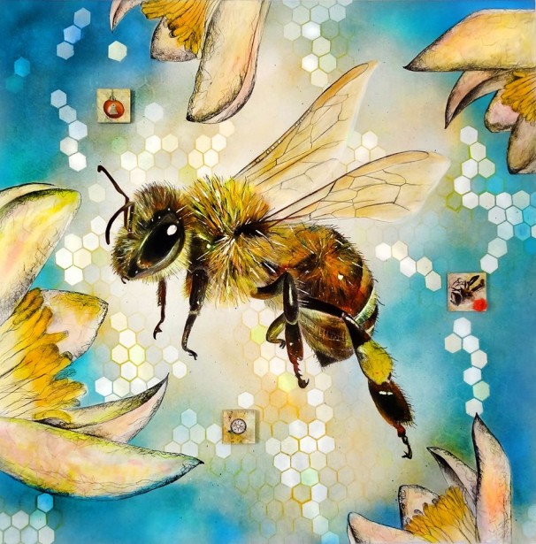
Heather Scholl’s “Salt of the Earth” – Dedicated to the Bees – mixed media on wood
36″ x 36″.
©Emiliano Ponzi
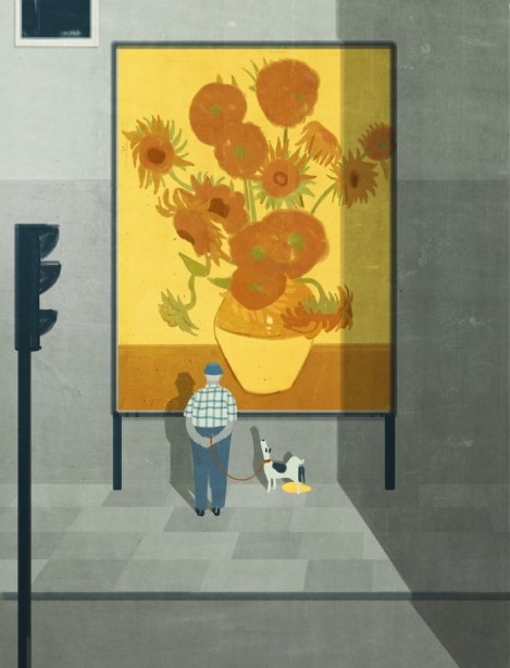
Emiliano Ponzi illustrates for La Repubblica for an article which presents the question does art pieces really change the environment?

©Brook Pifer
The latest from photographer Brook Pifer is her new beach version series of the Lady Adventures.

©Neale Osborne
Neale Osborne’s latest illustrations continue his pictorial tribute to ‘The Fantastic Four’ – and, of course, their creators Stan Lee, Jack Kirby, and (fellow Birmingham-born) artist John Byrne.
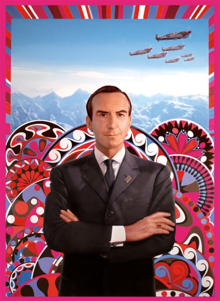
©Tim O’Brien
Tim O’Brien’s recent assignment for Reed College Magazine was to illustrate Emilio Pucci, the Italian fashion designer.

©Otto Steininger
Otto Steininger adds a new illustration to his portfolio “Flying Exercise No. 3”.
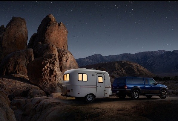
©Nick Nacca
Photographer Nick Nacca found this spot in the hills of California and had some fun lighting up the campsite.

©Alex Nabaum
 Alex Nabaum illustrated a preview in Chicago Magazine for the play “Native Son” by the author Richard Wright.

©Kari Moden
Kari Modén’s illustration for Red Magazine’s feature story was on the 2014 technology trends, for example, Google glasses and Samsung gear watch.

©Cade Martin
Cade Martin photographed a fresh brand identity for our Woolly Mammoth Theatre Company’s 35th Anniversary Season.
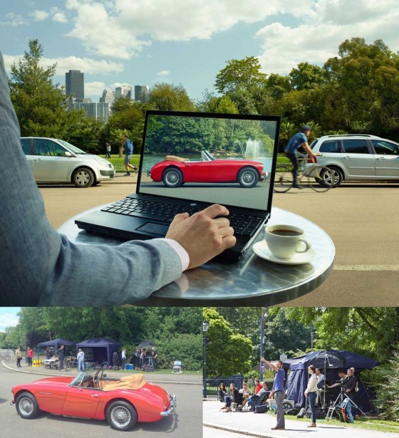
©George Logan
Photographer George Logan shoots HSBC campaign for JWT.
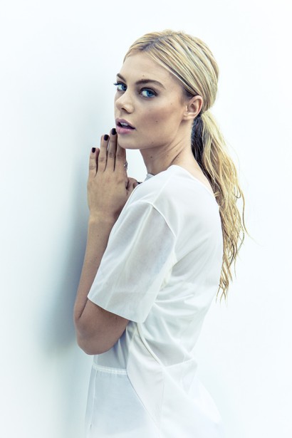
©Brian Kuhlmann
Brian Kuhlmann adds some new portraits and fashion to his portfolio with his new series “Hannah K”.

©Kevin Hauff
Kevin Hauff had an interesting commission for the Radio Times where they needed an image for the magazine radio pages to accompany a Radio 4 drama called Psalm – about the playwright Ben Johnson.

©Lorenzo Gritti
Lorenzo Gritti’s Portrait N.28 from The Book of W.W.2 Italian Resistance W.I.P.

©Edel Rodriguez
Edel Rodriguez illustrated one of the covers for Margarita Engle’s books, “The Lightning Dreamer”.

©Stephanie Diani
Photographer Stephanie Diani recently photographed actress and writer Judy Greer for a cover story in Backstage magazine.

©Alicia Buelow
Alicia Buelow’s latest design work for Adobe: Hero illustrations for Adobe CC Learning.

©Phil Bliss
“Rarely am I moved by the loss of a celebrity the way I am with this man. He battled demons as many creative geniuses do. He gave us all so much”, comments illustrator Phil Bliss.
To see more Altpick artists’ work, click here.



To view John Lacko’s work, go to his website and Altpick page.

Boston
©Simon Puschmann
by Simon Puschmann
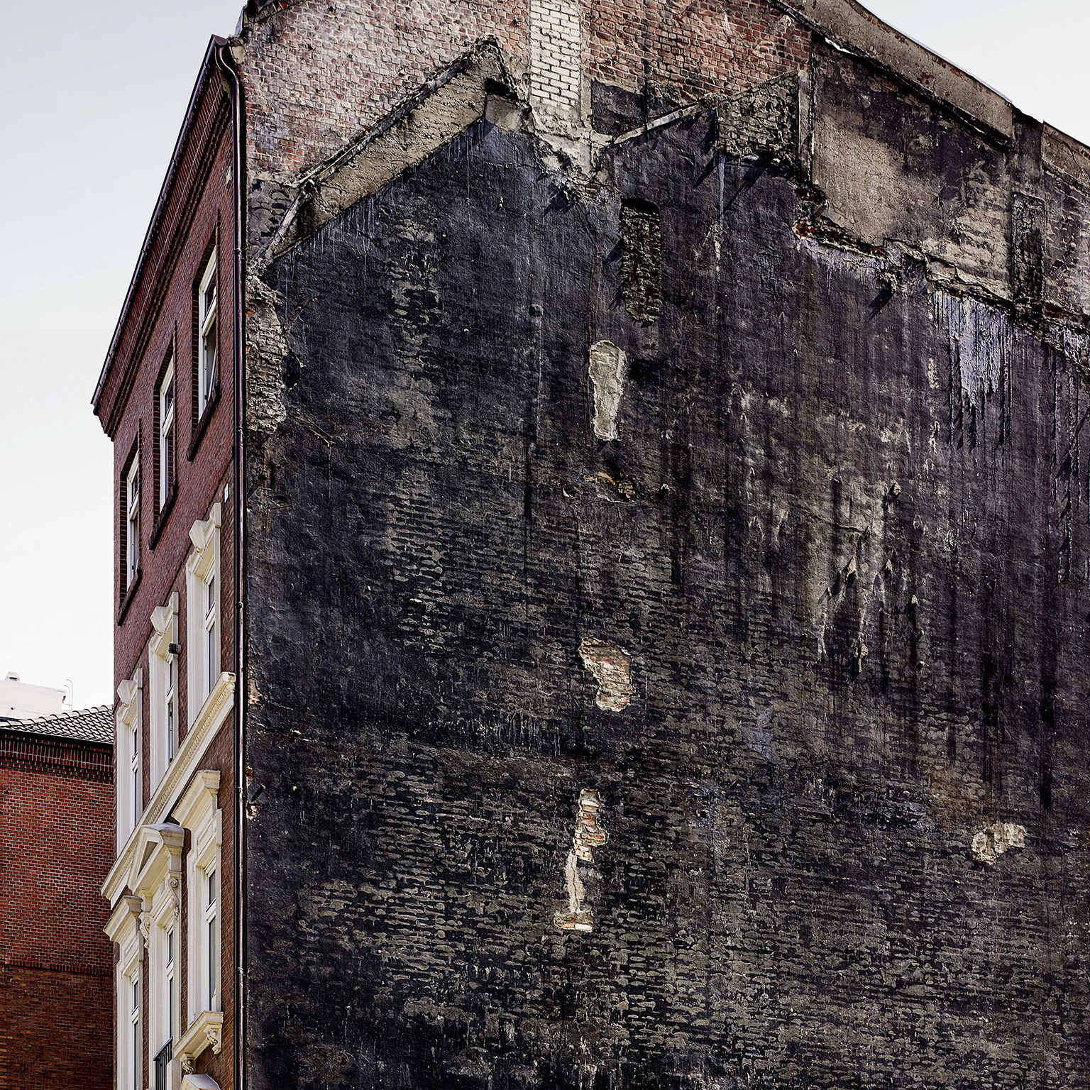
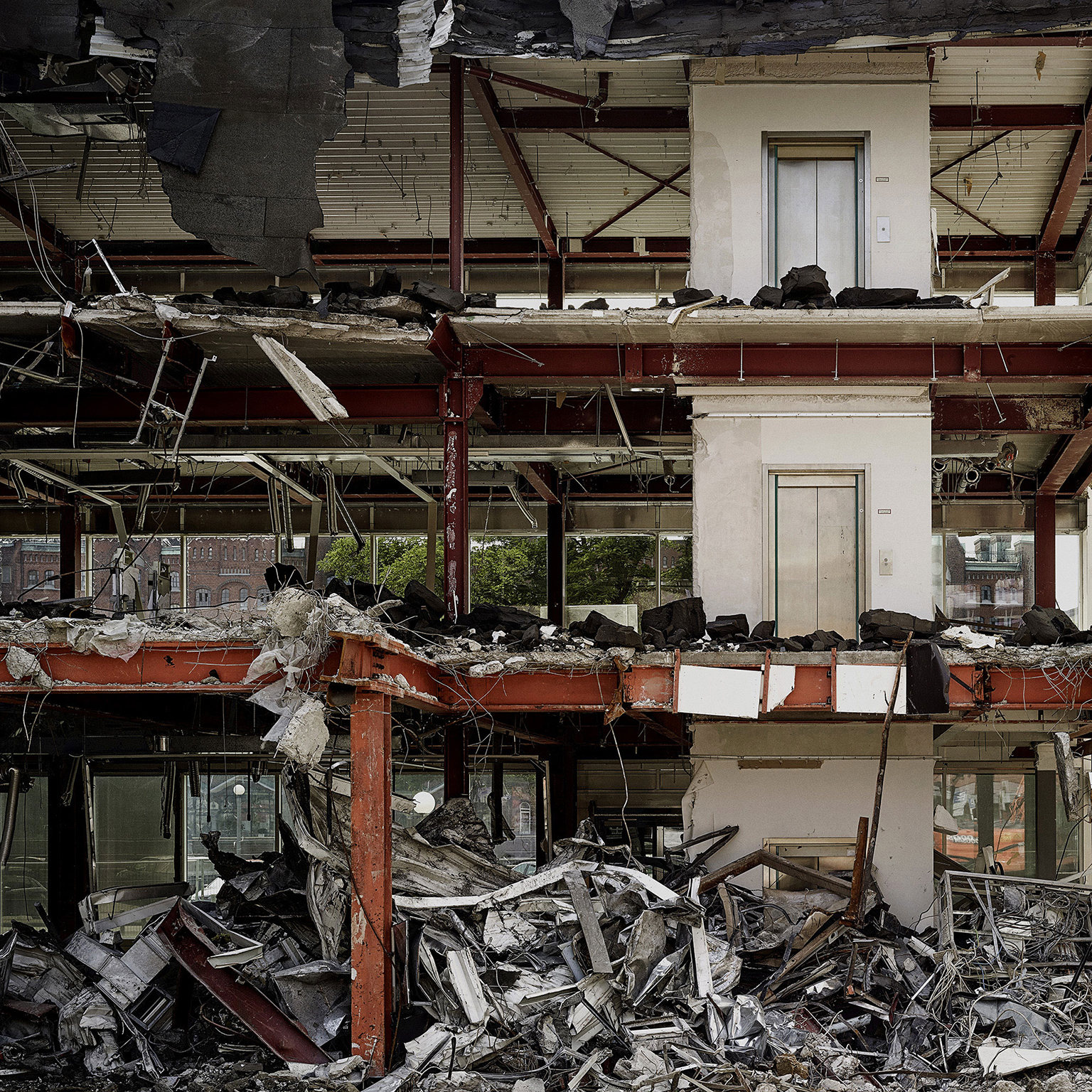
To me a building that was ripped open like the ones in my images looks wounded, lacerated, hurt, torn apart, suffering. That is what I feel when I see buildings in that very state. I prefer to still see a notion of the former inhabitants. Sinks on walls, windows, I like to be able to feel the former presence of the people that lived or worked there. I also like the graphics of open buildings. I don´t photograph ruins or buildings that have been decaying for years and years. I look for fresh, open wounds, hence the name. These buildings are hard to find because often they are gone by the time I get there with my Alpa Max Camera. And usually within a week after I shot there, they are gone for good which is another aspect I like about these photographs.

Boston
©Simon Puschmann

Boston
©Simon Puschmann

Boston
©Simon Puschmann

Hamburg
©Simon Puschmann
Hamburg
©Simon Puschmann

Hamburg
©Simon Puschmann

Hamburg
©Simon Puschmann

Hamburg
©Simon Puschmann

Hamburg
©Simon Puschmann

Hamburg
©Simon Puschmann

Hamburg
©Simon Puschmann

Hamburg
©Simon Puschmann

Hamburg
©Simon Puschmann

Hamburg
©Simon Puschmann

Hamburg
©Simon Puschmann
Hamburg
©Simon Puschmann

Hamburg
©Simon Puschmann

Hamburg
©Simon Puschmann
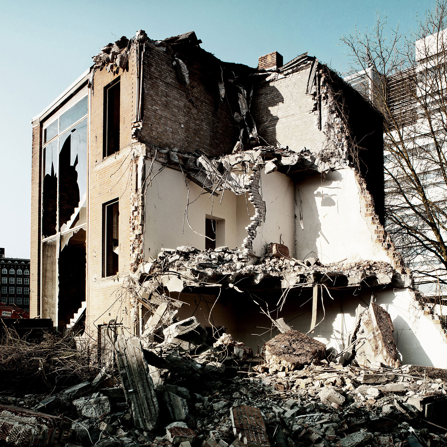
Hamburg
©Simon Puschmann
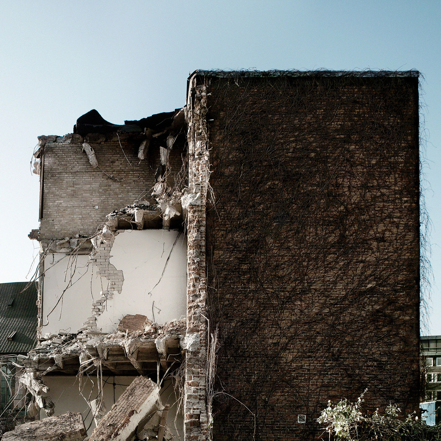
Hamburg
©Simon Puschmann

©Simon Puschmann
Los Angeles
Simon Puschmann is an award-winning commercial photographer who defies all photo categories. For more than 20 years, he has been creating his own brand of dramatic, unexpected imagery for a prestigious clientele, including Audi, Citroen, BMW, BMW Sauber F1, Mercedes Benz, Doc Martens, FC St. Pauli, Lufthansa, Hamburg City Film Council, Volkswagen, and Mobil One NASCAR Racing. Among his honors are bronze and silver medals from the International Aperture Awards, 2008; first place, Altpick Award, Photography Series, 2007 and 2008; and Photography Website of the Year for 2008, by altpick.com.
Simon says:
There is no doubt. I found photography and it found me. It’s as solid a marriage as the one I have with my wife, Susanne. I bought my first medium format camera, a Hasselblad, a 503CX, in photography school in 1987, then shot only 4×5“ for years and then turned digital with a Contax 645. Now I use a Phase One DF645+ and an Alpa. I like surprising my clients, the audience, even myself. I resist being put into any photo category. Clients know they can expect the unexpected and that I try harder. I invent, love, laugh, work, live, and breathe photography.
See more of Simon Puschmann’s work go to his website and Altpick page.

©Matthew Bowie
Chicago has many opportunities to grow your documentary photography skills and is always a good way to stretch ones self as a photographer. Nothing beats the thrill of walking up to a complete stranger and asking them if you can take their portrait and talk with them about their life. In many cases people politely say no and walk away but occasionally someone will share with you an amazing story that is so interesting.
That’s the adventure of documentary photography. You never know what your going to learn or what type of images your going to get.

Recently, I have been striving to create more personal work by documenting the people close to me.
Several years ago I moved into a building in Logan Square and become very close friends with my neighbor Betty Cherry, a 70 year old Christian missionary, who has more interesting stories than the library.
Betty has been through enough hardship to fill several life times. She keeps things simple and has a unique and personal way of talking about God. This series reflects the stories, emotions and experiences I’ve had with Betty over the years and how in many ways she is the grandma I never had.

©Matthew Bowie
I decided to reference a body of work created by fellow photographer, Andy Anderson, when I thought about the look and feel of this series. When I create personal work I try and be particle first and creative second so I don’t get carried away and then abandon an idea.
Betty was having a BBQ for her 70th birthday party and I knew that many of her friends and family would be attending. I thought this would be a great opportunity to create a mini body of portraits that would be interesting and fairly easy to create.

I showed up early. Set up a black fabric background off to the side and throughout the party grabbed people and spent a few min. with them. It was a lot of fun and I learned a lot and got to try some new ideas on getting more emotion out of a subject which was a success. I’m really happy with how the images came out and thankful to all the amazing subjects I got to work with.
To see the full collection visit: Betty Cherry’s Birthday Party
Check out more of Matthew Bowie’s photography on his website and Altpick.com page.


