

Illustrator and hand letterer, Daniel Fishel, typically likes to work with swatches of paint, lino block/silk screen textures and ink washes collaged together in Photoshop to create his characters and images. He uses metaphor, color, the placement of figures and lighting to tell the story. In his own words, here are a few of Daniel’s favorite illustrations:
DF: This is a piece (above) I worked on for the Globe and Mail. They are a really wonderful Canadian newspaper that has a section called “Facts and Arguments” where the readers submit stories. Often times these stories are emotional and somewhat etherial. This story in particular is about a young man who just turned 25 and was going through a quarter life crisis. I just turned 26 not to long ago so I can emote with the writer on not feeling as if he’s lived life. Especially because his grandfather just turned 100 years old and has lived a great life. The anxiety of wanting to explore and experience so much is what came to mind with this image. So it made sense to some how draw the piece sequentially to feel as if the young man was trying to fulfill his quest.

DF: I’ve gotten hired by the Washington Post to illustrate a book review about “The revised fundamentals of caregiving” by Jonathan Evison. The main aspect of the story is that a man is down on his luck and the only job available was to be a caregiver for someone in poor health. He is assigned to a 19 year old he has a degenerative disease that is slowly killing him. The main character spends the entire book trying to show the beauty and wealth life has while also trying to deal with his own demons. The idea for this illustration was to show how the young man was slowly falling apart and how that was also hurting his caretaker. Like many illustrations, I try to dig deep on what the emotional pressure point of the article is and try to focus the emphasis on that. The idea for this came after I was walking home after getting coffee and saw a mangled umbrella in a trash can on a street corner.
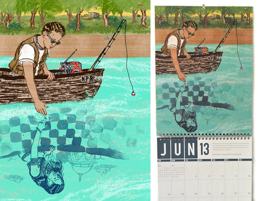
DF: I was asked by the exceptional folks at National Public Radio to make a piece for their 2013 Calendar. The art direction was to make an image that reflected our personal connection with the radio. I was in high school when I started to listen to NPR. For the longest time I wanted to go to college to eventually go back to my home town and make something there. I really didn’t know what. Listening to NPR opened me up to a world out there that I wasn’t aware of and made me want to begin exploring it.

DF: Not long ago, I started working in a limited color style along with my painted work. I’m doing this to not only offer something more bold and graphic but to challenge myself to make something more minimal and to the point. Not everything needs to be a landscape of detail. This piece was done for the Globe and Mail for a story about a woman who loses her job and realizes that her identity is completely wrapped up in what she did for a living. A consistent conversation I have with my studio mate is about this very subject. Are we our work? I like to think that the majority of it is an extension of myself, but when does the identity of the illustrator end and where does Daniel Fishel begin? Making an image showing a invisible business women looking at herself in sweatpants and a t-shirt seemed like an obvious answer to show her externalizing this question I often times pose to myself.

DF: This is an unpublished cover illustration for Markets Media magazine. The sketch was selected but was killed before I went to final after it was given a second look over by the editor. It doesn’t happen often but it happens. I still didn’t want to see this illustration not be finished up. The article this illustration goes with is about how investors can over protect their assets so they don’t lose money. Growing up in a small town there wasn’t a lot to do. So I remembered a moment where my friends and I would put on a ton of sports pads when we would jump our bikes over a ramp. The idea of putting a child in a ton of sports pads acted as the perfect metaphor since investments are like investing in your ‘children’.
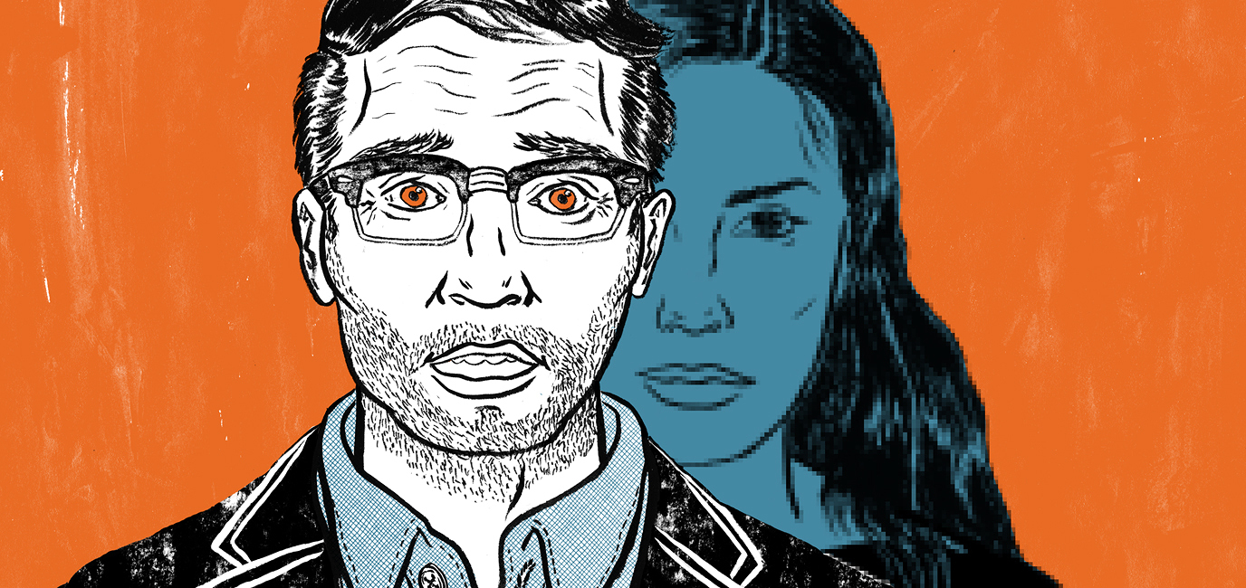
DF: Recently I got hired by the New York Times Book Review to illustrate a review of “Give me everything you have: on being stalked” by James Lasdun. The book is about a creative writing professor who helps out a talented student who becomes obsessed with him. She reverts to terrorizing his existence by writing strange reviews of his books on Amazon and writing weird emails to his fellow professors to the point that it is not only making him look bad but slowly crippling his creditability as a writer. I have two roommates who probably forget I live there sometimes, since I am pretty quiet. It’s funny to see them jump out of their skin if they are in the kitchen cooking and then notice me walk by. That same scare is what I was going for but with his digital stalker.
To see more of Daniel Fishel’s work you can go to his website or Altpick page.
Discover more from The Pick
Subscribe to get the latest posts sent to your email.

