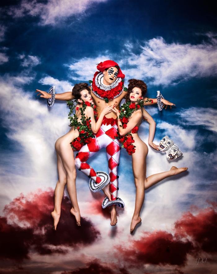
Scott Lowden received 13 honorable mentions in the categories of lifestyle, fashion, children, self-promotion and “other” at this year’s Lucie Awards presented by the International Photography Awards (sister effort of the Lucie Foundation). The 12th Annual Lucie Awards Show Gala took place earlier this month at Carnegie Hall.
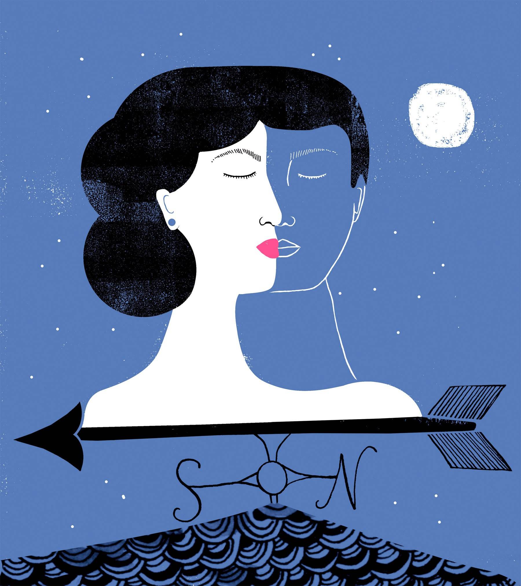
Gayle Kabaker
Gayle Kabaker’s animation “Exotic Yoga Retreats – See the World Differently” was one of only 42 projects selected from hundreds of submissions to be included in the International Motion Awards 3 collection.
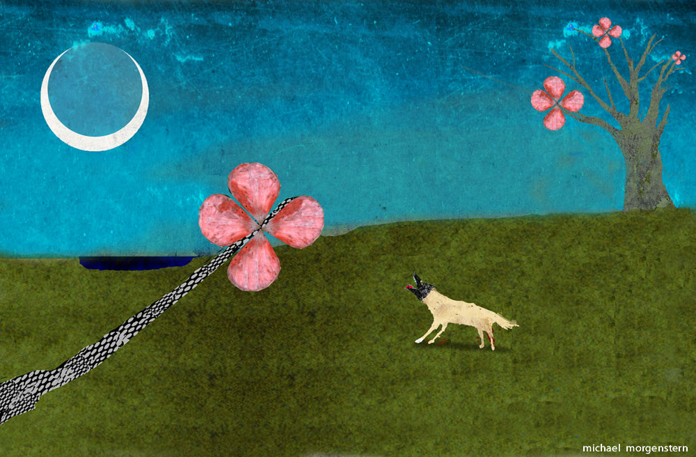
Michael Morgenstern was selected for the Lurzer’s Archive “200 Best Illustrators Worldwide 2014 – 2015”. “The judges were drawn to my personal work for this edition, which made me very happy. I’ve been illustrating for about 19 years, and have created a pretty large body of work over time that I like to call my “art”. These things that I create for myself are a significant part of my illustration process. This recent piece that Lurzers chose is titled “moon dog”.
Red Nose Studio’s piece for “Hero of the Five Points” by Alan Gratz was accepted into the 57th Society of Illustrators Annual, along with Chris’ stop-motion public service announcement “Holding Polluters Accountable” which was awarded a Gold medal.
Dana Hursey received a couple of Honorable Mentions in this years IPA’s (International Photography Awards). “It is always so great to be included with such a distinguish group of professionals and we love the winning imagery this year!”, comments Hursey. “So much talent out there! Thanks so much to the judges for including two of our images in the mix!”
Hanna Barczyk’sillustration, “An Answer Blowing in the Wind Chimes” for the Los Angeles Times was selected by the Society of Illustrators for their annual book (57) and show, which will be exhibited in February at the Museum of American Illustration in New York City. Art director: Wesley Bausmith, L. A. Times/L.A. Affairs.
Tom Cocotos had two illustrations selected to appear in the American Illustration 33 award book. The images of bees are part of an ongoing ad campaign for the Writer’s Foundry MFA program at St. Joseph’s College in Brooklyn.
Lennette Newell received an IPA Honorable Mention for her “Tanzania Wildlife” series, “Muddcrack diptych” series, “Ani Human Butterfly” series, “Alien” image and “Affection”, which was also a winner in the Moscow International Foto Awards. Lennette also won 1st place in a Special-Pets Category in the 2014 IPA Competition for the winning entry “Black & White Affection”.
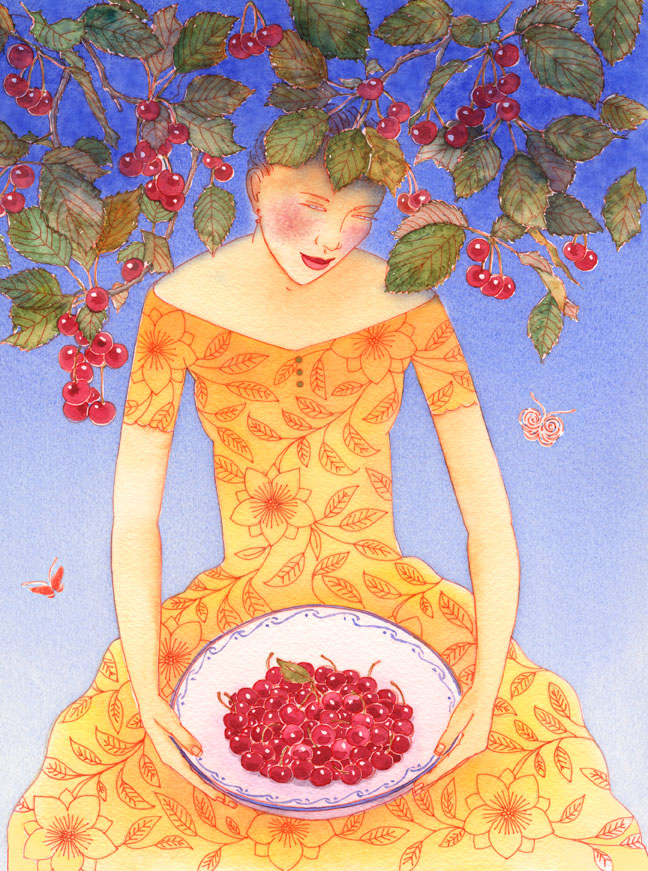
Denise Hilton Campbellreceived word in September that her image for the June/July issue of Organic Gardening Magazine “Cherries” was selected as a runner-up in the Creative Quarterly 37 International Competition. Denise’s work will be featured in the CQ online gallery winter 2014-2015.
Leela Cormanwon a silver medal from the Society of Illustrators for her short comic “Yahrzeit“.
Selina Alko and Sean Qualls
The Case For Loving; The Fight for Interracial Marriage (Arthur A Levine Books, Scholastic), written by Selina Alko and illustrated by Sean Qualls and Selina Alko has received TWO starred reviews so far from Publisher’s Weekly and Kirkus Reviews . The book publication is set for January 27th 2015.
Kevin Hauff
Kevin Hauff‘s image was selected to be in Lurzers Archive: 200 Best Illustrators Worldwide 2014/2015 which was just launched.
Colleen O’Hara‘s “Kim Jung-Un” and “Amy Winehouse images were chosen for the 2014 Illustration Awards in Applied Arts Magazine in the Portrait Illustration category.
Chosen for the 2014 Illustration Awards in Applied Arts Magazine, Rocco Baviera‘s images were part of a series for an issue of Philanthropic Trends Quarterly focusing on the necessity within organizations of developing a strategy and integrating a game plan, while stressing the need for simplicity.
One of Vlad Alvarez‘s personal pieces was selected in the Latin American Ilustración 3 Competition. The piece was also chosen in the “LOS DIEZ” (The Ten) group and was displayed at the American Illustration / American Photography Party in New York City held on Thursday November 6th. It will also be displayed in a special traveling exhibit sponsored by EPSON.
Ellen Weinstein‘s “A Primer on Forgetting” for Radcliffe Magazine was accepted into Society of Illustrators 57th Annual. Also, “Patron Saint of Ugly” book cover and “Superstition for Nautilus” were accepted into the American Illustration 33 Awards.
An image of a breast cancer patient from Robert Houser‘s “Facing Chemo” project was awarded placement in the 2014 APANY International Photo Contest. The images were displayed in October by a gallery in Chelsea, New York. Robert’s “Dancers” series was recently accepted into the APA San Francisco event, Something Personal, which opens on December 6th.
Paul Garland’s illustration for ‘UA Hemispheres’ magazine was accepted in the Society of Illustrators 57 show. In addition, “The Prize for Illustration 2015” in association with the London Transport Museum illustration has been accepted to be exhibited by The Association of Illustrators.
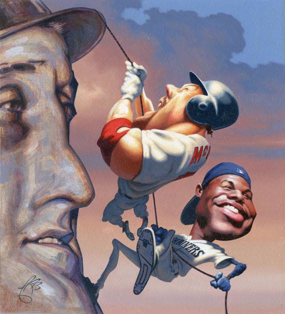
James Bennett‘s painting of Ken Griffey Jr. and Mark McGuire was accepted into Baseball’s Hall Of Fame in Cooperstown. The art was originally created for TIME magazine, during the Home Run Chase of 1997.
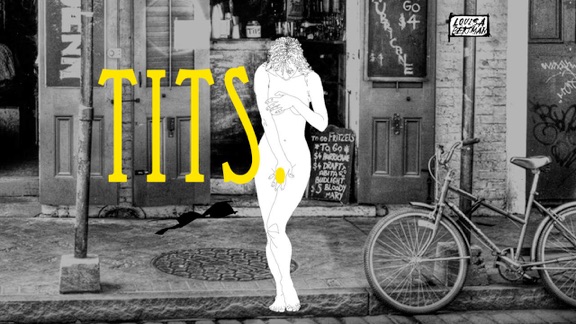
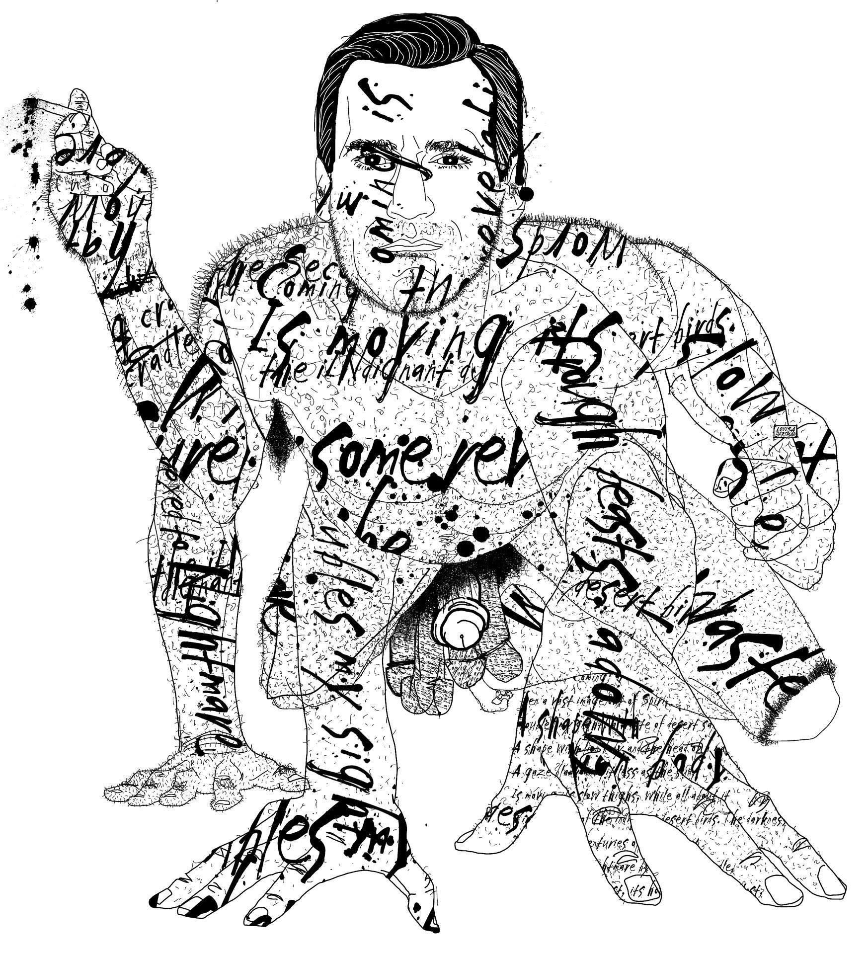
Louisa Bertman‘s animated short, Tits. is Lunabar’s 2015 Lunafest Winner and her illustration “Naked Beast Don Draper” for Seed & Spark’s Bright Ideas Magazine is an AI-AP American Illustration 33 Selected Winner.
Brian Cummings‘ “Crest 3D Whitestrips” ad was accepted into Graphis Advertising Annual 2014 and Brian’s “Knife & Flag” campaign was accepted into Communication Arts Photography Annual — 2014 Award of Excellence,Addy Awards — Best in Show — Regional 2014 and Luerzers Archive VOLUME 4/2014 — Featured.
Francesco Bongiorni‘s “Risk Management” illustration for ONE – Johns Hopkins Carey Business School was accepted in the Society of Illustrators 57 show.
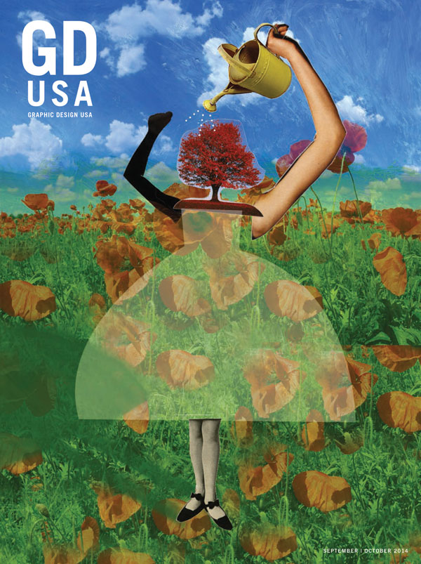
Barbara Kosoff‘s illustration, “Prosperity” was chosen to be on the cover of Graphic Design USA for their Sept/Oct issue. Her winning entry was one of two winners selected for the digital printing competition sponsored by Neenah Papers.
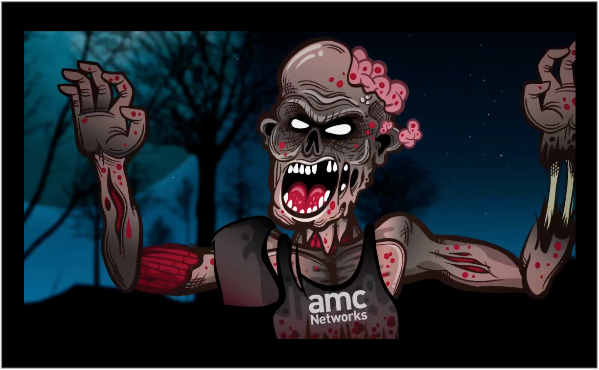
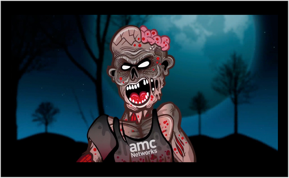
When it comes to matters of the Zombie Apocalypse, fans of AMC’s The Walking Dead are extremely passionate about catching the latest episodes on Sunday nights. So when the network aired a commercial spot at the beginning of Season 5, Episode 4 threatening that “AMC may go black” due to a contract dispute with DIRECTV, a Twitter firestorm erupted that nearly drowned out the storyline for the next half hour. DIRECTV fired back in the second half of the episode with a cartoon zombie whose head explodes because the threat of interrupted service isn’t real.
Miami Beach’s Lacko Illustration provided the comic relief with his frighteningly funny zombie design for JxTwo, Inc. under the creative direction, design and production of Jeanne Le Blanc and Jeremy Alcock. The DIRECTV commercial assures Walking Dead fans that AMC is only trying to scare them and that there will be no break in the undead action. “We intend to renew our AMC partnership at a price that is fair to our customers. It really is a no-brainer.” And with that, the zombie’s brains pop out.
The DIRECTV spot impacted the show’s many fan discussion boards and shifted the dialogue on Twitter. However, the threat of a contract dispute made more waves in the press the next day than the recap of the show’s gory narrative. Networks and satellite providers taking their fight straight to the audience during a top-rated show proved more frightening than the bite of a walker, but for Lacko and the JxTwo agency, it’s all in good fun.
Lacko has a dark and scary history with the SciFi and Horror genre having worked on GODZILLA graphics for the ADOBE MAX Creativity Conference in Los Angeles, DC Shoes Musical Monster Skate tees, Hasbro Toys Monstrocity Cuponk Collection and recording artist ANDY GRAMMER’s 8-bit inspired tour tees. He provided art for YouTube’s GEEK WEEK and the FEARNET.com Fun House plus the FANGORIA CHAINSAW AWARDS, an annual celebration of the year’s best horror movies.
Webb Chappell shoots portraits of students for the over-sized brochure for the Beacon Academy, Boston, MA. The school is proud to claim that it pushing young, smart motivated thinkers to go beyond.
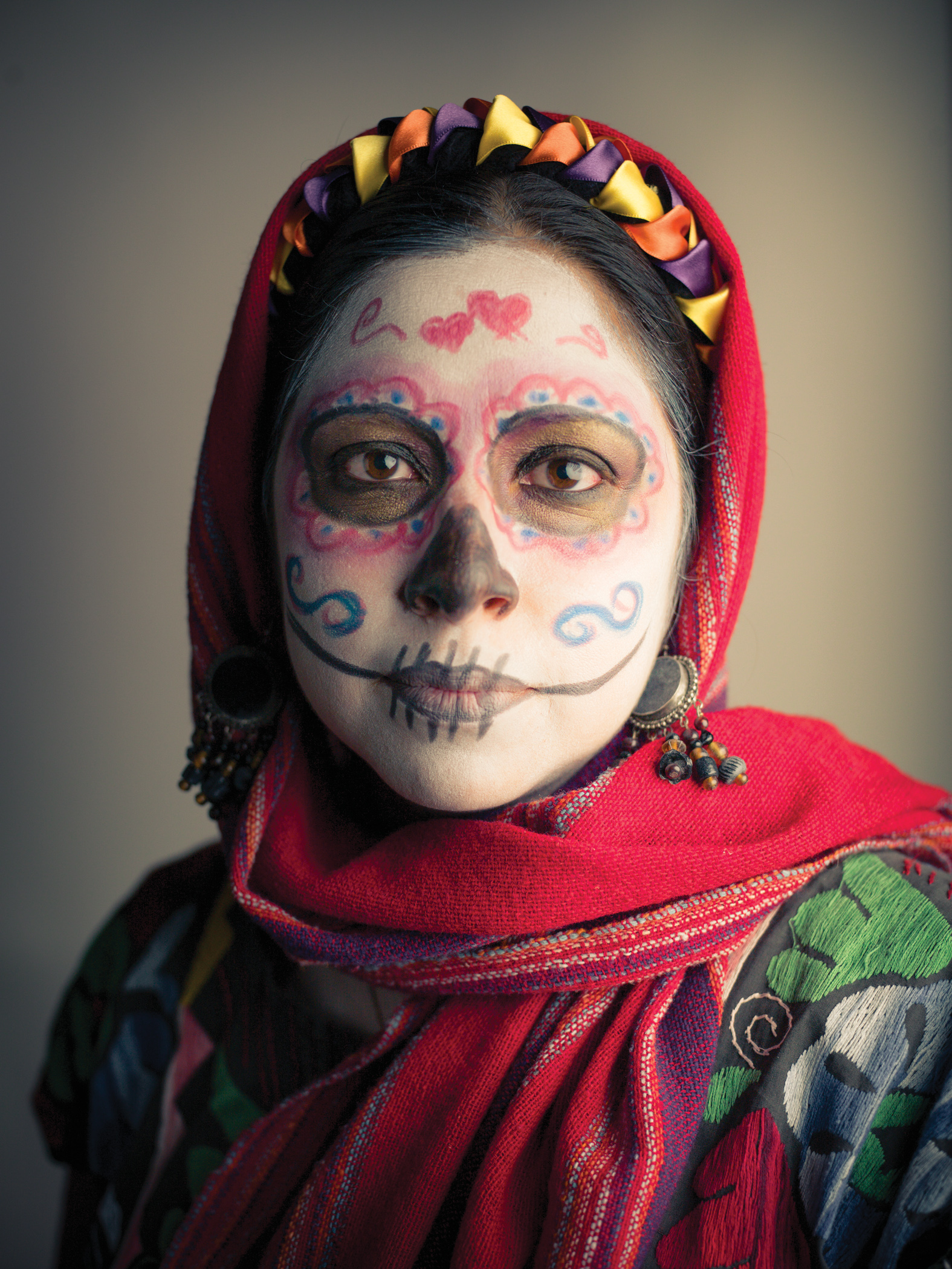
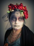
Cade Martin, a renowned photographer and long time visitor to San Miguel de Allende, Mexico, visited the town to capture the spirit of the Day of the Dead festival. During his four-night stay, Cade and his crew set up a small mobile studio and took photos in the street.
“The idea is to create tight portraits of existing faces with the hopes of photographing real people that we see walking around,” said Cade. “We were looking to find inspiring people who are already dressed up for the festival.”
Several local art galleries helped Cade Martin’s efforts out, including the Guiness Gallery, Moyshen the Gallery and Fernando M. Diaz Art Studio. All three are located in La Fabrica La Aurora, served as a staging area for Cade Martin’s efforts. Helena Moreno Fine Arts Gallery in downtown San Miguel de Allende also served as a staging ground to help photograph the festival.
Joining Cade was renowned social media blogger Geoff Livingston, http://geofflivingston.com. They posted live updates throughout the weekend on their social media accounts, including @cademartin on Twitter, cademartinphoto on Facebook, and @geoffliving on Twitter. They also live blogged San Miguel’s Day of the Dead festival on the Huffington Post.
The team took photographs of San Miguel Allende itself and feature the town as a travel destination. They will publish several articles about the visit upon their return to the United States. If you would like to contact Cade’s team, contact them on their social media channels, website or email them at geoff@tenacity5.com.
Cade Martin is an award-winning photographer for clients worldwide, and is often featured in top arts and design publications. His meticulous attention to detail helps shape an environment that echoes the real world, but with a heightened emotional focus.
Specializing in people and location photography, Martin has worked for clients including Tommy Hilfiger, Coors Brewing Company, Zurich, America’s Next Top Model, Discovery Channel, JC Penney, IBM, Verizon, Marriott International, Grey Goose, National Geographic Society, Starbucks and other companies and creative agencies.
It might be pure accident that the word Cure is in the word Curation.
No it is no accident.
Curation is the only cure for information overload.
In the digital age, everyone can be a content curator. Regardless if you collect art on deviantArt, favorite illustrations on Altpick or if you are on Twitter. You don´t need to make up tweets on your own, you can re-tweet someone else’s content as long as it reflects your opinion.
The free magazine app Zite for example, allows users to accept or reject content and lives from users who actively curate what they want to see. It begins with social media and tends to become a soft skill for creative professionals on a global scale.
In times where we don´t have to reinvent the wheel, the winner is the one who can rearrange the wheel in the fanciest way imaginable. You´ll know it by now: the emphasis of this post lies on the content curation; not the job of a curator. We still need the curator and digital content curators who are not artists but the new gatekeepers, hobbyists and professionals alike. As an art creator, people believe your task is to create new works of art on a regular basis.
But this only reflects half the truth. The lesser known fact is that 50% of his/her time, a successful creator is also curator of their own content. Every feedback, critique or sale leads to knowledge that consciously or unconsciously, goes straight into a new work of art.
Curation as part of the creation process allows an artist to pull from past experiences and from failure to create something new and original in the future. A curator – as professional person who only curates the work but does not create art – can trace the progress and make up wild speculations of the future work and value of a particular artist.
Seeing trends, influences and reminiscence is an asset, ignoring that is a risk.
Collecting reference images, illustrations and artworks of other artists is always a good start. When done digitally it can be a good exercise to categorize, label and sort these digital copies. Any illustrator working with references for a project does this, combining different resources to create something new towards a given briefing. In the best case this includes your own work.
As creator it is easy to observe progress from any existing body of work/oeuvre, opposed to what a mathematician does.
There is a list of advantages below that artists should start thinking about:
As part of the creation process, curation allows for a consistent oeuvre
Curation allows an artist to find out what his/her audience wants
It helps the creator to focus on what is important
As part of research it also trains the eyes and nurtures the taste
Curation allows artists to get sensible for even the tiniest flaws
It helps to keep track of influences and inspiration in order to develop a unique style
Curation can be helpful to find creative solutions
Actually what this intrinsic aspect in the process of creating art does, is that it allows an illustrator to be objective with his own work, to see things from an editor’s or art director’s’ point of view. As part of research and analytics, it can also help the artist to find out what style or technical solution works best for his genre. This is actual knowledge of an art director and professional curator, but this knowledge can serve the artist very well.
Sure, there are rightfully artists or illustrators who clearly deny the curation aspect. If they have an agent or manager, these people will do it for them. There is always this stage that we can never reach; being someone else. And because we will never become so objective, it is very vital to get in touch with curators around us, the people who can boil down in a few sentences what our work means to them or how they think it should be seen. No soft skill can replace true emotions.
And we can work on us accepting the feedback that comes from the heart to put it right back into our work. From there the cycle starts to repeat itself and the wheel keeps spinning.
How would you describe Halloween? Spooky, haunting, supernatural, eerie, scary, fun, creepy, ghostly? Well, here’s your change to pick your favorite Halloween image(s) that best expresses how you feel about “All Hallows’ Eve”! Add your comment to the image.
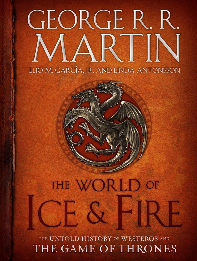
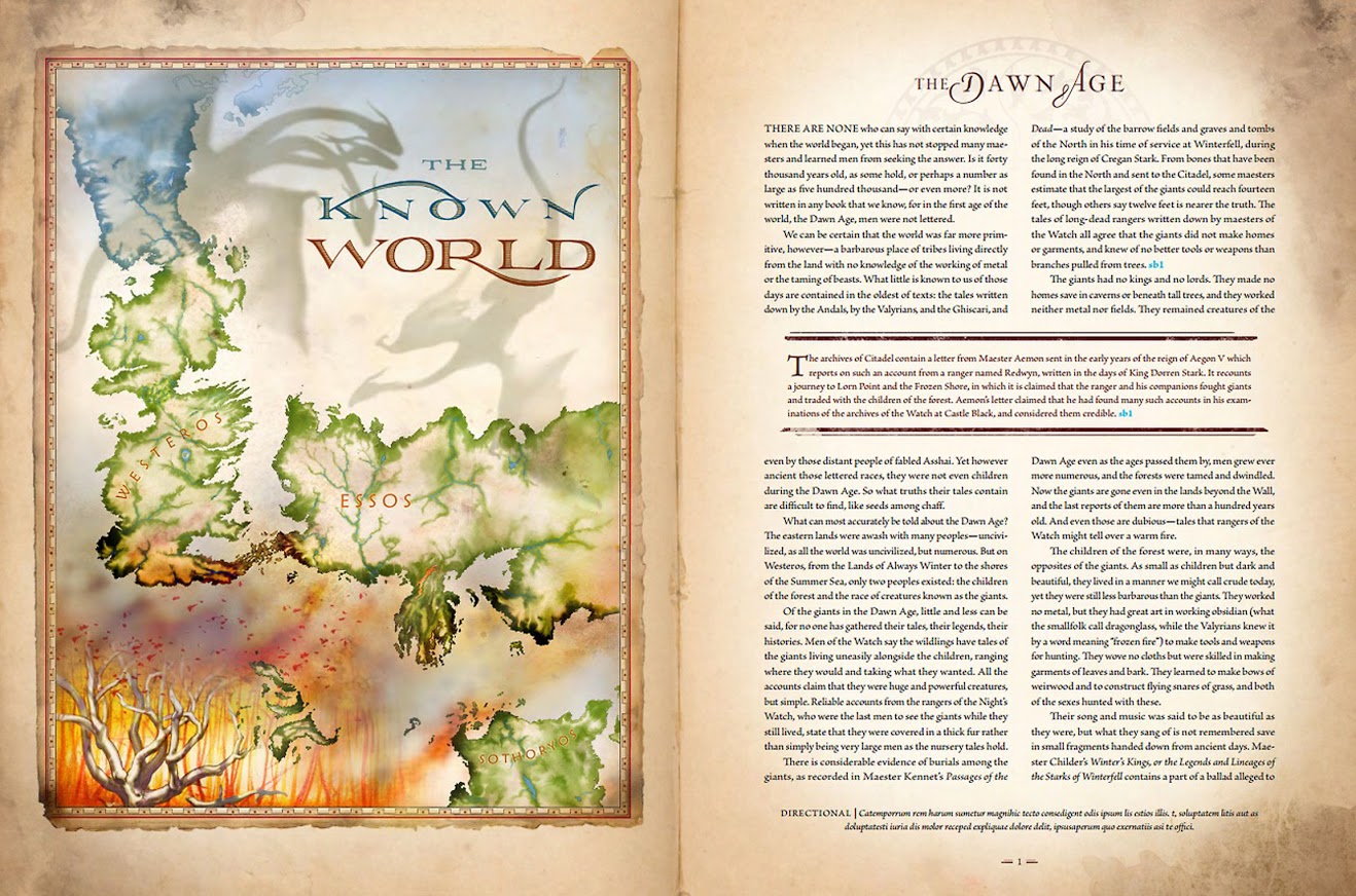
Recently writer Alex Piskin and artist Michael Gellatly discussed Michael’s 7 year map project for the upcoming release of George R.R. Martin’s World of Ice and Fire.
M. As is rarely the case in the fantasy genre for any need or interest in a history, George Martin, along with Elio M. Garcia, Jr. and Linda Antonsson have compiled the whole history of Westeros and some of Essos. How this book further expands the genre, is how the story is told. Along with a factual history (or as much so that you might find in fantasy), it’s a compendium of stories, myths and legends told by a maester roughly 100 years before the events of the ‘Game of Thrones‘.
A. How did you get involved with this project?
M. As a freelance illustrator, I’d been working for Random House for some time before George came around in search of a map illustrator. He too already had a long past with Bantam Books (imprint of RH who puts out his books). By that time through commissions from Bantam, I had assembled a few sets of maps for various titles. It’s funny, thinking of it now, the maps he saw then of mine which made up his mind, were a few I drew for a book called Ironfire, a story of the last Crusades. (Ironfire, Ice and Fire,…should I be worried about pigeon holing here?)
What might be interesting too, is this was 2006 when I was first commissioned to do these maps, kicking around some visuals based on a lot of uncertainties. But for reasons that are standards within Martintime, the real production of things didn’t get roll’n for me until 2011, when HBO’s series opened up all and any stopgaps.
A. Did you, or any other authors, work with George Martin at any point and to what extent?
M. What contact I had with George was early on in the project when we were introduced through Random House – a few phone calls, and a few emails. As for other illustrators, I can’t say. I believe there were 22 of us involved. I do know that Ted Nesbath, the painter of all those fabulous castles in the book, has worked with George on quite a few projects.
A. Did you use the novels’ map artwork as a guideline? How much deviation was there from the source material?
M. When acting the cartographer, typically one abides by what is stated by the church and state (in this case the author), having the power to adjust land mass according to the level of power, or unless of course you’re currently involved in rendering boundary maps between Israel and Jerusalem. Initially, George provided me with all his earliest sketches of Westeros and the other worlds. There was a lot that didn’t exist at first until George got more writing into the heart of these places, which then were passed on to me.
A. Tell me about your passion for cartography and botany. Any other projects in those fields?
M. I’d say that maps are a slow developing passion of mine, by now a much more realized one in my practice. I’ve always liked and understood maps, found early on that besides the geographical form of a place, a lot more of its story could be told right there within the picture plane. Bingo, a means to get through school without always having to write reports. It was amazing to me, the ease to which my maps were accepted in a variety of course. So it’s no surprise to me (well it is, but for different reasons) that only recently (10-12 years) maps would come back to me. I love it. The Botanicals, lengthy as well, another time. But I will say, it’s an odd bit of art behavior to take on the study of Ice Plants in Miami. (more on that on my blog… www.bamboo2studio.blogspot.com
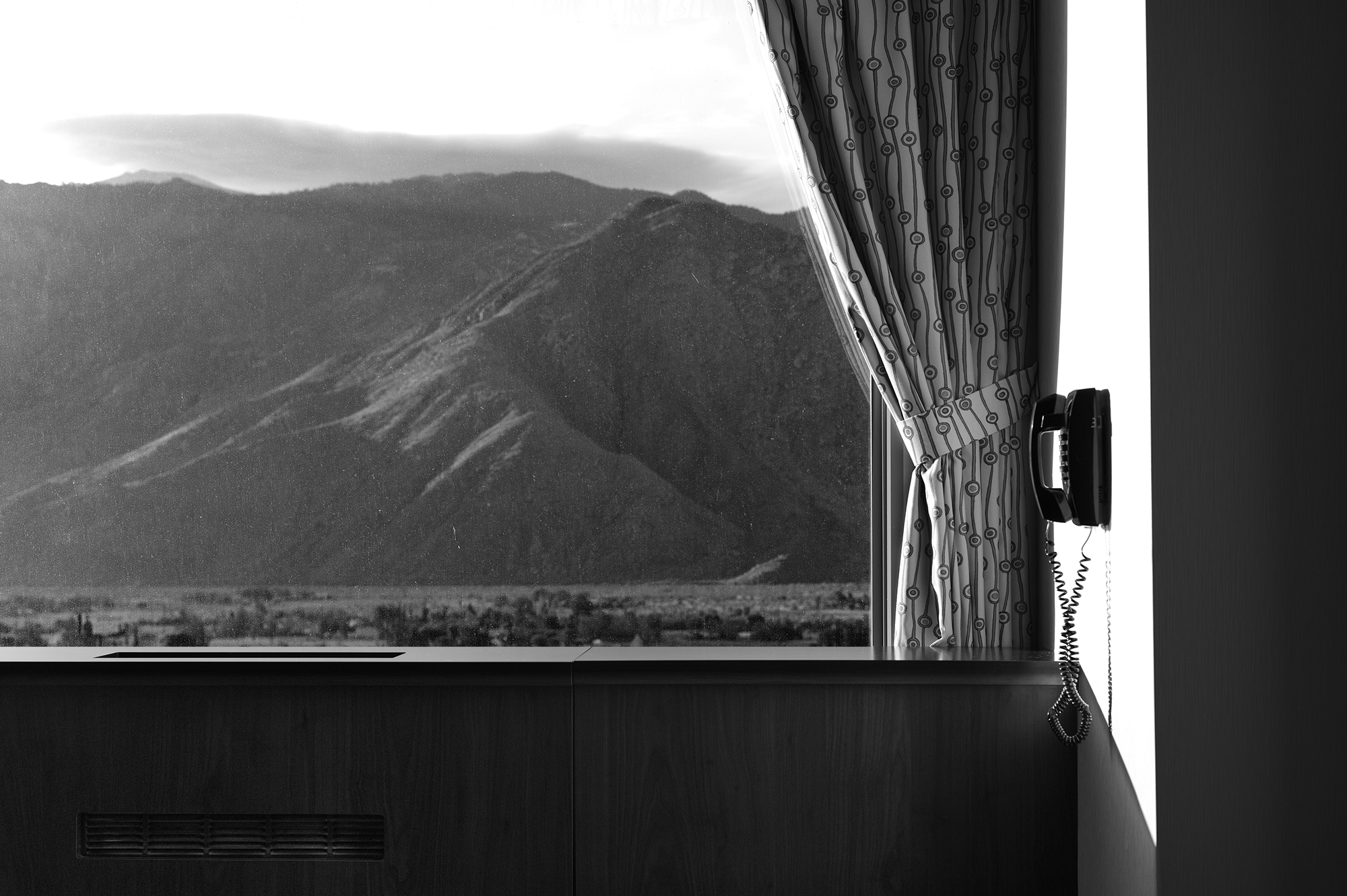
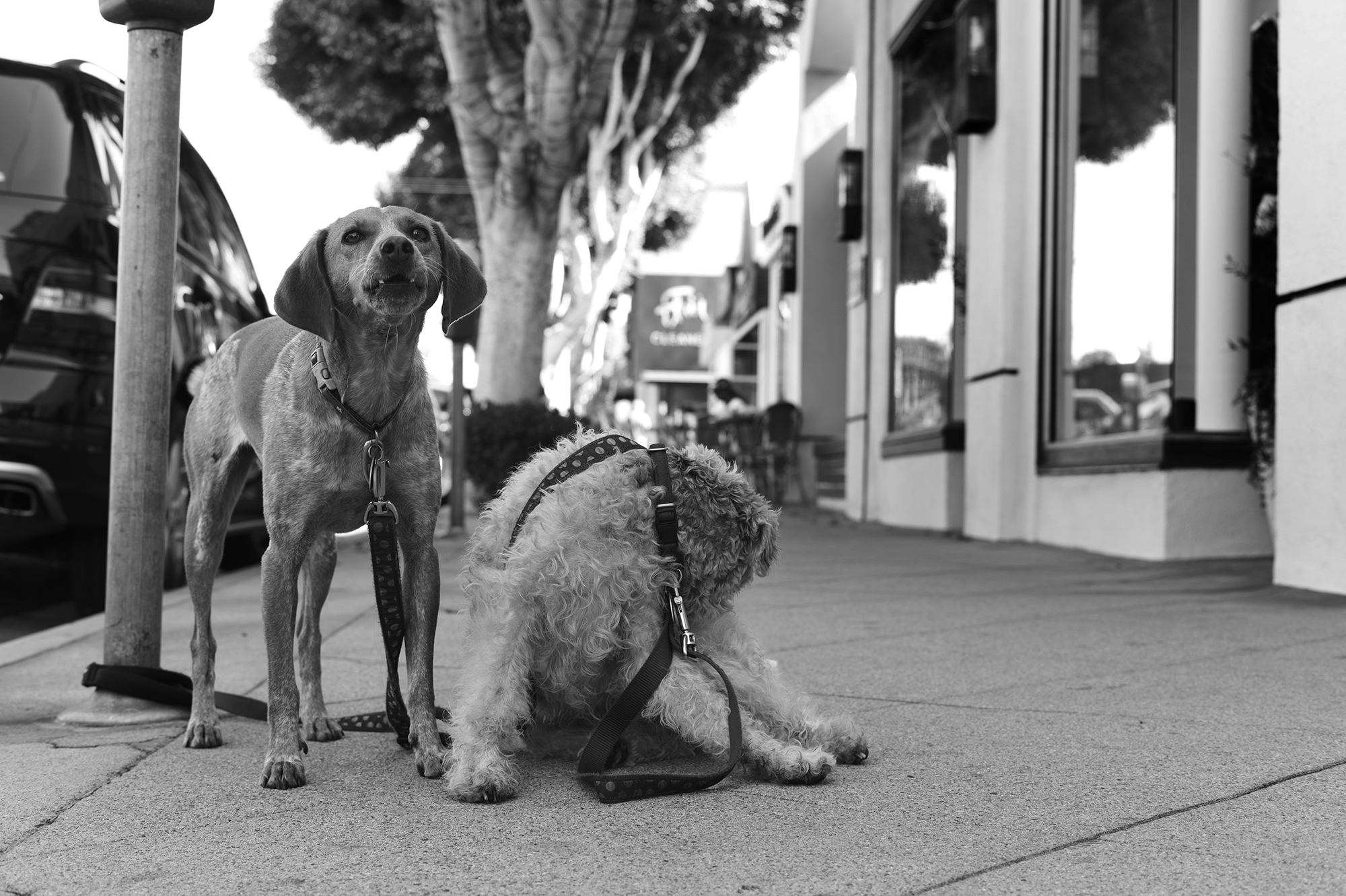
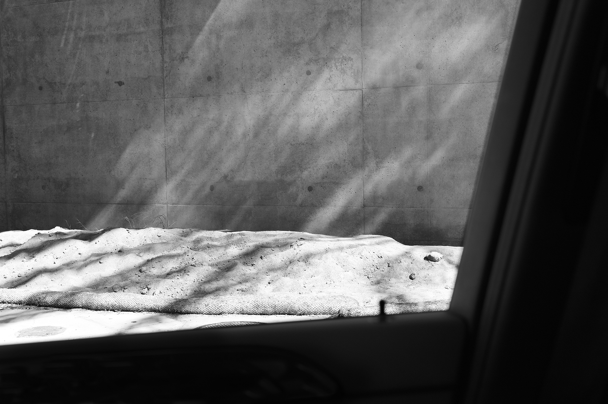
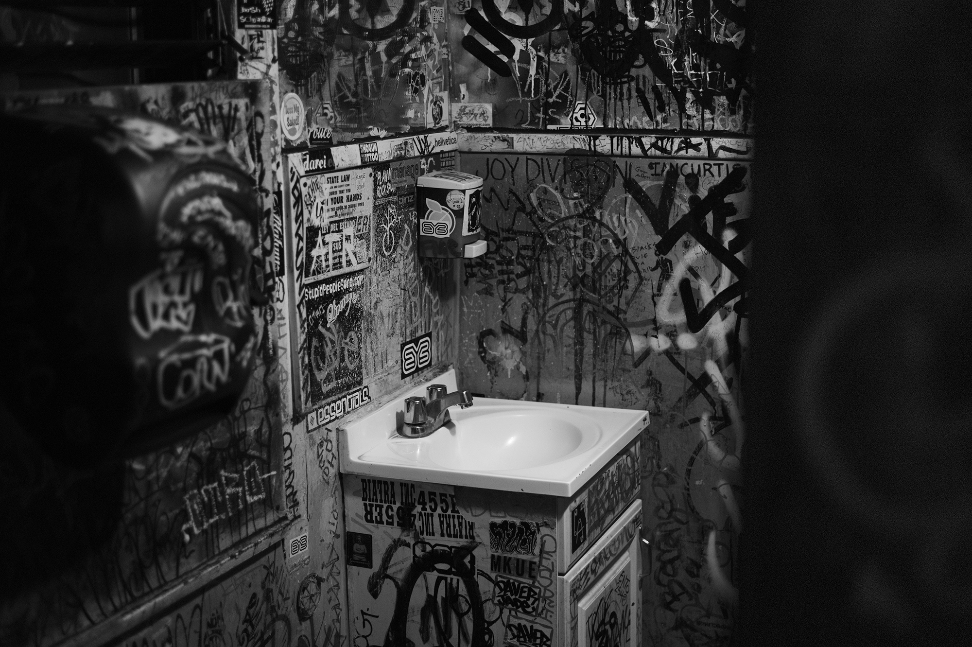
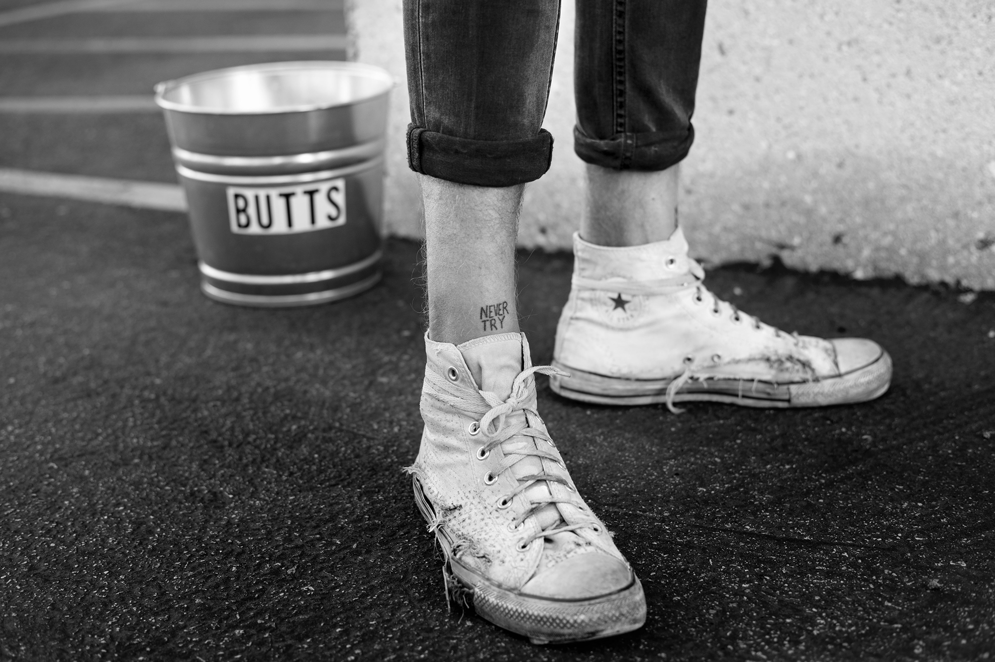
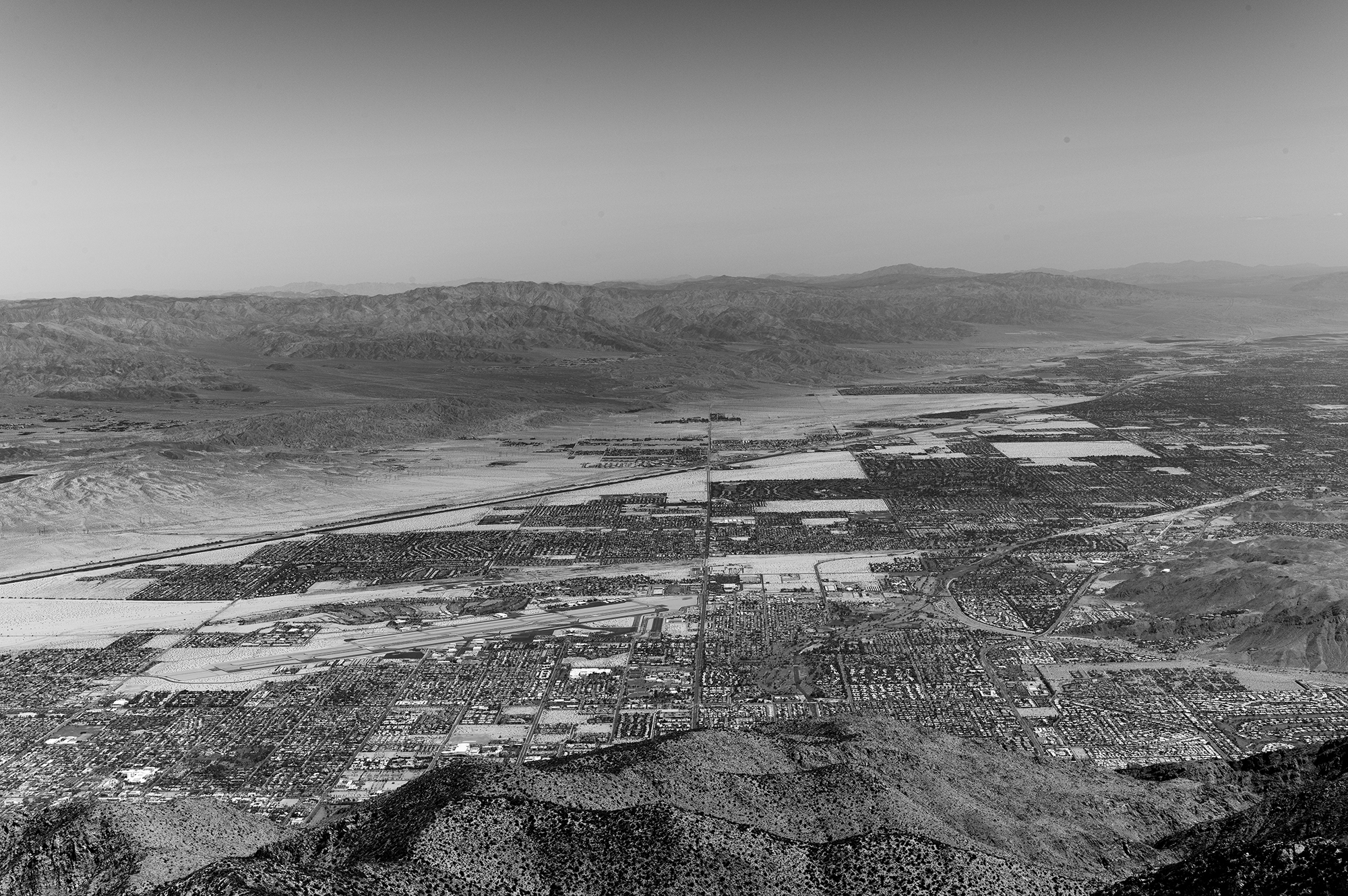
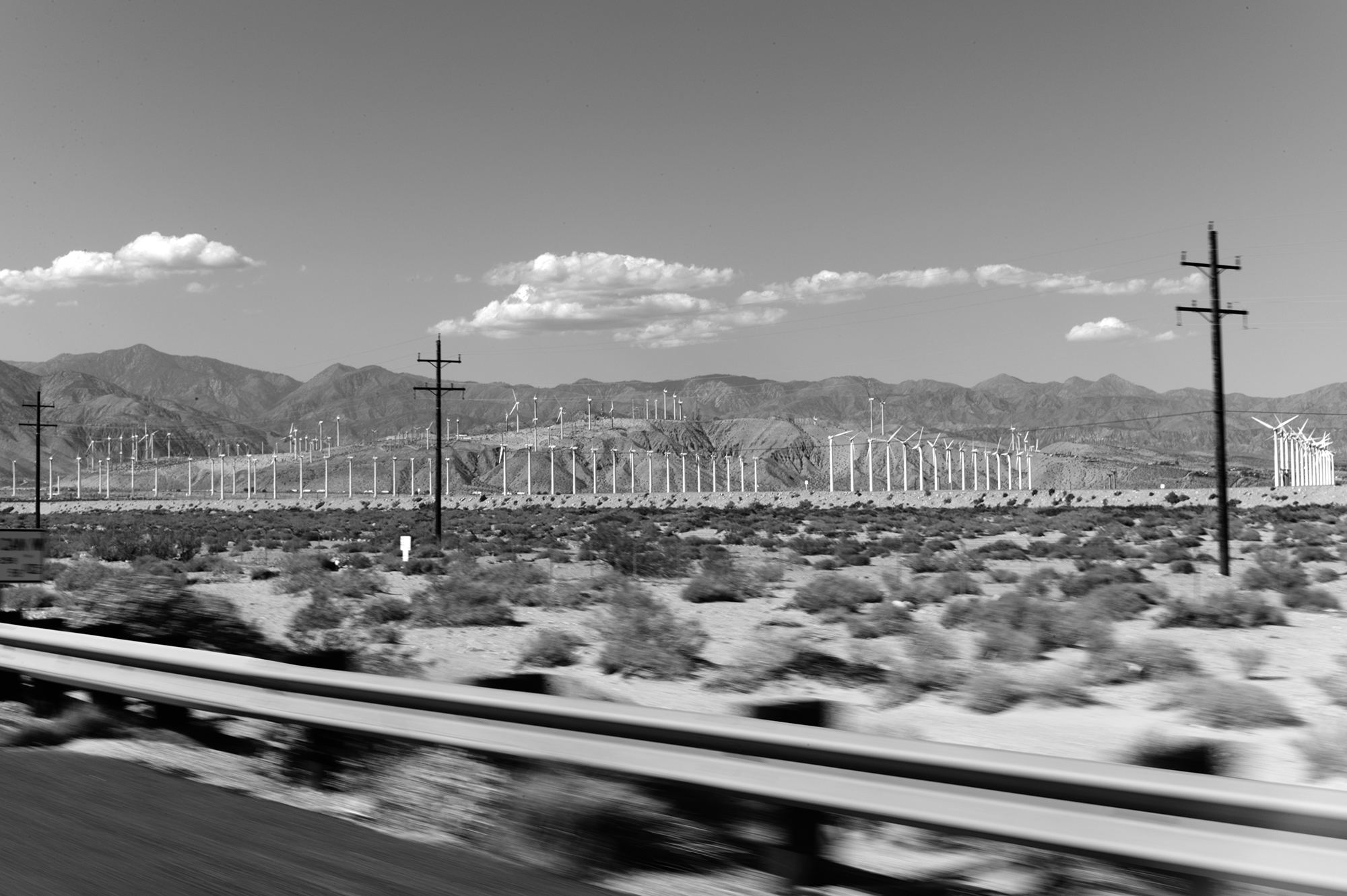
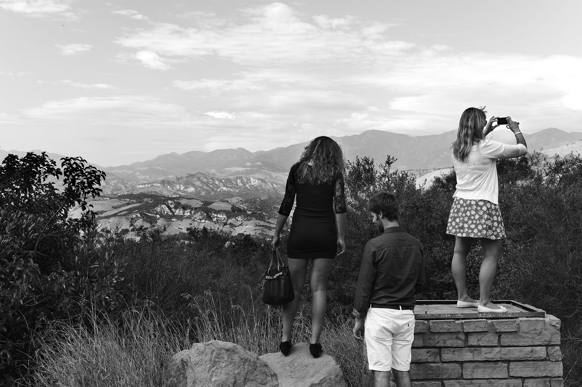
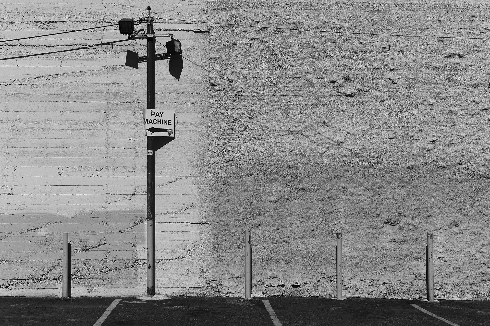
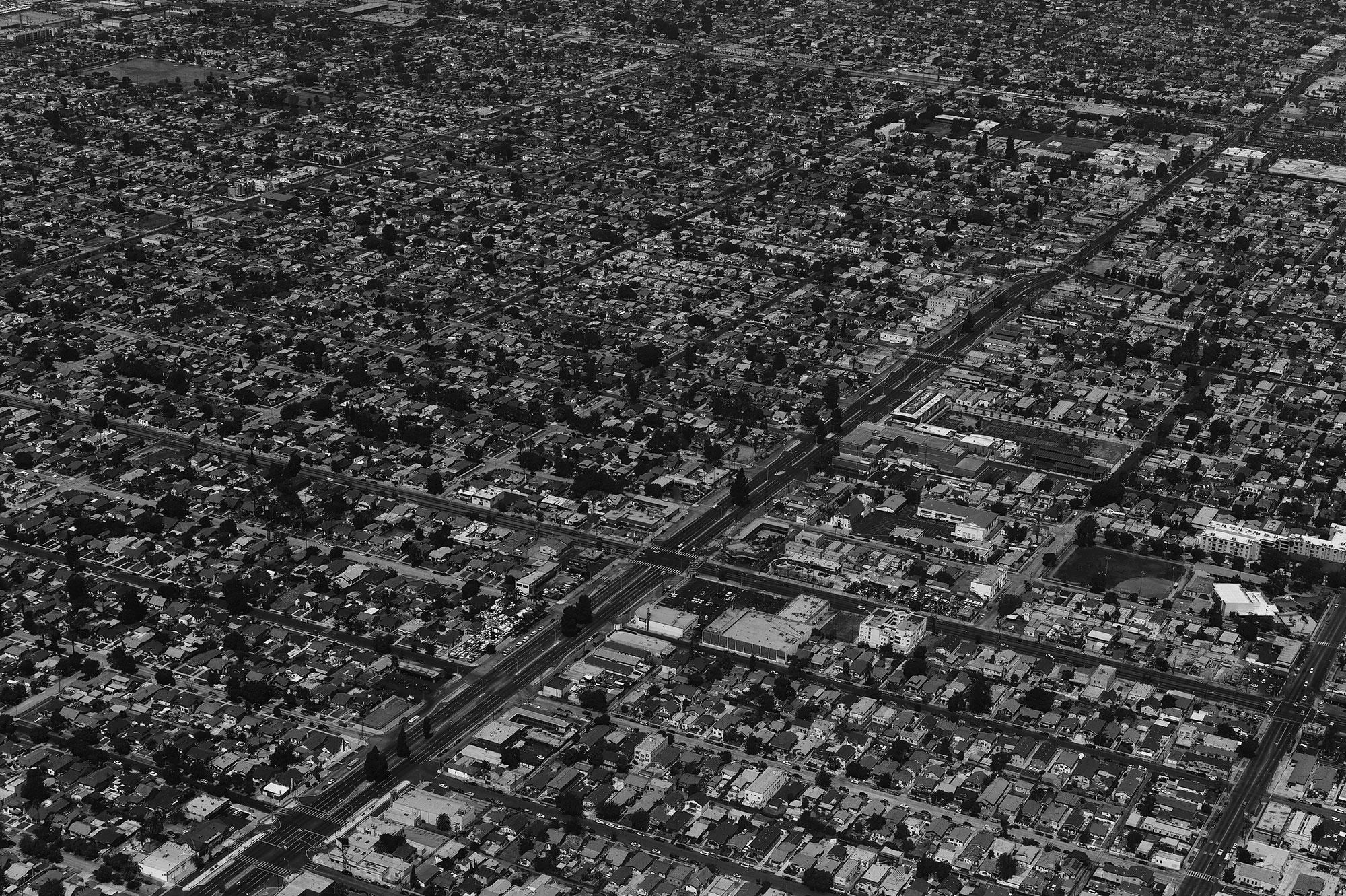
Simon Puschmann uses his Leica Monochrom and a 2.0/5mm Summicron for his ongoing project 365_2014. Simon simply documents his life, travels and what he sees and feels. Here’s Simon’s California segment.
Somewhere over the state of California. @Simon Puschmann
Los Angeles Freeway. Somewhere. @Simon Puschmann
Santa Monica. One last glimpse from my hotel room. @Simon Puschmann
Santa Monica. 2 dogs. A touch of Elliott Erwitt. @Simon Puschmann