
Lacko Illustration
With record temperatures keeping South Florida locals indoors this summer, Miami Beach artist Lacko Illustration has his eye on the start of the NFL PreSeason which marks the debut of his animated Mechagodzilla cover for The Seattle Times.
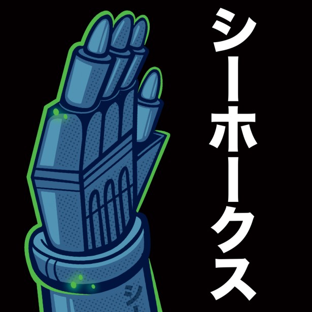
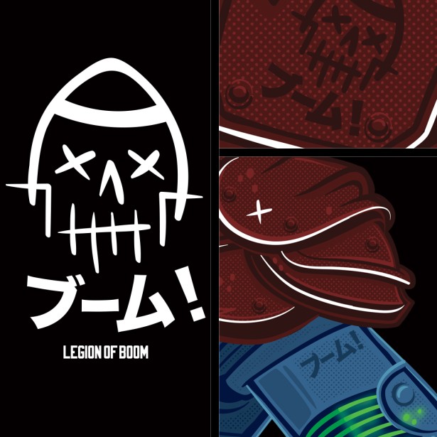
Celebrating the contributions of the defensive backs for the Seattle Seahawks who are nicknamed the “Legion of Boom,” Lacko created a hybrid football Kiru (Japanese for “machine dragon”) wearing Seahawk colors and fiercely guarding the ball.
Lacko Illustration
The NFL PreSeason kicked off on August 3, was perhaps the most anticipated team taking the field this summer is the Seattle Seahawks who kickoff against the Kansas City Chiefs Friday, August 25. Washington football fans are not only ranked highest when it comes to team loyalty, but also rated loudest when they reached over 137 decibels of ear-splitting sound cheering their team to victory at CenturyLink Field.

Lacko Illustration
To gauge just how passionate Seahawks fans can be, know that 137 decibels of cheering equates to a jet engine at 100 feet or a rock concert in full throttle. Sustained exposure to sounds over 90 decibels may cause permanent hearing damage – but that fact certainly won’t quiet a football fan on gameday. The Times serves as a vital link between players and fans. At the end of the 2016-2017 NFL season, former Seahawks running back Marshawn Lynch took out a full page ad in the newspaper to thank his fans before he left to play for the Oakland Raiders.
Lacko Illustration
In the stands, Seahawk fans wear lime green wigs, bright blue face paint and massive bird headdresses to show their team spirit, so the editors at The Seattle Times wanted a cover with a degree of intensity that mirrors that fanaticism. John Lacko laughs, “The Seattle Times contacted me earlier this year to see if I might want to take on a top secret project that would capture the attention of NFL fans. I knew I was up to the challenge.”

Lacko Illustration
Starting out with pencil sketches based upon the specific contortions of an NFL defensive player combined with the massive robotic structure of the Japanese extraterrestrial super villian, Lacko began to merge the mechanical with the muscular. “I struggled to make a 1970’s era space monster look more athletic. The one unifying factor for both characters is the notion of the BOOM, the moment of impact when monsters collide or players like Richard Sherman impact the ball.”
Lacko Illustration
Lacko’s full length monster covered Washington’s largest-circulation daily newspaper on September 4th, reaching nearly 350,000 readers in the Pacific Northwest. To add a layer of excitement to the NFL season launch, Lacko also created a 20 second animated spot featuring the booming footsteps of a massive Seahawk Mechagodzilla batting away a football. The teaser spot will appear on http://bit.ly/LOB_MechaGodzilla

Lacko Illustration
Please visit LACKO Illustration’s website and his Altpick page for more of his work.



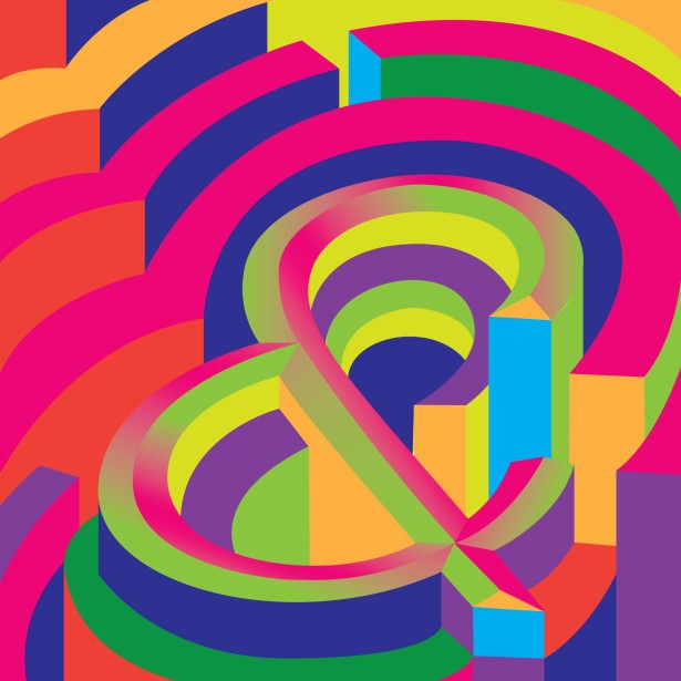 Judith Mayer was chosen as an artist for the newest series of typographic posters for Avondale Type Company, based in Chicago. The ATC Artist Series III is an illustrated exploration of the alphabet, highlighting illustrators and designers from around the world. Now in its 3rd year, the artist series boasts over 50 of the worlds leading illustrators from over 15 countries.
 Mayer chose the typeface ATC Harris, a monospaced sans serif, because she was charmed by the two-storey lowercase g and the ampersand. The monospacing means the normally narrow characters, like the lowercase t, are wide in order to fill the space.
 Mayer’s design started with creating a feeling of a three-dimensional space, but then she explored how highlight and shadow can inform (or confuse) the viewer about space. “I replaced light where dark might be in some areas. Flatness and depth are competing with each other. Inspired by psychedelic posters, I used a lot of colors with similar intensity next to each other. After I completed the designs I realized they reminded me a little bit of pinball machines!” said Mayer.

















 My background in visual design & merchandising dates back to Burdines “Sunshine Fashions,” another beloved South Florida institution that faded into memory in 2005 when many regional big box stores were absorbed into the Macy’s brand. I got my start on the selling floor building store displays and wound up as an executive-level visual presentation designer crafting the interiors of specialty departments working on a computer. Partnering with two devoted South Florida families who have put their heart and soul into the resurrection of Velvet Creme is a far more personal task, and so I’ve found myself back on a ladder helping to place the dynamic graphics I designed that honor the history of the company and move the brand forward for the next generation.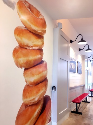


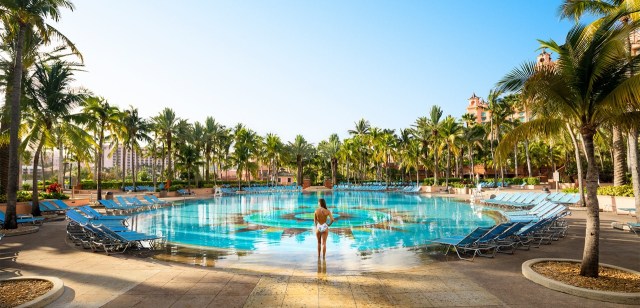







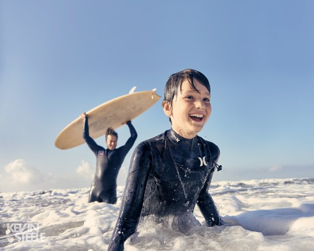


 It may sound like a reverse from the famous quote of hit TV show, “Game of Thrones”, but despite increasingly unpredictable weather changes, one fact still remains: summer IS coming. And that, for many, means putting on some comfortable shoes and heading out for a number of different summer activities. For anyone unsure about what this might entail, take a look at some of the photographs from
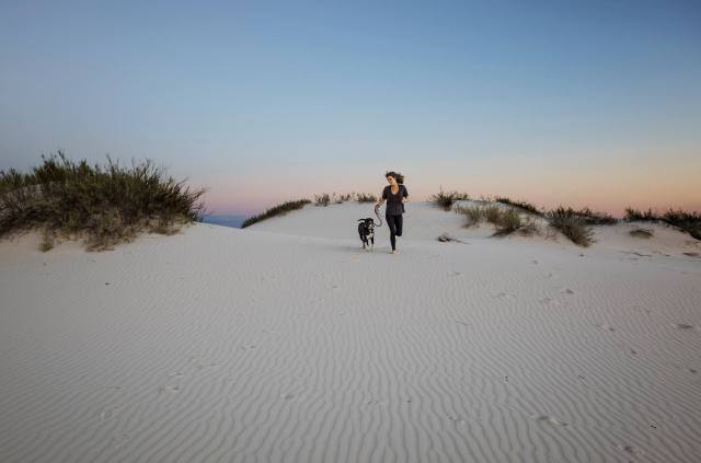

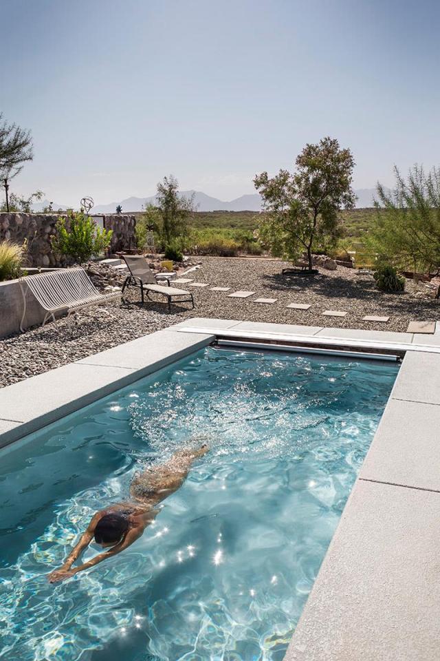

 The Pick