Eric Cassée Goes Back to School :: TIME Magazine Assignment

kids1

Eric Cassée got his start in photography shooting for the local papers on Maryland’s eastern shore.   After a stint studying landscape photography in Italy, he decided to stick with shooting people and interned at Daylight Studios in Paris.  While at Daylight, he assisted both fashion and commercial photographers from all over the globe.  A loyal fan of red wine and all things Italian, Eric also plays guitar and piano, and has aspirations to write.  Altpick Connects had the pleasure of talking with Eric about his recent photo assignment with TIME magazine.

AP: Eric, recently you photographed a series for TIME magazine of school kids. What was the article about?

EC: The article was about a new educational software tool being used in some schools around the country. The software products are from Knewton, a New York based tech start up. While using the programs to complete lessons, tests, quizzes or comprehension assignments, the various programs track how a student learns best by collecting data as the student works. Such as: the time of day, the subject matter, how long it takes them to answer questions, how correct the answers given are, and more information I am not privy to. Over time it builds a profile of the student that can show their own individual strengths and weaknesses and tailor lesson plans specifically for them, as well as predict how they will perform in the future in high school, the SAT’s, even college.

taylorcomputer

AP: Are these kids models?

EC: No, none of the kids are models. Though by the end of the shoot a few of them were sure acting like it. They were all students that are currently participating in the Knewton program.

AP: What was the mood, expression or style were you trying to achieve in this particular shoot?

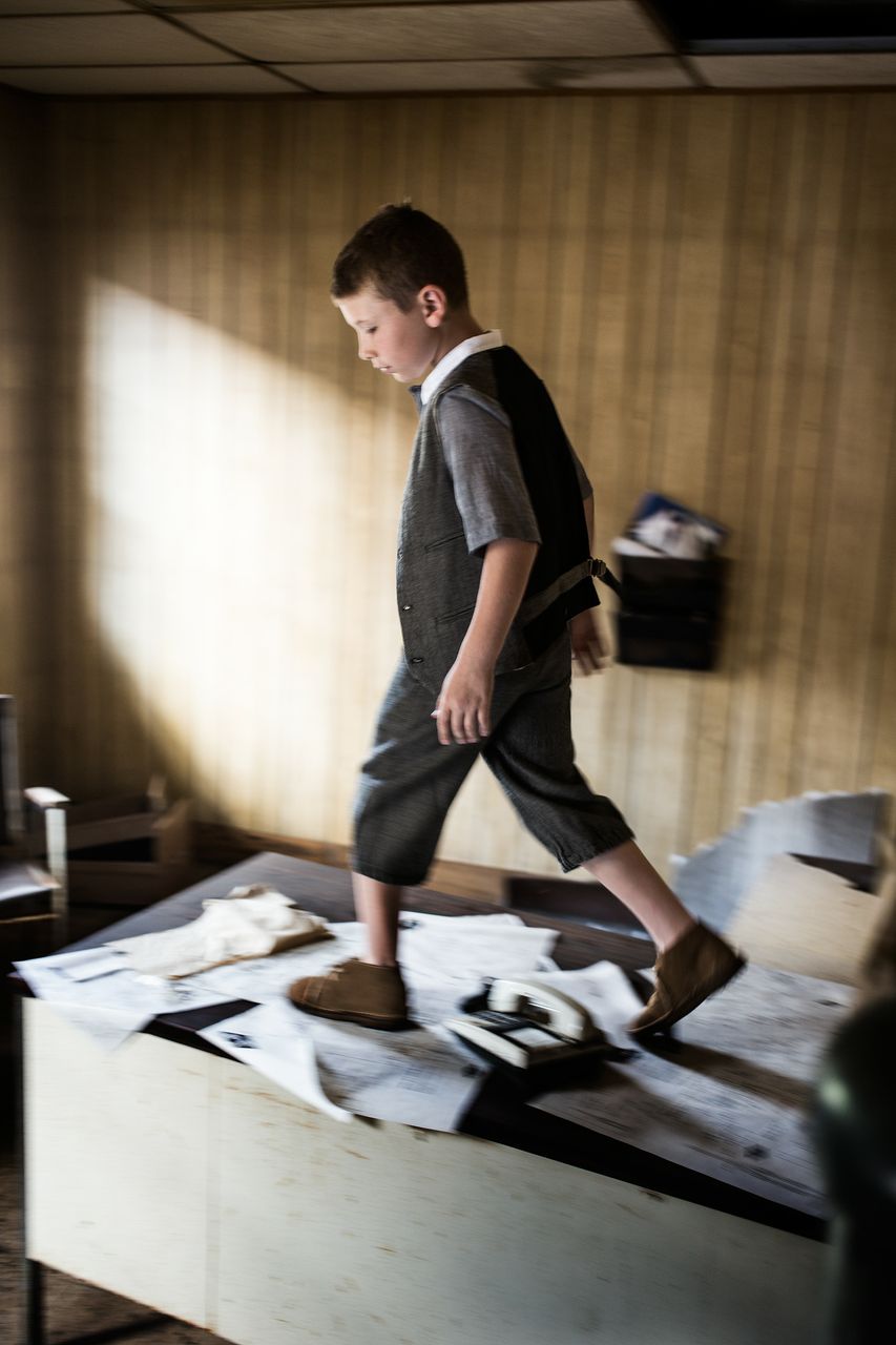
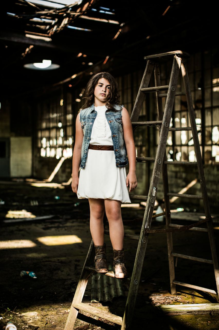
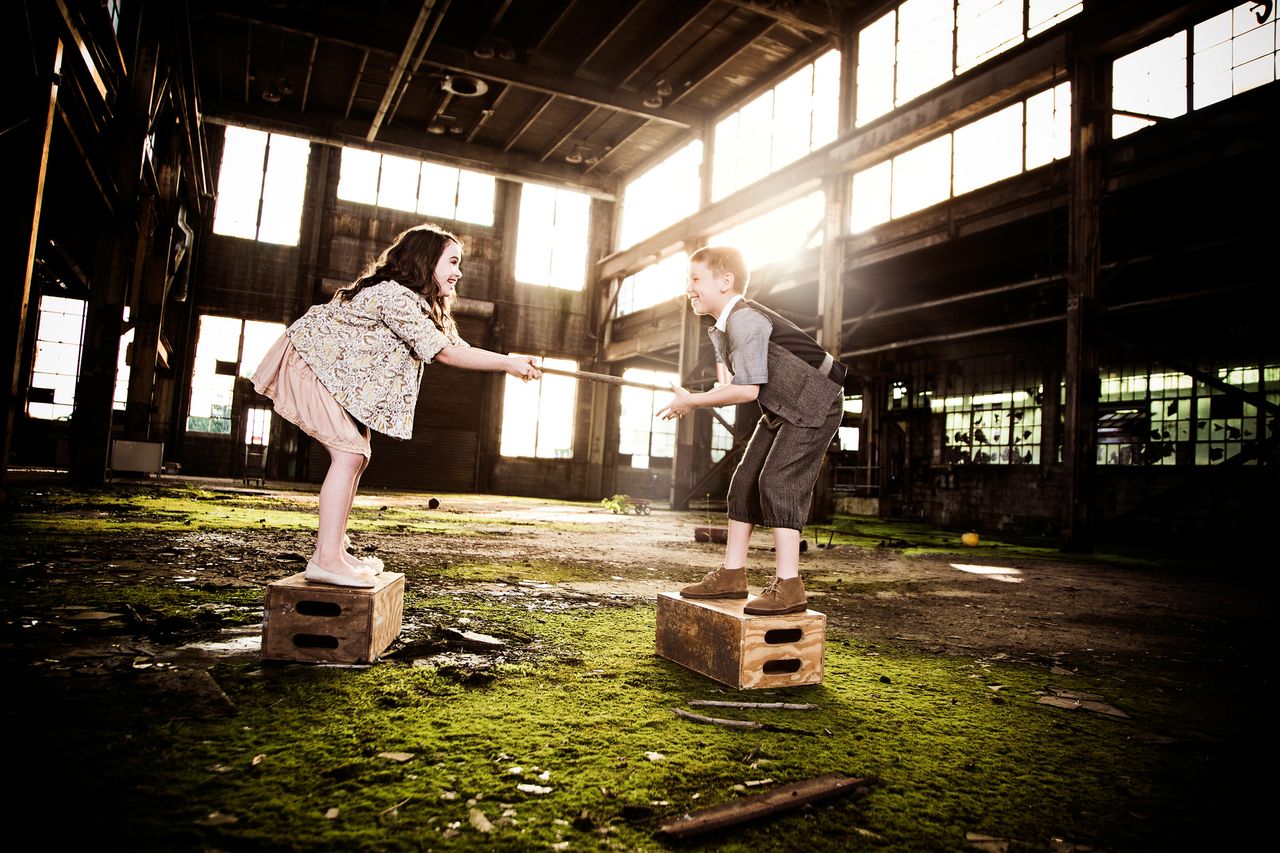
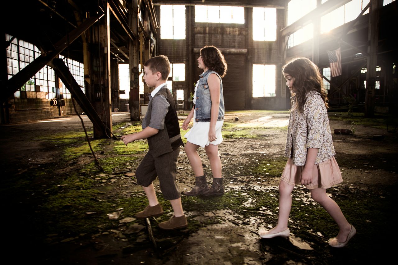
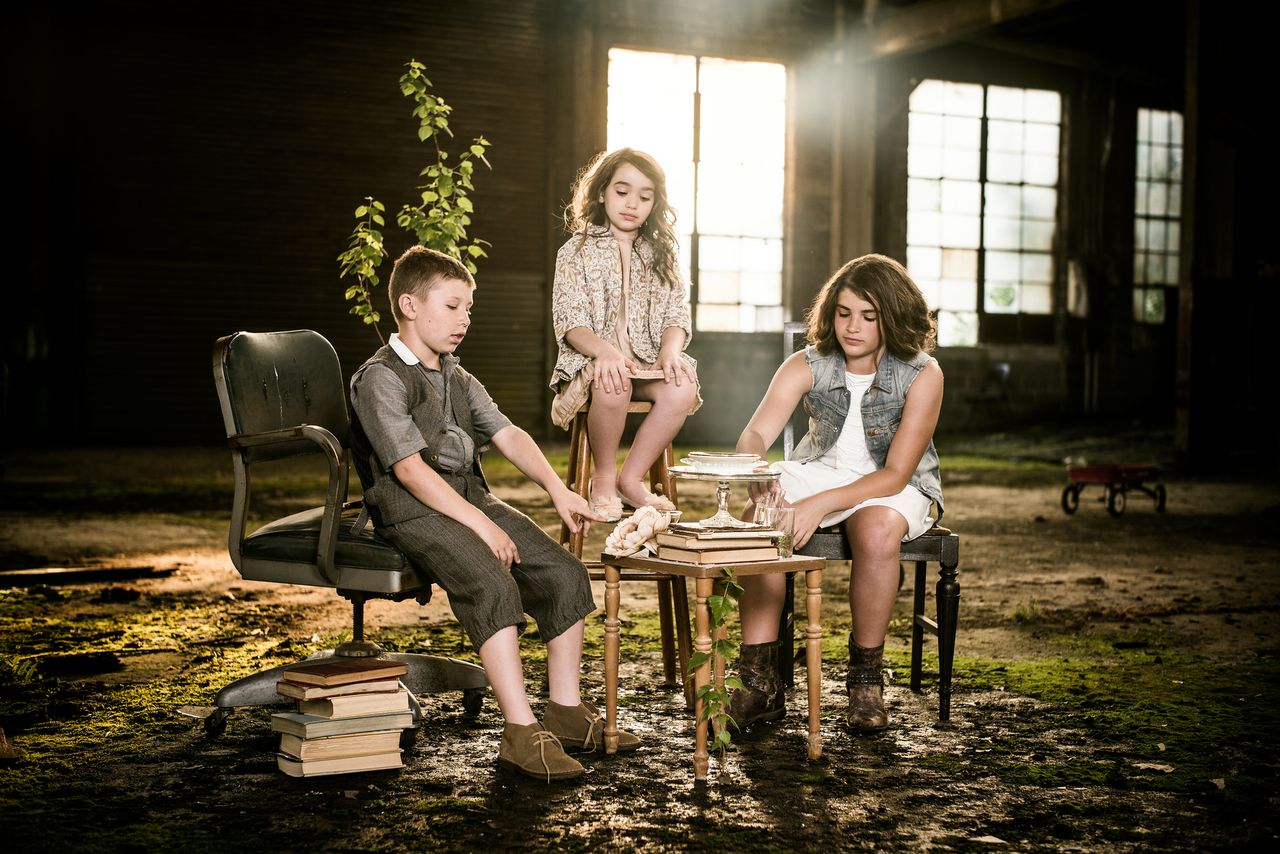
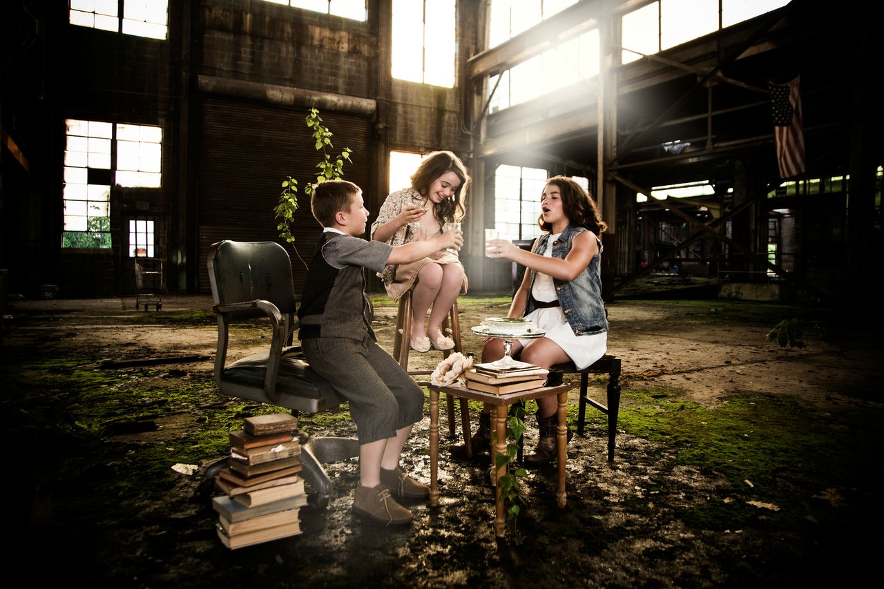
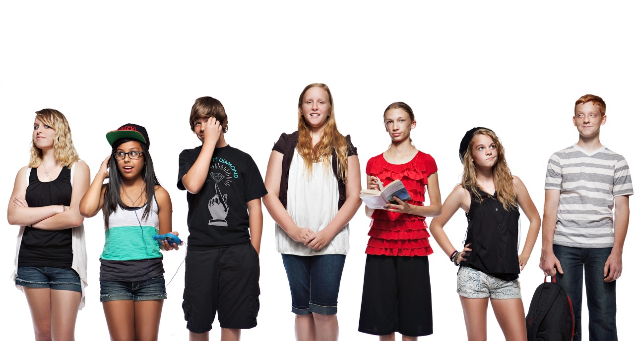
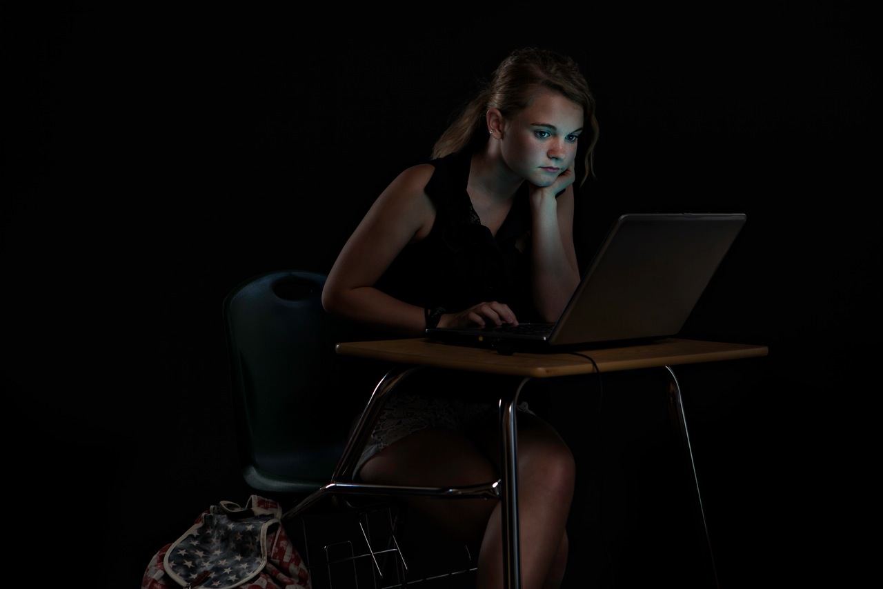
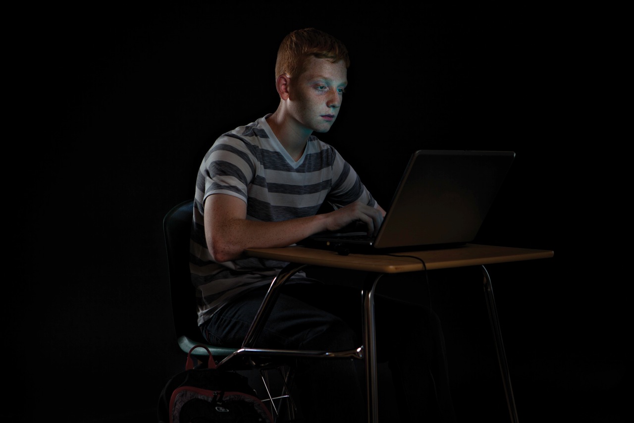
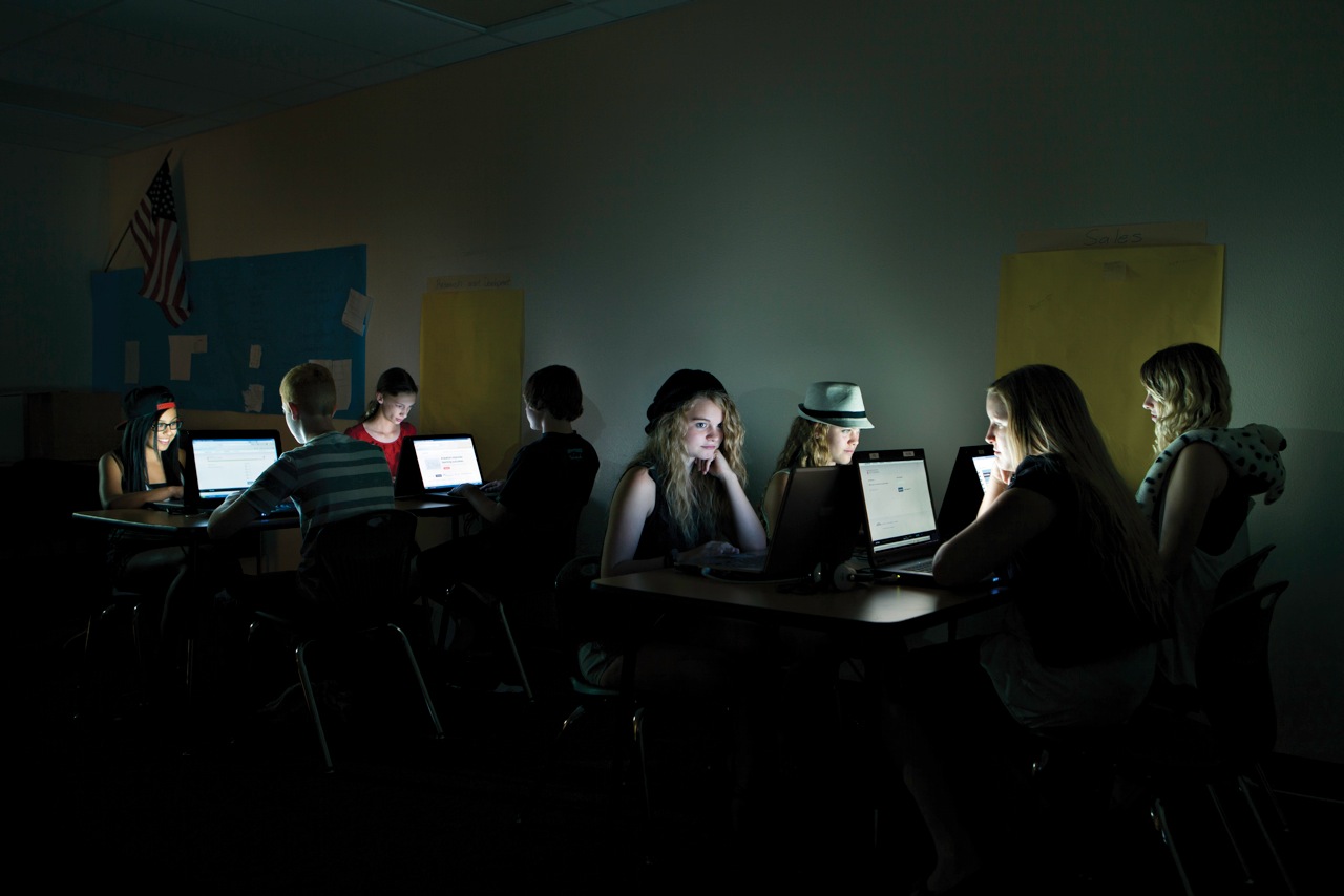
EC: Well, originally when I spoke with the art director for the story, he referenced a shot of mine that he saw on my website of a man sleeping on an airplane. His face was lit by the small TV screen in the seat back. He really liked the light and the moodiness of the image and wanted to go in that direction with the images for this story. We talked about how to incorporate something as aesthetically unappealing as someone sitting at a school desk computer into an interesting image that told a story of interaction between the student and machine. I was really glad that he didn’t want something straightforward and that I had some creative freedom to do something interesting with light. That resulted in the dark images of the kids at the screens. We essentially built a small black cave in the gymnasium of the kids’ school with large flags, C-Stands, and black seamless. The shutter speeds were slow in order to pull the glow off the laptop screen, so the kids had to be pretty still. That was the first challenge: getting an expression that did not appear posed or static and then getting the kids to hold it. Middle school school kids are crazy, there’s just so much going on in their heads. If as a director you can get some of those insecurities, random thoughts, humor, or obnoxiousness out of them, it makes a great image. It was really fun interacting with them and coaxing them out of their high school shells. So much fun that we decided to try another treatment while we were there. We went with a standard blown out white background portrait set up and just got the kids in front of the camera. They were all stoked to be out of class and were just hanging out and teasing each other. I was listening to them and remembering how much I hated high school, but the more I listened and watched them the more I started to see who they were and I got an idea of who was going to do what in front of the camera. I saw what their personalities were like, they were all so different, and my goal was to capture that.

Originally these second shots were considered for individual head shots with quotes for the layout. I really liked looking at the diversity of characters on my screen while working in post, and I had an idea for a composite that I thought would look cool. I did a quick mock up and ran it by the art director. He loved it, and it ended up a double page spread.photo

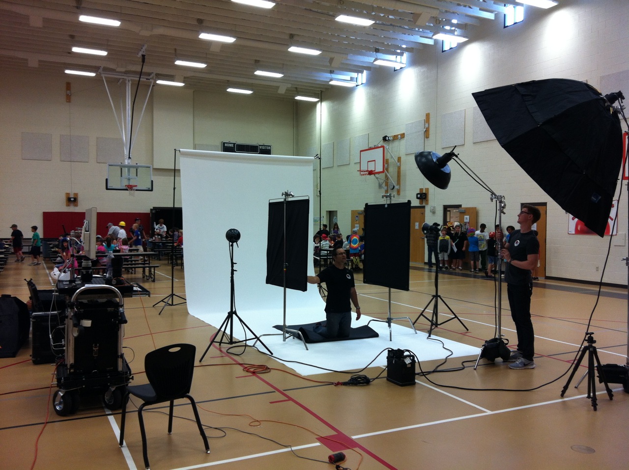
AP: Tell us a little about the behind-the-scenes. Did you run into any snags?

EC: The first snag was that I almost ran out of gas in the middle of the freakin’ desert. This school was OUT THERE. I was doing exactly what my iPhone told me to do up until it didn’t know where the hell it was anymore. So I called my digital tech who was ahead of me. He explained that I was gong to keep going through this “town area”, over a ridge, and then to just keep going until it looked like I was going to disappear forever into the desert never to be found again. Quite literally, there was NOTHING to see in any direction for far to long for me to be comfortable. My dashboard was telling me I had 0 miles left before empty. Did I mention it was approximately 150 degrees? As luck would have it, the first man made structure I encountered upon returning to civilization was a Shell station, so catastrophe was averted.

Once at the school we scouted around a bit, testing the ambient light, looking for some cool settings. We eventually made base camp in the gym, which also served as the cafeteria, and was in full blown lunchtime chaos when we starting loading in gear. That was funny. The kids were geekin out, the boys showing off for the girls a foot taller than them, all the awkwardness of puberty on full display. Some kid came right up and dunked a basketball at the short hoop right next to two 30″ monitors on the Digi-Tech’s cart. We exchanged glances. He was promptly scolded by the cafeteria boss who was exactly like every male gym teacher you have ever seen in any movie ever. I felt like I was in a John Hughes film. But of course, once we were set up, myself, my assistant, and the tech all had to have a go at dunking on the short hoop.

bradleycomputer-1

AP: What was it about the assignment that you loved the best?

EC: One of my best friends used to say, when talking about chasing girls in a town with limited options, that he could always find something unique about a girl that would spark his interest. It was different with every girl…

I find that photo assignments are the same for me. I don’t always get to do exactly what I would like to do, but there is always something beautiful in any assignment that I try to identify and concentrate on. Personally I love working with people as my subject. I always try and try to pull something out of them until I get it. With this assignment, that was pretty easy. The kids are all showing you something because they are still kids. They haven’t had years of practice crafting their ego’s to reflect only who or what they think they should be. So they may be wild and crazy, or quiet and detached, but whatever it is, it’s them, and it’s beautiful.

classroom

To see more of Eric Cassée’s work go to his website and Altpick page.

Posted in Altpick, Photography | Tagged , , , , , , , , , , | 1 Comment

Photographer Ryan Ketterman Picks His Favorites

The Blue Angels in Jacksonville Beach

Editorial and commercial photographer, Ryan Ketterman, runs a client-friendly, service-oriented business where he believes creativity often is the result of team effort and working closely with his clients.  Ryan specializing in people and corporate photography with a style consisting of colorful and energetic imagery.

Based in Jacksonville Beach, Florida Ryan picks a few of his favorite images.

Ketterman_121104_5089 Ketterman_121108_1342 Ketterman_121108_1457

To see more of Ryan Ketterman’s work, go to his website and Altpick page.

Posted in Altpick, Art, Photography | Tagged , , , , , , , , | 3 Comments

Scott Lowden’s Lord of the Flies (Sort-of)

Every holiday and even some random weekends, I would find myself driving down Rt. 309 in Hazleton Pa. There’s this building that continually caught my eye, especially when the sun was low and bright. It’s an abandoned machine shop of some type, and I can only imagine the cool widgets they’d make inside. Finally on a recent loop around the Northeast, I put a shoot together featuring my nieces and nephew, whose parents I convinced to let them follow me into this tetanus-ridden environment to create some ‘fun’ imagery. Borrowing some clothes from LA’s Blu Pony Vintage, and pulling a few key props from the nearby Salvation Army and dollar store, a super light version of ‘Lord of the Flies’ was born.

SLP_LordofFlies2 SLP_LordofFlies3 SLP_LordofFlies4 SLP_LordofFlies5 SLP_LordofFlies6 SLP_LordofFlies7 SLP_LordofFlies8 SLP_LordofFlies9 SLP_LordofFlies10 SLP_LordofFlies11 SLP_LordofFlies12To see more of Scott Lowden’s work, go to his website and Altpick page.
Posted in Photography | Tagged , , | 1 Comment

Blair Kelly Shares His Favorites

TravelTips-2

Blair Kelly grew up in a world surrounded by all things Crayola, Lego and Play-Doh, so it was inevitable that he would end up loving art class in high school and eventually attending art school.  Blair graduated from Sheridan College’s (Oakville, Ontario) illustration program in 1999 and has been working ever since.  His work has been used in a variety of applications such as magazines, newspapers, annual reports, packaging, t-shirts, posters and animation.  Blair shares with us his two favorite images.

BlairKelly-1

Altpick Connects: Blair, you chose the above two images as your favorites,  why?

Blair Kelly: I am always into my recent work most I guess.  One piece is about technology and TV viewership for the cover of Marketing Magazine, the other is about travel tips for UCLA Magazine.  I had lots of fun doing both pieces.

AP: How would you describe your work place?

BK: My work space is fairly small, computer on one side, desk on the other, some toys for fun and lots of bulletin boards for inspiration.  Here are a few pics, one of which features one of my dogs; Oliver, who will occasionally join me while I work.  And one of my favourite toys, Black & White Astroboy, a gift from my best friend. The space works for now but hoping to have something more expansive in the near future.

AP:  Three words to describe your style?

BK:  Hmm, 3 words might be: Bold, thoughtful, evolving.

AP: If could you live anywhere in the world where would it be?

BK: If I could live anywhere in the world it would definitely be London, England, a great city with such history and beauty.  It has a really great vibe, from the cool street style to the pubs, galleries & royalty, it’s a great mix of old and new.  I also happen to love all the different versions of the accent.

To see more of Blair Kelly’s work go to his website and Altpick page.

Posted in Altpick, Art, Illustrations | Tagged , , , , , , , , | Leave a comment

These are a few of Jane Mjolsness’ favorite things…

coffee at 9

Jane Mjolsness’ artwork has appeared on packaging, editorial applications, books and book covers, fashion, greeting cards.  Jane enjoys illustrating complex emotional issues, women’s issues, relationships and food in a stylized, simplistic, elegant manner with great attention to composition, color and line quality.

day-spa
“My absolute love for drawing and day-dreaming when I was a little girl brought me to the place of illustration. I love to turn a complex idea or concept into an eye pleasing, thought provoking visual treat. originally from Minnesota, I studied in Italy, lived in London, and travelled extensively throughout Europe and currently live in Naples, Florida. I love history and story telling, and understand that the most amazing artists, were actually illustrators.”

earth-mother
“I draw inspiration from Chagall, Gauguin, Klee, Matisse, and Picasso. If I could, I would turn back time and live in Paris in the 1920’s. Although I’m sure it was challenging, just the sheer energy that was going on at that time is mind numbing.”

happy joyous and free crt Maria's-espresso

new baby recreation1 rejuvination2 Serenity book cover

Gratitude book coverTo see more of Jane Mjolsness’ work, go to her website and Altpick page.

Posted in Altpick, Art, Illustrations | Tagged , , , , , , , , , , | 1 Comment

Sergio Baradat’s Series of United Nations Stamps “SPACE”

UNPA Space Souvenir Sheets 2013 New York

Space

World Space Week is an annual event, declared by the UN General Assembly and is observed during the week of 4-10 October.

World Space Week is the largest annual space event in the world. Some of its goals are to educate people about the benefits that they receive from space, encourage greater use of space for sustainable economic development, excite young people about science to inspire the workforce of tomorrow, and to foster international cooperation about space outreach and education.

Today, the United Nations Office of Outer Space Affairs in Vienna provides the overall global coordination of World Space Week, under the guidance of the United Nations Committee on the Peaceful Uses of Outer Space, and with the support of World Space Week Association, a non-government organization.

This year’s United Nations “Space” stamps feature images of Nebulae. A nebula is a gigantic interstellar cloud of dust particles and gases in space. It is made up of mainly hydrogen and helium gases. The term nebula comes from the Latin word for cloud. Nebulae come in many different shapes and sizes and can be light years across (trillions of miles). Some nebulas are regions where new stars are being formed, while others are the remains of dead or dying stars.

Designed and illustrated by Sergio Baradat, this series of the U.N. “Space” stamps’ official first day of issue and sale is today, August 9th.  For more information or to purchase, go to the United Nations Postal Administration site.

See more of Sergio’s work, go to his website and Altpick page.

UNPA Space Souvenir Sheets 2013 Vienna

UNPA Space Full Sheets 2013 New York UNPA Space Full Sheets 2013 Geneve UNPA Space Full Sheets 2013 Vienna UNPA Space Souvenir Sheets 2013 Geneve UNPA Space ENV. Souvenir 2013 Combo UNPA Space ENV. Single 2013 Combo UNPA Space COVER 2013 New York UNPA Space COVER 2013 Vienna UNPA Space COVER 2013 Geneve

UNPA Space Poster 2013
Posted in Altpick, Design, Illustrations | Tagged , , , , , , , , , , | Leave a comment

Summer Greetings from Alessandro Bonaccorsi

swimming_w_the_shark-1

The ‘Lemon Shark’ or better know as the ‘Yellow Shark’ has the most distinctive color among the shark species.  Illustrated here by Alessandro Bonaccorsi from Zuppassion, the yellow shark is mainly found along the Southeastern coast of the United States and the Gulf of Mexico. They primarily depend on their sense of smell and feed on small prey including mollusks and crustaceans.

To find out more, go to this informative video on The National Geographic site.

To see more of Alessandro Bonoccorsi, go to his website and his Altpick page.

Posted in Altpick, Illustrations | Tagged , , , , , | Leave a comment

Who killed the music industry? An interactive explainer

Posted in Uncategorized | Leave a comment

Carolyn Ross :: Intense and Powerful

Model test shoot fashionPhotographer Carolyn Ross chose this image as one of her personal favorites because she had a specific vision in mind of what she wanted to capture.  “I feel like all the elements came together to make it a breath-taking photo. The expression on her face, the wetness of her hair, and the lighting all combine to create a feeling of female sensual energy. It feels very intense and powerful.”

To see more of Carolyn’s work go to her website and Altpick page.


Posted in Altpick, Photography | Leave a comment

Kate Taylor Has a Sense of Humor

image002

Illustrated for the United Kingdom’s March 15th “Red Nose” Day

Cartoonist and illustrator, Kate Taylor, creates strip and single panel cartoons and illustrations for a wide variety of clients across the media.  Her work has been featured in numerous magazines, newspapers, calendars, greeting cards and has been animated for television.  Here are some of her favorite cartoons…

Trapeze colour

Part of a series recently illustrated for Snap Surveys.

Money save

“Money Saving” illustration was inspired by Kate’s Yorkshire roots where the locals are known to be ‘careful with their money’.

Moving card.

“The moving house illustration” was for ‘New Home’ greetings cards.

Red nose grump.

To see more of Kate Taylor’s work go to her website and Altpick page.

Posted in Art, Illustrations | Tagged , , , , , , , , , | Leave a comment